Apologies for the length:
I promise you it’s a rich tapestry of a mad man. Enjoy.
A lot of people starting out, myself included, let the client dictate the timeline. That doesn’t happen for me anymore. If someone told me on a Friday they wanted concepts by Monday I’d tell them they’ll have them the following Friday as I have other commitments, I know you have a family member and it’s tougher to say no, but it’s still your weekend, and working with family is rarely good anyway.
Don’t get caught in the trap of thinking you owe clients your evenings and weekends. You’re providing a service they can’t do themselves. A rushed timeline rarely produces the best work.
Set your business hours and stick to them. If a client wants work outside those hours, or wants an unrealistic turnaround, that’s not your emergency, that’s theirs. They can either wait, pay a premium for the rush, or find someone else.
It’s your business and your time. Professional clients generally respect professional boundaries. The sooner you learn to manage expectations and timelines, the better both your work and your sanity will be.
The irony is that most clients would rather wait an extra week for a good solution than get a rushed one by Monday.
One thing I’d add regarding the decorative elements question.
A good test is to remove it.
If you take an element away and the logo still communicates exactly the same thing, functions exactly the same way, and arguably looks cleaner, then there’s a good chance it was decorative rather than functional.
If removing it makes the mark weaker, less recognisable, less balanced, less memorable, or removes meaning from the concept, then it’s probably serving a purpose.
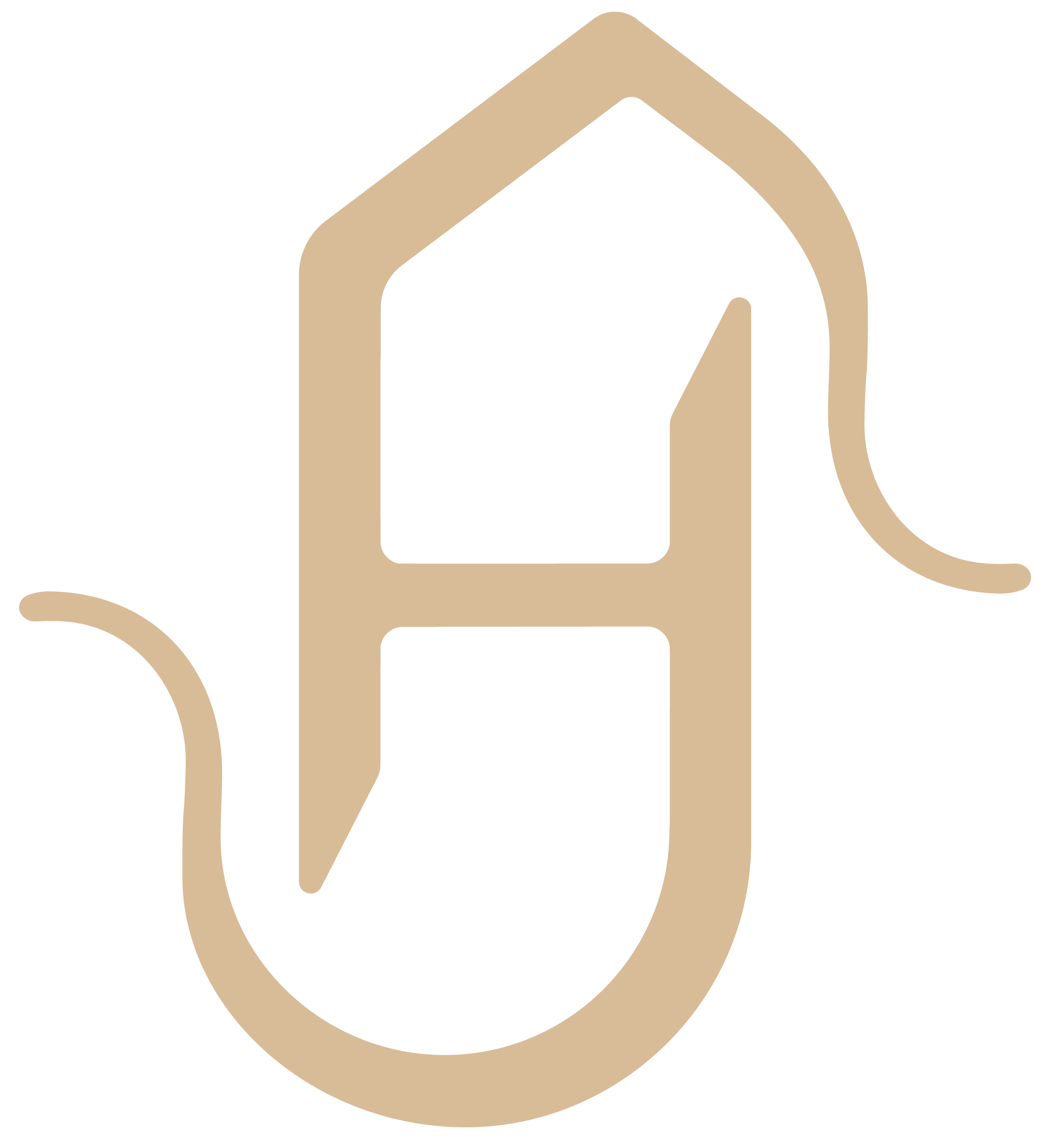
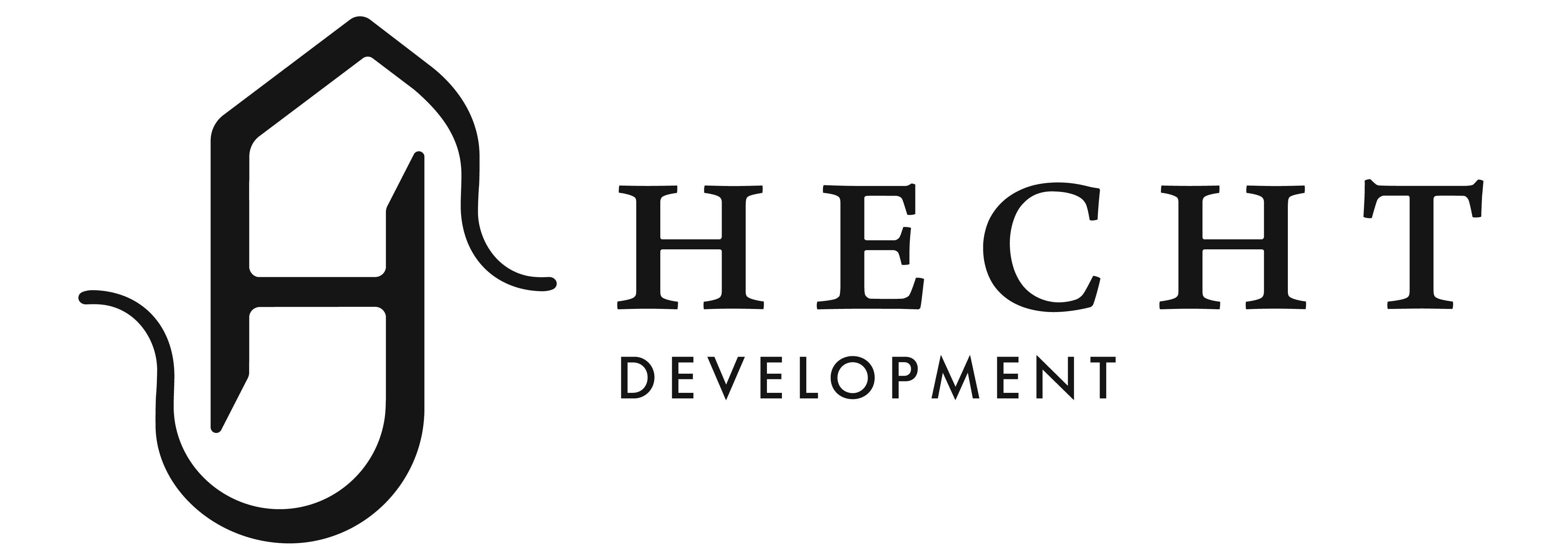
For example, the roof shape in your mark. If you remove it and the logo loses its connection to property development, then it’s serving a purpose. If you remove it and the logo becomes cleaner, more stable, and still works perfectly well, then maybe it was unnecessary.
The same goes for the angled cuts. Ask yourself what they are communicating. Do they represent something? Do they improve legibility? Do they create a stronger monogram? Or are they there simply because they look interesting?
Every line, shape, colour and effect should have a reason to exist. If you can’t explain why it’s there, it’s worth questioning whether it should be there at all.
On the monogram itself, I’d also ask whether a monogram is the right solution for the business. Is Hecht already a recognised name? The target market is high-end right? Monograms often work well for luxury brands because they’re associated with tailoring, jewellery, fashion houses and prestige goods.
If you do go down the monogram route, I’d explore it much further. A capital H is essentially two columns connected by a crossbar. For a property developer, those verticals could become architectural elements, pillars, buildings, gateways, or other forms connected to construction and permanence.
The important thing isn’t whether the first idea is right or wrong. It’s whether you’ve explored enough alternatives to know it’s the best idea.
HECHT is also a fish, I just found out. Is a FISH right for the business? Is a BIRD right for the other property development company listed below. Birds are nice, and marlet sounds like it could be a bird, but it probably has a connection to their family crest, so that’s a good connection.
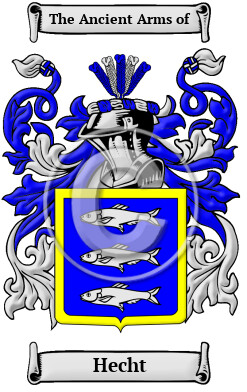
The HECHT family Crest is actually 3 fish
Not very appealing
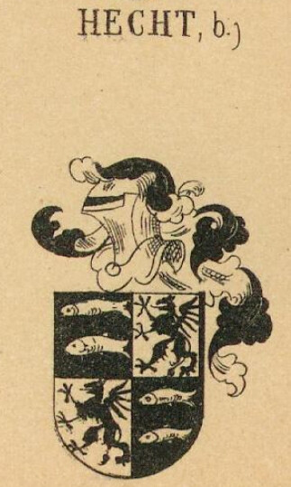
Here’s an earlier family crest - this one - you can probably indicate some sort of higher level of property with Royalty - Dragons as a motif would be strong and distinctive.
another version here
We’ve got elkstone - terrible logo - nice but terrible
https://www.elkstonepartners.com/real-estate-investment
Cairn - sylised A in shape of roof
https://www.cairnhomes.com
Marlet - some sort of stylised bird but can’t find a marlet bird, there is a mythical Martlet… seems to be Marlet or Martlet and it’s on coat of arms as a mythical creature
https://marlet.ie/
McGrath - some buildings in a honeycomb shape
Ballymore - just a wordmark
All of this is just with about 15 minutes research. Typically I’d spend minimum 4 hours researching and gathering info on what’s good or bad and honing into ideas.
In about 15 minutes I’ve got probably 3 good ideas.
Can I make a column or pillars that you see on fancy mansions out of the H
Can I use a fish - perhaps hidden subtly within the logo, not noticeable at first glance but can it be done tastefully (probably not)
MAYBE this is your rational for the tail - or the hook like thing.
I’ve got a stylised dragon and an arrowhead weapon.
Arrowhead is interesting but more suited to maybe archaeologically or something.
I wouldn’t spend less than half a day researching and gathering imagery and what competitors do and what their logo solution is.
Then I’d concentrate on the name of the company.
What typefaces look good what looks bad. Thin, thick, script, serif, sans serif, what one suits the company, their ethos, do they want modern, old fashioned, cheap looking, high end.
This case it’s high end, we know that.
Luxury logos are a dime a dozen
Luxury Property logos are not
Terrible
Not bad
It’s nice - gives the impression of a castle though - it’s not a location in Ireland…
Montane - not a fan of this one either - looks like a button on a website from the early 2000s
How do you know you’ve got something good - it’s better than the crap that’s out there.
it’s researched
It’s polished
It’s functional
Every stroke and angle is intentional and backed up with an explanation.
@CraigB is right - you need sketches - sketch sketch sketch.
Research - sketch
And keep going keep iterating until you hit the nail on the head.
Speed comes later. Concentrate on accuracy.
Something I used to teach my martial art students, concentrate on accuracy, practice in slow intentional moves, don’t rush it, when you reach a stage that it has become muscle memory then add speed, then each strike on the opponent becomes intentional, delibrate, hits the target as intended, causes maximum damage, and not only that you learn to move quickly to the next strike.
I always taught in a way that was similar to learning to read and write. First you learn to associate images with words, A is for Apple. Then you learn to form the letter A.
One can’t go straight from A is for Apple to writing a Stephen King style novel. It takes practice, intent and patience.
Speed comes later. Concentrate on forming letters, then words, then sentences, then paragraphs then essays - design is no different.