We don’t see Quark or Corel files any more either.
Up until about 5 years ago, several sign warehouse supply companies were offering “startup bundles” that included Corel, but not so much any more (I just did a quick check and didn’t see any at all.)
Corel was difficult, made horrible PDFs with the way it handled transparency. I wonder what ever happened to Broacher. He was a Corel god.
As for Quark, they shot themselves in the foot in the large format field by not enlarging their artboard from 48" and their max 400% output scale until it was far FAR too late. The minute InDesign came out, most of my clients jumped ship and never went back to Quark. I don’t currently have Quark loaded on my newest work desktop. They were always rude. And the techs were offshored and always followed a playbook. If I had to call, you can bet it was something that wasn’t going to be in their playbook and certainly not a standard press. There were all kinds of workarounds we had just to get stuff to rip at larger output scales.
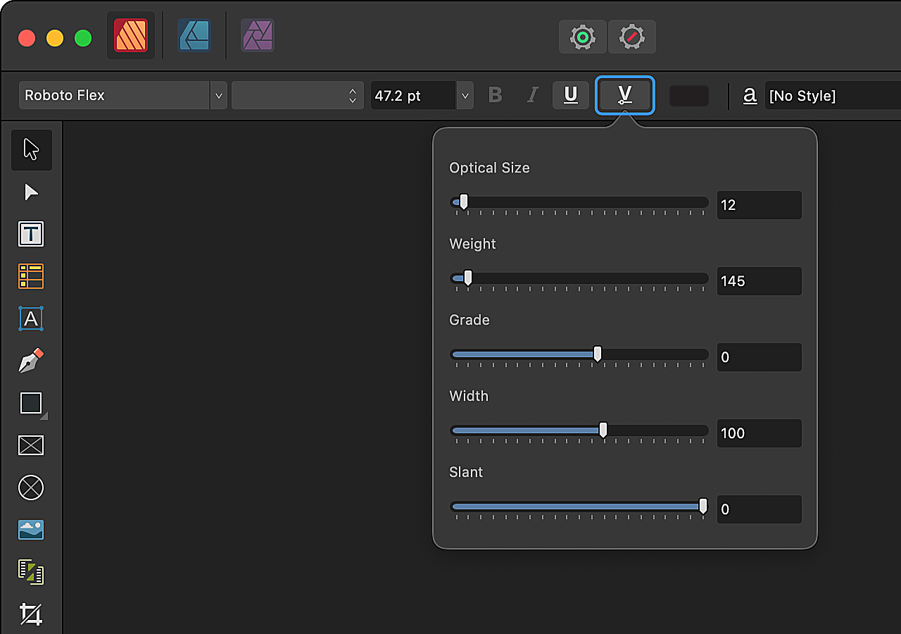
That’s the best news I’ve heard all day. The Affinity apps’ non-support of variable fonts was a deal-killer for me. I think I’ll wait a few days to see how others review it, but I’ll probably go ahead and upgrade my version 1 copies to 2.5 now.
They must have been working on this for some time. I can’t imagine Canva pulled it off so rapidly.
We’ve all seen headlines that have been manually stretched, squished, and bolded to fit. Professional designers know enough not to distort type that way. Instead, they’ll make do with whatever widths and weights come with the font—either that or they will substitute another typeface.
Depending on the axes built into a variable font, stretching, condensing, bolding, lightening, etc., is easily doable while preserving the proportional integrity of the typeface design in ways that are predetermined by the font’s designer.
For example, if a poster design calls for headline weight that’s somewhere between bold and medium and also needs to be a bit wider to fill the horizontal space, a variable font makes that easily doable without compromising the integrity of the typeface design.
Variable fonts are probably unnecessary for those who are satisfied with the fixed widths, weights, and other attributes that come with static font families. However, variable fonts are extremely useful for those who like to tweak things and fine-tune the details.