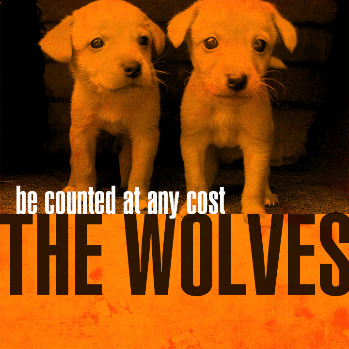
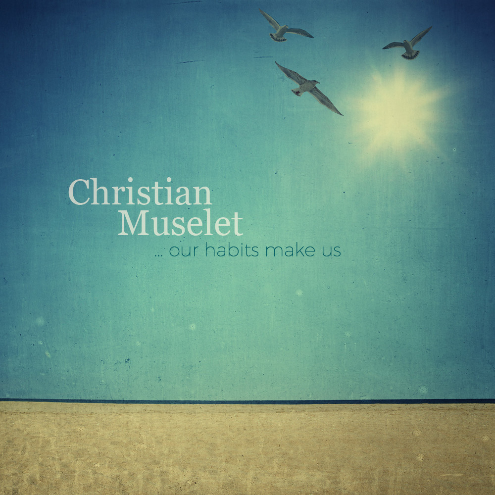
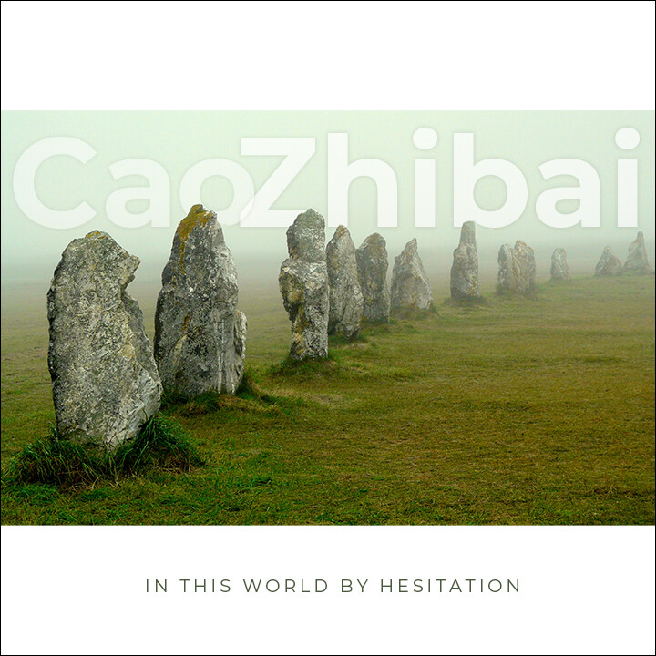
Nice. A great photo to work with as well.
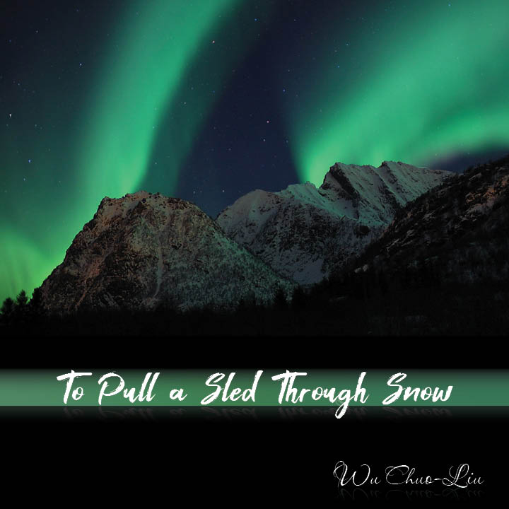
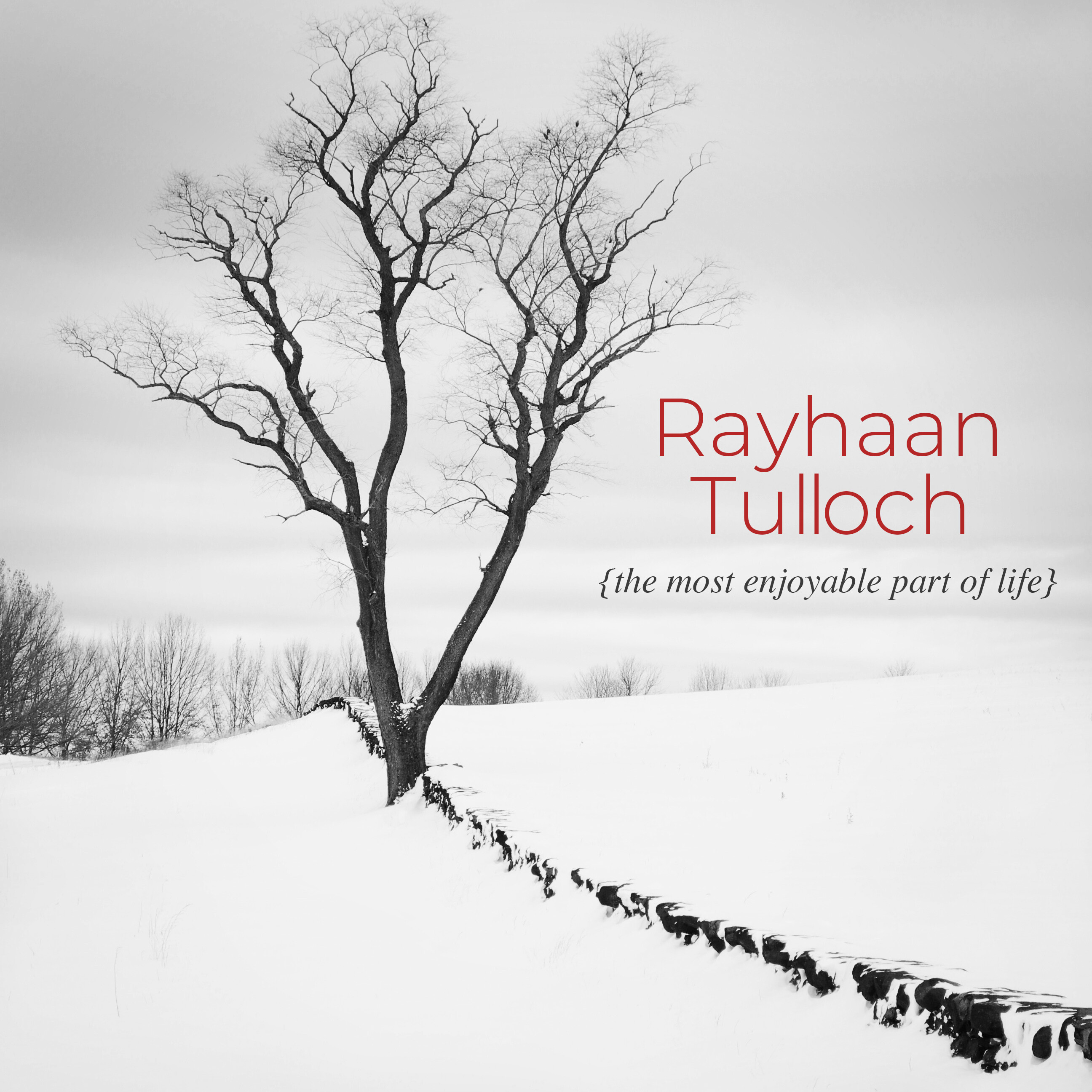
This is a fun little practice, here’s a second one. I fudged just a little bit in that I used the last six words of the quote I got just cause I thought it worked nicer.
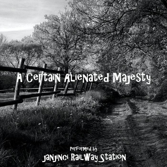
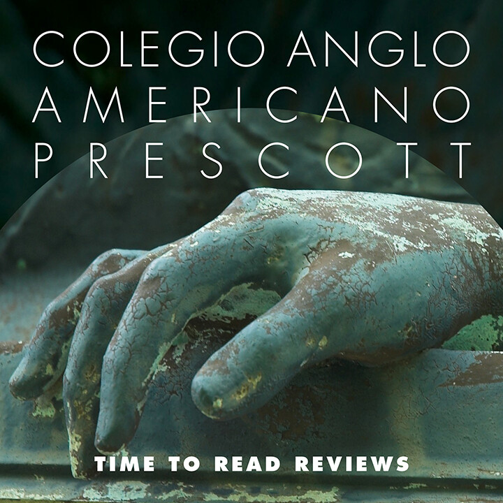
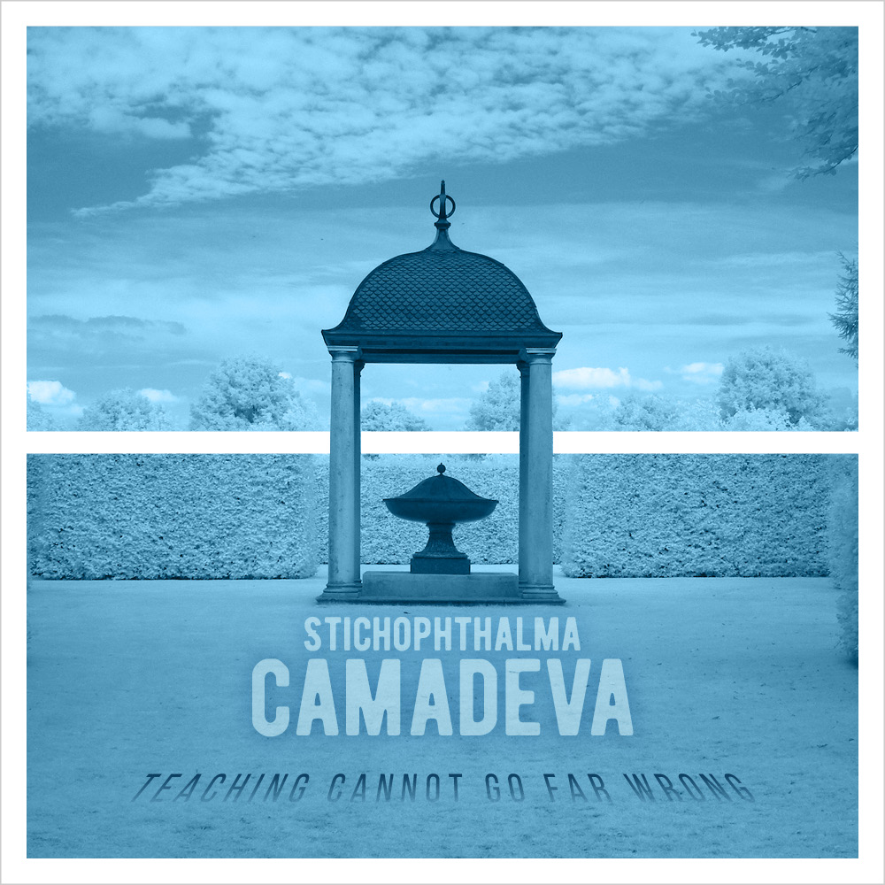
Well, I don’t know if this is a case of great minds thinking alike, but this one I was putzing around with is very similar to @CragB’s latest. I swear I didn’t copy. Thought about not even posting it. But it’s done, so here it is.
I like it. I don’t see much similarity other than stacking the name and title. It looks good!
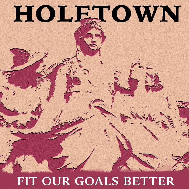
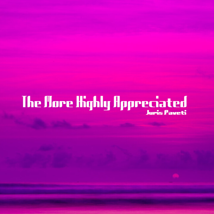
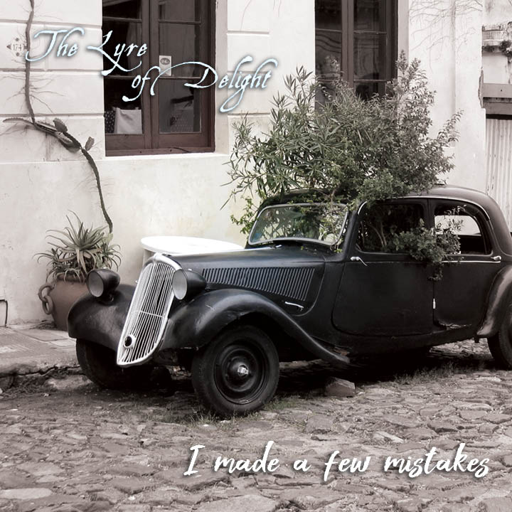
Great photo! I think it would have worked with any band name and title.
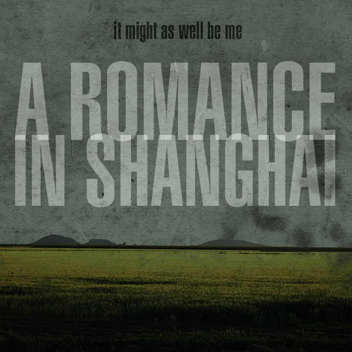
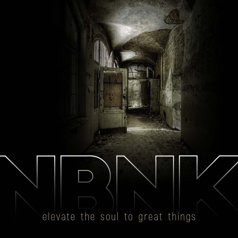
Thanks. I actually was worried about the photo, not having much color. I added all of the “shadows”. Here’s the original photo which, IMO, was way too flat.
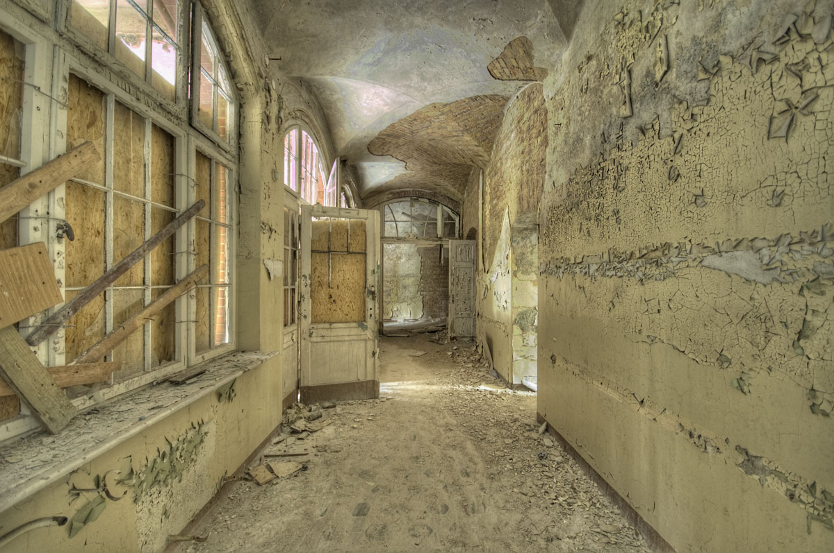
Your dark and moody edit makes the photo way more interesting.
Thanks. Yup, I was trying to play up the “creepiness” of it. Ha.
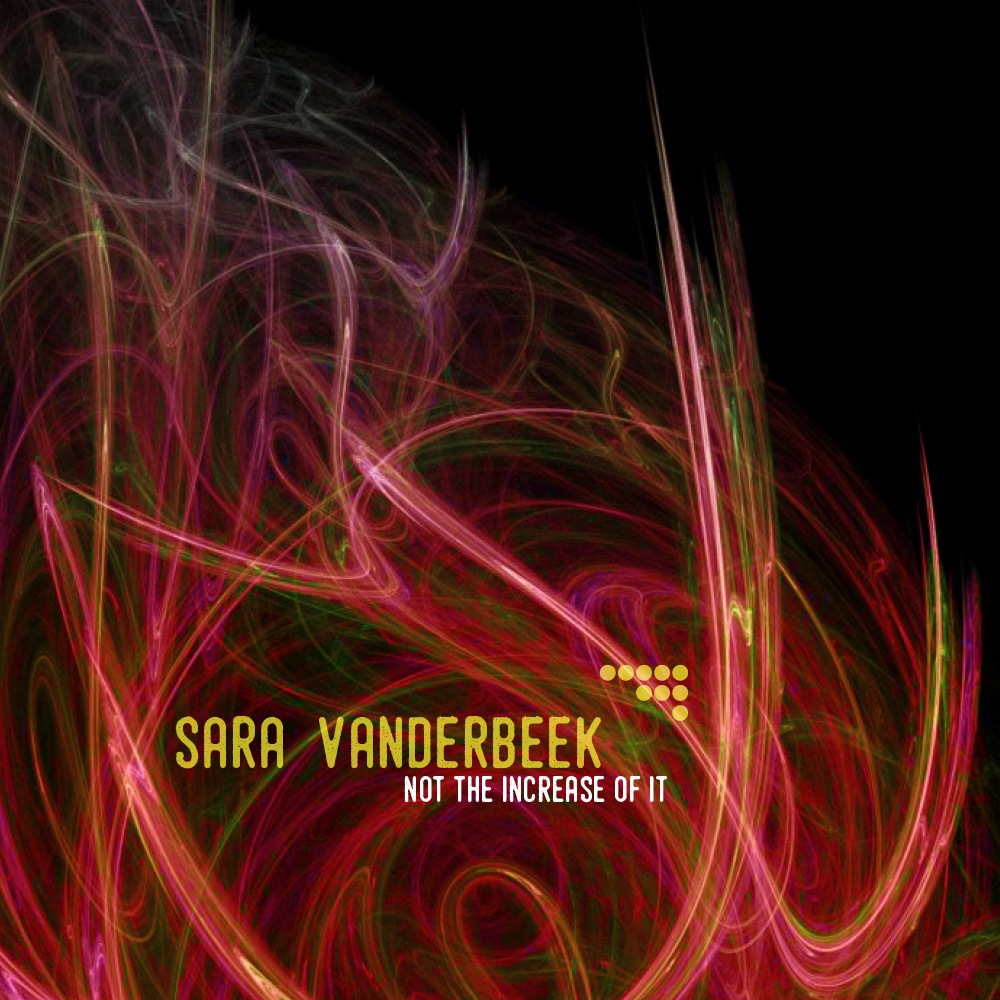
I needed a little “decompression”, so I opted to do this “fake album” design before a (thankfully) 3 day weekend.