Hi everyone. I’m trying to make a logo for a non-profit I’m starting. Would it be okay to show what I have so far and get some help on this forum?
I will allow it. Let’s see what ya got.
You can ask for opinions and recommendations, but the forum rules prohibit asking others to do free work.
The forum rules have two entries that relate to this subject.
-
Do not request free work. Graphic design is how we earn a living.
-
Do not take work posted for critique and redo it. If your critique is difficult to explain in words, a supporting sketch or example to clarify your words is acceptable.
If what you’re asking want fits within these rules, feel free to post whatever you have.
1 Like
Even for non-profits?
Right, not asking for free work. Just help with design direction and maybe some advice on what types of effects to try. I have my brand themes and I have logo layout, but I’m not a designer and I think a little design intuition would allow me to get past the finish line.
1 Like
My brand theme / concept is the waters of the Caribbean, so ideas of how to incorporate that better would be really helpful. Metallic aesthetics would be relevant too, since metals are highly relevant to the clean energy technology that my org would be educating people about.
The text you see around the outside is the actual vector path, this is a screenshot not an exported render.
Also, I am using gimp, please don’t crucify me. I’m content with gimp, I think the results will be good enough. I can always revamp the design later when my project is more established and has financial backing.

As few as possible. Focus on conveying meaning with the use of words, shapes, and color.
Rather, that seems to be the specific geographical location that you focus on in regard to the effects of climate change. The brand promise appears to be that you have an answer to climate change, simply.
Why are metals highly relevant, if I may ask?
1 Like
I’m focusing on educating people on technology that will be the answer to climate change, and providing initiatives for activists on how we can accelerate the development of that technology. So education on that tech is important. And that tech involves various metals and forms of water.
Actually, the idea of the Caribbean is more about the concept of the water being crystal clear and the concepts it immediately conveys. And there’s a lot of alignment with other aspects, both that we’re aiming to solve climate change, hence preserve the environment, as well as the technology we’re talking about being very reliant on water, and the technology being non-polluting, hence preserving clean water in our environment.
OH, and also, the way the blue and green shades blend together in the Caribbean looks really nice, and normally I hate the way blue looks with green. But with these shades and gradients, I think it looks really nice, so it’s a nice way to get both blue and green into my brand color theme.
If you are set on doing this and not hiring a designer …
- Ditch the thin lines
- Ditch the gradient
- Keep it simple and easy to read. As it is, the color combos make it hard to read (especially on old eyes)
![]()
2 Likes
I’m hesitant to write such a negative critique, but I’m doing so in an attempt to steer you away from the problems this logo will cause you.
I’m not a big fan of these kinds of seals. Government agencies use them all the time, but to me, they look like something from decades ago. Looking up-to-date is especially relevant when the seal relates to the future, as yours does.
There’s insufficient contrast — Blue background, blue logo, blue type. This lack of contrast creates legibility problems — especially when viewed from a distance or printed in shades of gray (which would all be similar in value). Background colors are rarely considered part of a logo since a logo needs to be flexible enough to print on any background.
This logo won’t reduce well to smaller sizes. Shrink it down to the size of a postage stamp or smaller, as on the barrel of a promotional pen, and all those thin lines will turn into blurs or disappear altogether.
Gradients don’t work in logos. Well, they sometimes work in the blinged-out versions used for particular purposes. As a general rule, though, they’ll cause problems. Gradients place severe restrictions on the logo’s usefulness. Logos need to work in all kinds of challenging environments, sizes, and reproduction methods. The same is true for the little drop shadows you’ve used.
As for GIMP, you said not to mention it, but a logo must be able to scale up or down. A fixed-resolution logo prepared in GIMP can’t scale upward without getting blurry.
Nothing about the logo’s personality suggests the Caribbean, islands, climate, or the environment. Maybe you thought the greenish-blue colors did this, but to me, it comes across as a painted symbol submerged beneath the water on the bottom of a swimming pool. For the purpose you suggested, the logo needs to be inspiring, simple, optimistic, attractive, and have the seductive appeal of an ocean breeze on a pleasant day. Your logo doesn’t have any of this. It could just as easily be for a concrete company or a wastewater treatment plant.
Honestly, this is a complete do-over. Conceptually, it lacks substance. Aesthetically, it doesn’t work. And from a practical standpoint, it has major problems. I’m very sorry.
2 Likes
That’s okay, I appreciate your honesty. Any advice on where to start or what style of logos I should explore? Appreciate the help.
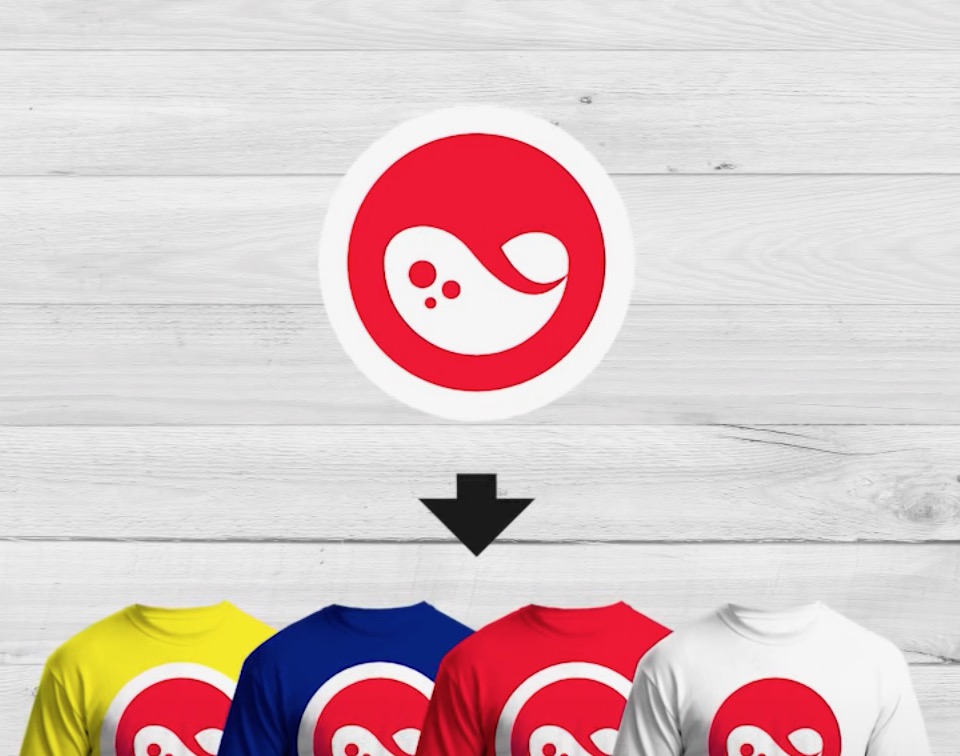
I was thinking that something similar to this would be smart.
But I’m not sure how to convey “the seductive appeal of an ocean breeze on a pleasant day”, and actually, “a painted symbol submerged beneath the water on the bottom of a swimming pool” I think would be just fine.
Re: Gimp, I’m also comfortable with Inkscape and if you think I can’t simply start from very high res, I can start off in Inkscape for my next attempt.
I’m not going to beat you up anymore as I trust it’s clear that you should not move forward with this logo.
Perhaps you can find a designer — or design student — that would be willing to work with you on a pro bono basis since this is a non-profit.
There’s no reason that you should be aware of this but effective branding is a rather specific activity with particular procedures and goals. A lot of work comes before even thinking about a logo design. An ad agency or designer could help you with this.
How do I find a designer to work pro-bono? Obviously there is Google, and I did find a few places where I can submit a request. Any specific orgs you could recommend though?
I can’t give you specific suggestions since I don’t know enough about this endeavor, its target audience, the personality of the company, the technology you mentioned, etc.
As @Praxis wrote, a large part of a successful branding project is the preliminary research to determine how best to solve the problem.
If you have no budget for a designer and must, from a practical standpoint, do this yourself, I’ll suggest doing a few Google image searches for environmental logos or ocean-related logos.
As you will see, the best ones will almost always be simple, fresh, clean, attractive, a bit abstract, and visually compelling.
However, as important as aesthetics might be, the personality of the branding must also re-enforce the desired and realistic traits of the company — those that create positive emotional responses. A blurry, submerged, drowned, bottom-of-the-swimming pool look is almost certainly not appropriate.
Not sure how non-profits work where you are, but here (UK), there are usually grants available to help fund these kinds of things for non-profits and charitable organisations.
I’d suggest it may be a better use of your time to investigate funding and find someone who understands how to brand and market what you are doing.
The DIY approach, if you are not particularly skilled in this area, won’t likely end well for you. It is not about just having a logo in the corner, it is about targeting and communicating with your intended audience in a way they’ll understand and in a tone of voice they’ll respond well to.
Sorry if this sounds a bit dismissive, but in the name of brutal honesty over feint praise, I think it is far better you don’t waste your time on something that is unlikely to do what you need it to do and find a way to fund someone who can do it.
Good luck.
This topic was automatically closed 365 days after the last reply. New replies are no longer allowed.