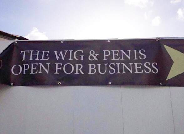
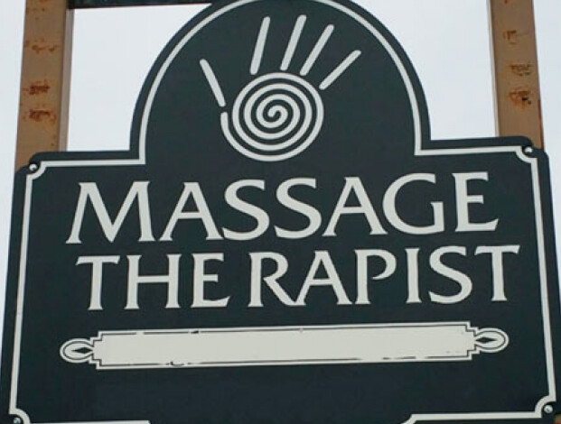
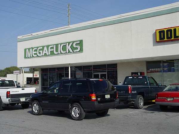
Post any examples of the bad and the ugly when it comes to kerning.
Will start us off with these beauties:
Post any examples of the bad and the ugly when it comes to kerning.
Will start us off with these beauties:
Hmph. And here I thought I invented wearing a wig on it.
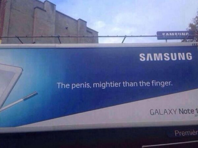
Eh gads, how did that get printed?
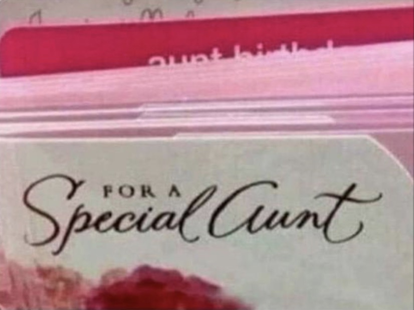
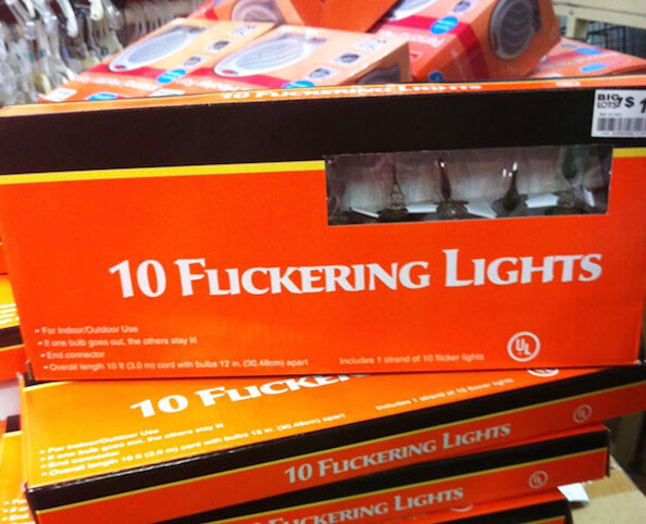
IDK lol but if I see them on sale imma getting a bunch of them. For my Special Aunt natch.
ME TOO!!!
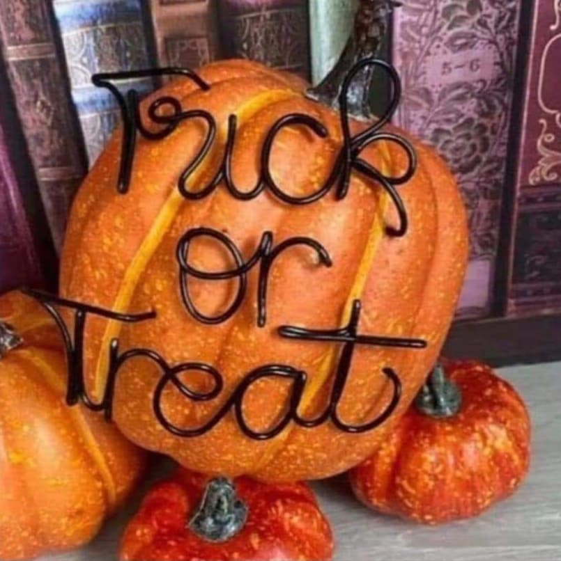
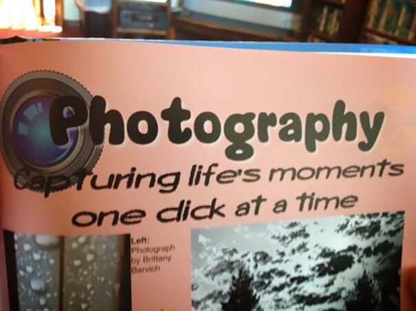
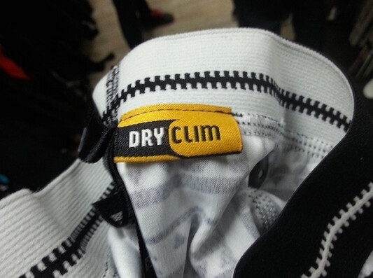
I think this one is intentional 
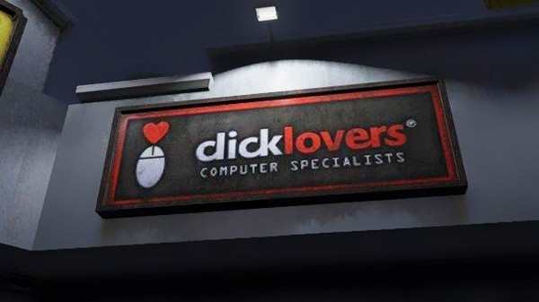
That mouse is questionable at best 
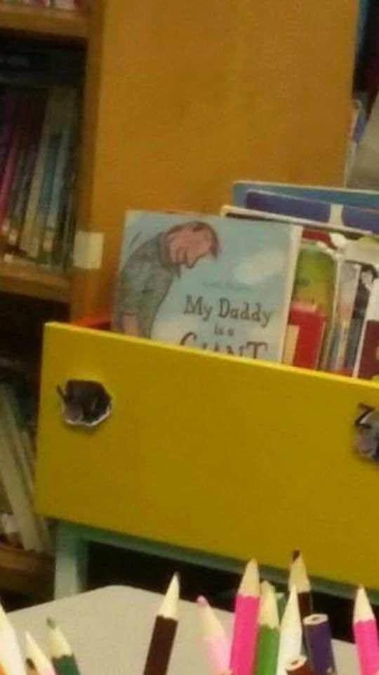
Not a kerning issue, so much as unfortunate positioning, but this was in our local library, in the kiddies’ section…
Ha. That’s awesome.
Added the NSFW tag to this since some of our images have taken a bit of a turn
Sorry, looks like I have scraped the bottom of the barrel – we all have to be good at something!!
These are pretty funny. It shows you the importance of showing your work to others before going to print or production.
Did you know…
Haha still funny even if it’s photoshopped.
Not that kind of funny but related. I downloaded an unfamiliar font today so I could give my client a very specific look with her name in all caps. I looked to another window for something and then back at the name and was horrified at the kerning. It was only a three letter name but oh my the first letter was like a whole finger away from the other two. That’s what I get for free downloads, more work. 
Tough choice some days.