Yep.
That’s what it is.
Hex colours on a printed label, good luck with that…
Took the words right out of my mouth, LOL
What’s the unwrapped label look like (ie the back where all the junk has to go like UPC code and Nutrition label
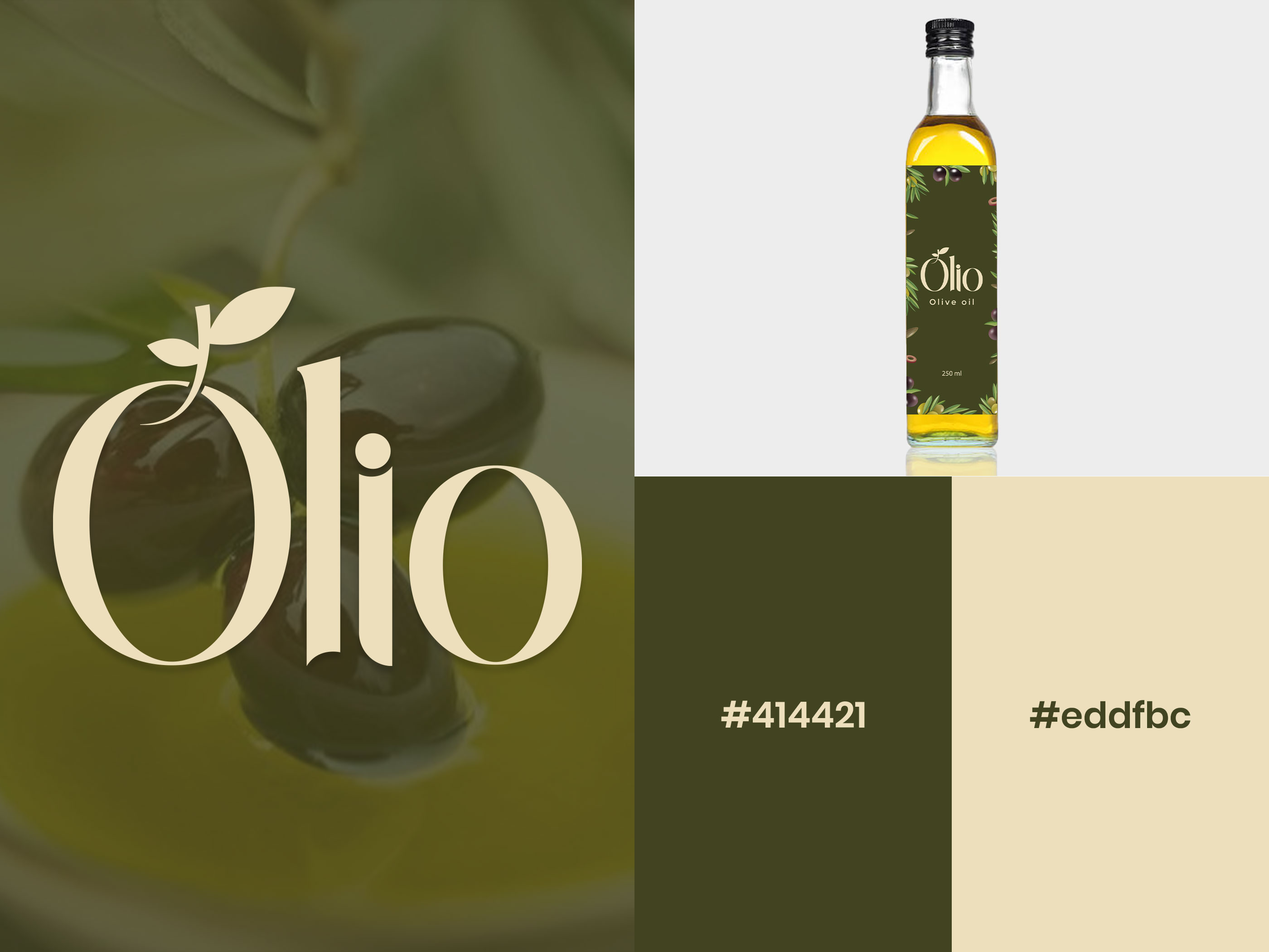
It’s a nice-looking front of the bottle, and I like the logotype, but I’m really wondering how you’ll continue the look to the sides of the bottle. Packaging is three-dimensional, but what you’ve shown us reduces everything down to two dimensions.
And what’s the deal with the hex codes? Aside from hex being inappropriate for print, what possible reason do you have for including their mention on the comp?
However, I don’t want to focus too much on the negative; I really do like the colors and the general look of the label and how it works with the bottle and the color of the oil. I especially like, the logotype, but I’d probably raise the dot on the i a bit to separate it more from the rest of the letter.
I seem to recall a logo comprising of a fruit with leafy stalk, and even it was far from being a first one.
Hex colors are not for printing, I saw a presentation on Instagram. That moment I created it actually… If it’s looking wrong, I won’t do that next time,
Hex colours are web only. They don’t translate to print.
People doing that are only showing their own ignorance and then others follow.
As demonstrated here. Which leads me to another question, is this for a real client or a practice brief???
If you’re designing a spec book for the brand that covers everything from print to online to whatever else is needed, yes, specifying hex colors in the book is appropriate, as are RGB, CMYK, Pantone, or even LAB.
However, you weren’t showing us a spec book. You wanted feedback on your olive oil bottle design and logotype. From that perspective, providing hex colors is completely irrelevant. It’s a bit like designing a magazine ad for a new car and prominently placing into the ad the volume of hydraulic brake fluid the automobile requires. That technical detail is necessary for the service manual but is completely irrelevant to the magazine ad.
Don’t take what you see on Instagram as being the best way to do things. It might seem cool, but if it makes no logical sense, don’t do it. For what it’s worth, I’ve seen other people do this very thing too. It’s like some weird fad that makes no sense.
It actually makes perfect sense. But for all the wrong reasons…
I understand @Just-B , Thanks for your valuable feedback on this. Next time I won’t do that for sure…
Project was a real client but I uploaded it because it was the first attempt. I just change brief from real project to this… Will upload real project soon.
Exactly…
Hello Prince,
Its such amazing information and an idea to design the olive oil logo and label. It is very informative for me and my working ideas. Thank you
You’re most welcome. Glad you found it helpful.