A condensed sans-serif would be a good option. Myriad Pro Condensed is generic, friendly, and quite legible in small sizes.
Really though, at best, all you can do is make it slightly less bad than it otherwise would be.
A condensed sans-serif would be a good option. Myriad Pro Condensed is generic, friendly, and quite legible in small sizes.
Really though, at best, all you can do is make it slightly less bad than it otherwise would be.
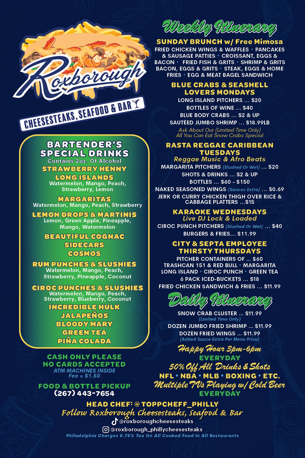
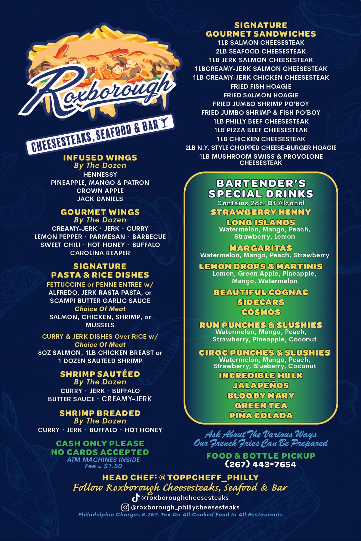
I used all of the same typefaces as the previous menu banner. The folks I work for had the master files for the banner and the client wanted me to stick to that, Cerebri Sans, Brush ATF & Omnes. Where I did consider something different, I decided just to get it over with the way the client wanted and thus move on. The only solution really just being, as said in the tread grit your teeth, do it, get paid, and move on. I don’t really care for it, but it is what it is.
This topic was automatically closed 365 days after the last reply. New replies are no longer allowed.