Why is this so complicated, why hasn’t someone found a way to accurately and easily convert from RGB to CMYK, someone needs to get AI involved! I’m close to paying someone on ** contest site removed ** to do it, if I knew what to ask even!!
I’ve never run into the problem you’re having because I know the pitfalls to avoid. I also suspect you haven’t absorbed the information you’ve been given here.
There is no equivalace between RGB and CMYK. There are only approximations because they’re fundamentally different color spaces. The closest possible approximations in CMYK for some RGB colors vary consideably because mixtures of cyan, magenta, yellow, and black can’t produce them – physics doesn’t allow it.
Some digital printers use CMYK inks plus additional ink colors. This enables them to approximate RGB better, but those approximations will never be perfect equivalents. Making this more difficult is the fact that digital printers differ from each other.
If you have an RGB color that looks bad in Adobe’s conversions, about all you can do is shop around for digital printers with the necessary equipment to create printed approximation more to your liking, and then send them the RGB file.
3 Likes
You can convert RGB to CMYK, but the results vary depending on the output process and devices used.
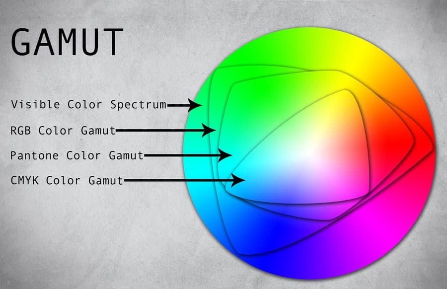
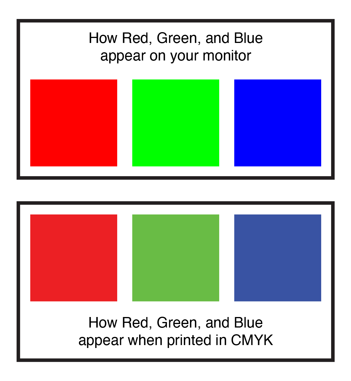
RGB (Red, Green, Blue) is an additive colour model for digital screens, where colours are created by combining light. Adding more light brings you closer to white. CMYK (Cyan, Magenta, Yellow, Black) is a subtractive colour model used in printing, where colours are created by combining inks. Adding more ink brings you closer to black. Black (K) is included because CMY inks have impurities and can’t produce a true black on their own.
RGB produces a wider range of colours (known as gamut), including vibrant and neon hues that can’t be replicated in print. CMYK, however, has a more limited range, especially in bright greens, blues, and oranges. For precise colour matching in print, you need specialist colours like Pantone, TOYO, or similar systems.
Converting from RGB to CMYK is challenging due to the fundamental differences between light and ink. Some RGB colours don’t have direct CMYK equivalents, as they just don’t exist in the CMYK spectrum. To get the best results, manual adjustments are often necessary to tweak the CMYK values for the desired output. This is where the Pantone Matching System can be very useful, as it helps ensure accurate colour matching between screen and print.
There’s also the issue of print variability. Home printers and professional presses have different capabilities, so the CMYK colours you see on your screen or printed at home won’t perfectly match those produced by a professional printer. This discrepancy arises because RGB and CMYK are fundamentally different systems—RGB uses light, while CMYK uses ink. The CMYK values on your screen don’t have a true output intent, meaning they can’t precisely predict how the colours will appear when printed. Your home printer makes an approximation, which may not align with the output of a professional printing press.
Printing introduces additional variability due to different printing presses and materials (called substrates—like paper types, finishes, metal, fabric, cardboard, etc.). Even the colour of the paper can affect your choices. For example, newspapers often use paper that contains lignin, a substance from wood pulp that binds cellulose fibres. Lignin is prone to oxidation, which, when exposed to light, air, and moisture, turns the paper yellow. This happens because UV light from the sun or artificial sources, combined with oxygen in the air, triggers chemical reactions that produce chromophores—molecules that absorb certain wavelengths of light and reflect others, creating a yellowish-brown colour. Paper type, humidity, temperature, pollutants, and impurities in the ink all contribute to the degradation of paper colour.
If your logo is yellow and printed on such paper, it will turn more yellow-brown over time because printing inks are not opaque.
To mitigate these issues, soft proofing is essential. This software simulates how RGB colours will look in CMYK, though it’s not perfect due to the complexities mentioned. Hard proofing involves printing test samples and making adjustments based on the output intent (whether digital, lithographic, flexographic, screen printing, embroidery, gravure, etc.).
Tips
Start your design in CMYK if the end goal is printing to avoid major adjustments later. Use professional design tools that offer better control over colour conversions. Communicate closely with printers to understand their specific requirements and limitations.
Converting RGB to CMYK is challenging because they are two separate colour models (light vs ink), and neither can fully replicate the other. This often results in colour shifts and dullness.
Advice
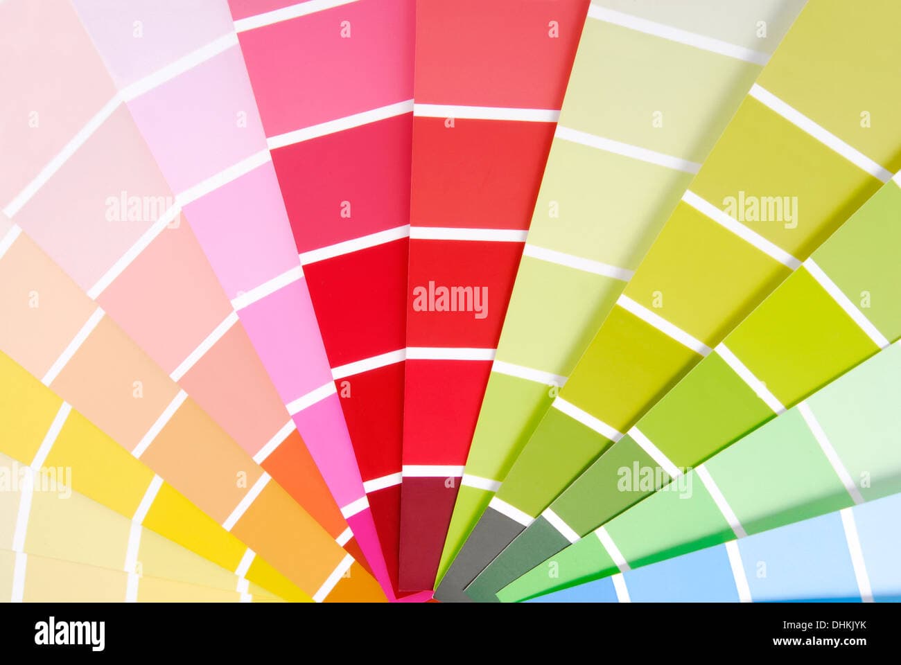
Get a printed Pantone Book - which will show you the Spot Colour, and also the RGB and CMYK conversions in printed paper.
This way you can convey to your printer that you have used Pantone 148c or whatever, and to match that in CMYK.
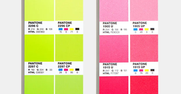
They can then make adjustments on their end to match. You can see how 2297C and it’s CMYK equivalent are different - but printers could adjust to a better match.
They will (or should) use the conversion in the book - but it may not look exactly the same - so they could adjust the colour to a better match, perhaps using a different Pantone CMYK swatch breakdown that more closely matches your description
It’s quite common that the CMYK equivalent of the Pantone will be off - so even that conversion has flaws due to gamuts.
So I often pick a Pantone colour - and for the CMYK values, I would match from the book a CMYK version that is closer in match and use those values.
I am 100% guaranteed that the CMYK values I have used are correctly close in relation to the printed pantone colour.
Understanding and effectively managing RGB to CMYK conversion involves recognising the inherent differences in colour models and utilising ICC profiles to bridge these differences. ICC profiles facilitate accurate colour reproduction by ensuring that RGB images are converted to CMYK with minimal loss of detail and fidelity, resulting in predictable and high-quality print outputs. This process is essential for meeting colour expectations in professional printing environments and ensuring that designs appear as intended across various media types and viewing conditions.
3 Likes
That’s about as comprehensive answer as you’ll get. Nice one. You’ve done this colour printing lark before, haven’t you?!!!
The OP definitely has enough information now to, either answer have their question answered, or realise that they have to go away and learn colour theory from scratch.
It’s stuff like this that leaves me more than a little despondent about the current state of the industry. I cannot believe the amount of self-titled ‘designers’ out there who don’t understand any of this (and other essential theories) and yet are out there offering ‘professional’ services.
This is not meant to be a particular slur on the OP. They are legion. Ignorance is breeding ignorance. It’s time for a professional standards qualification before anyone can practice – be it a degree or vocational. I know it will never happen, but it should. Almost every other professional service demands it.
This post’s question should just be part of the basic knowledge needed to be able to function as a designer. It is fine to not know this stuff. We all started out, but the questions should be asked before anyone is out there offering services for money. It just increases ignorance in the industry, which, in turn, lowers expectations. There are just too many amateurs out there now thinking that they are pro because they know how to use Canva. Makes me want to jack the whole lot in sometimes and I never thought I’d ever be saying that. I wanted to be a designer (or a rock star) for as long as I can remember. It was never a choice of career for me.
In reality, I have pretty much dropped a large swathe of my previous clients and do not take on new work from smaller clients. Expectation has been driven through the floor. These days I have just kept to larger book publishers and the occasional other client who actually understands the value of having a designer as part of the process.
I remember when I first started working, the issue with colour was getting CMYK values consistent across various substrates and converting Pantone to its most appropriate CMYK equivalent for brand guidelines. You simply wouldn’t have ever heard a question like ‘Why doesn’t my print look like my screen?’
Even creating a brand now has come to mean the prettification of someone’s Instagram account! I just can’t be bothered with the bull any more.
The Dunning-Kruger effect lives large.
Apologies. Rant over.
3 Likes
I hear ya - and we all started somewhere.
I don’t ever have a memory of ever wondering why CMYK vs RGB was an issue.
I guess when I started we always used CMYK or Pantone - using RGB just wasn’t an option.
But I come from a print background, and understood RGB for web/screen, CMYK for print. It wasn’t a difficult concept. So we always used CMYK or Pantone.
If the OP is interested in the fundamentals of design LinkedIn offer a free month - plus paid courses.
And many other courses for print design.
3 Likes
There is no conversion possible because they are different things. Some colours can get close, but how close and how many colours can get close depends on how accurate you need to be. A lot of RBG colours simply cannot even get close with CMYK inks. That’s just how it is.
If you pay someone who says they can do this, you are being taken.
Am I reading right that you want to convert colors in .png logos?
That seems to have been lost in all of the above.
If your logos are vector, it’s very very easy to change your RGB to CMYK. Just “select same” and change it.
But all the other stuff written here still applies. Your CMYK conversions, there is no guarantee how they will print and they will print differently depending on the machine doing the printing. [If I turn off profiling] Every one of the machines I use would print out a different color for any given CMYK formula. And any one machine would print different colors depending on the media it is printing on. That might not be true on a conventional press to some extent, but coated vs uncoated paper can give you a severe color shift.
If you want to print CMYK on a specific digital machine, get a shotgun test and select from multiple options of your color printed one or two or 4 steps apart.
Then hope the weather doesn’t change. (not kidding.)
1 Like
I’ve seen two litho machines side by side print same plates and have difference colour printed.
Two machines, speed masters.
Guys, I’m not sure this was posted by a designer at all. Seems to me it’s the client trying to do this themselves. It would certainly explain the confusion.
It’s still their logo. If the designer accepted peanuts…[shrug]
But it do explain a lot.
Maybe paying a little more and getting a proper logo? All the time and effort spent trying to fix the unfixable, seems like a small price to pay. Even the printer should have offered to fix it.
I would have.
Offered.
With a pricetag attached.
![]()
1 Like
Hi can I ask what CMYK profile you used for this conversion?
I have absorbed the information, it’s a bit like an answer to a different question though. Previous printer gone bust, printed my work exactly as I wanted it, now I can’t recreate that result with with a new printer, what would you do to solve this issue? And before you say it, I’m trying to track down the personnel from the bust printer but no luck so far…
I don’t remember, but it was likely Photoshop’s U.S. Sheetfed Coated v2 profile because I was working on a project at the time that was going to run on coated stock on a sheetfed offset press. This reminds me that you never answered my first question about what kind of printing press your projects were printed on: digital, offset, web, letterpress, etc., which would have influenced the answer I would have given you. Based on everything you mentioned, I’ll assume you’re using a digital printer.
You initially went down the wrong path and ended up with the problems associated with that path. You’re standing at a confusing spot on the path and looking around you for answers. Unfortunately, the answers don’t lie in your immediate vicinity; they lie on the other path that you didn’t take.
You probably think I’m talking in riddles, but there are no good answers to the conundrum you’ve created, as everyone has tried to explain. You’ve been given workaround advice and explanations, but there is no simple and straightforward answer to solve this problem, considering the path you chose.
Here’s where the trail branched off in the wrong direction.
If all you received when your logo was designed was an RGB PNG file, a pretend designer ripped you off. The designer should have given you the following logo files: CMYK vector, RGB vector, high-res RGB PNG, Pantone, greyscale, and black & white. In addition, depending on the logo, variations of the above versions should have been provided for printing on both dark and light backgrounds.
If you have those other files and simply ignore them, thinking the PNG is all you need, you’ve taken another step down the wrong path.
When color matching is critical in digital printing (or offset, for that matter), you should use Pantone colors, not RGB or CMYK. (and no, you can’t convert RGB to Pantone) Professional digital printing devices (not your desktop printer) can use color lookup tables provided by Pantone for the printer model in question. If, for example, one of your logo colors was Pantone 185 C, the color lookup tables would tell the printer precisely what percentages of the inks available to the printing device were needed to most accurately produce the requested Pantone color.
Of course, your standard logo colors shouldn’t be RGB colors that lie outside the CMYK gamut because you’ll eventually run into situations where only CMYK colors are available, such as a magazine or a higher-volume web or sheetfed press run with no 5th color option.
One final possible misstep you possibly made on this path is the digital printing company you chose. If you use a local print shop with good digital printing presses, they would likely try to match your colors, even if you don’t specify them as Pantone colors. However, if you select an online gang printer, they will just drop your job into the hopper and print it alongside everything else, and you’ll get what they send you.
2 Likes