Hi all, could you please let me know what you think of my wesbite: www.monixm.com - it’s a website that I designed for a small car dealer. This is my first serious project, so any feedback is welcome.
Thanks!!
Lots of clicks but no one is replying lol 
Site loads fast and all the buttons work … seems ok to me. 
Thanks 
You’ve got some odd responsive design issues going on with the nav bar and business name (?) “Juragarage Märki” at the top. It scales oddly depending on the height of the page. Also, when resizing the page, teh top nav sometimes appears behind “Juragarage Märki” at the top. The hamburger icon seems tiny and odd when resized to mobile. And I think it odd that the Renault logo disappears at he top on mobile.
There are some readability issues with white on the light blue and light yellow at the top as well. Just not a lot of contrast.
In general though, its pretty clean and easy to navigate. My biggest issue is just looking at responsiveness for mobile. Even on the car listings.
A few comments.
– The site is clean, simple, and easy to navigate.
– I like the photos of cars you’ve selected.
– It’s a one page site, I’m not sure there’s a need for a home button.
– As CraigB pointed out, there are some issues with the nav. See included screen grab. The nav is sliding under the business name.
– The options in the Nav seem a little out of order. For example, you have team before New cars.
– You have a briefly presented section that’s not in the nav. Maybe tuck this under Our team.
– The portraits look like cell phone pics. Nicer portraits would tie in better with the nice photos of cars.
Thank you Steve-O! what great feedback, I appreciate it. so nice that you pointed out the Home button - unnecessary indeed when it’s a 1 page, I totally missed this. And yes, responsiveness is something I definitely need to work on, as well as how to work with MaterializeCSS for the navbar  THANKS!!
thanks so much for your feedback. Gotta work on that responsiveness. thanks a lot!
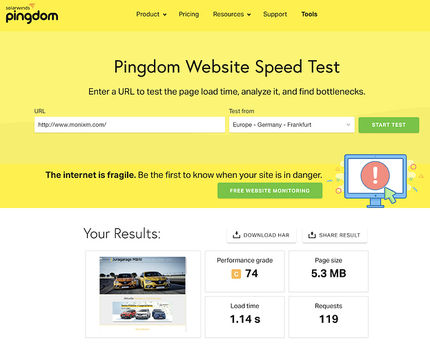
You want to aim for less than 2 or 3s for load time. Your site, tested at Pingdom on a European server, loads at a little over 1s. That’s good.
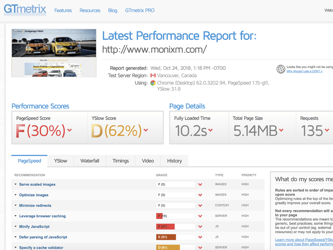
GTmetrix’s results probably aren’t very accurate since that test was done from a server in Canada, but you can see there what you can do to improve the site’s performance.
But I recommend you optimize the images at TinyPNG.com.
Good start! Reads well, nice clean design.
Maybe others will disagree but I don’t think you need a navigation menu at the top as it’s only one page.
Though it may be good for Occasionen to be on it’s own page instead of having a scroll within the scrolling page. I’m looking on a desktop if that changes anything. I imagine this part maybe quite a bit more complicated on mobile. Or instead of having a scroll, could you have a LOAD ALL button and let it just load the whole section?
The team photos would look better uniformly shot (portrait with yellow background) and cropped much closer. I feel like there’s too much background on those photos currently.
Thank you so much for the link and checking my work!
The Occasionen part is a link that I got from Autoscaut and it’s a bit hard for me to adjust it properly but it may be a good idea to have it on a separate page indeed. Thank you for the tip! 
Hope you have got the great suggestions.
I liked your website, It is quite attractive for users
If the navigation’s color and font are easier to read, I believe it will be a very nice website.
The site looks nice and it’s easy to navigate
A good way and a good site
A suggestion : remove the yellow stripes. Let the section simple, without those stripes. It will look more clean and pleasant.


