Sorry, I misunderstood your answer. 
Going from a “what bothers me the most when the fonts I’m using don’t have it” anglet, it’s gotta be character coverage. Most other features listed there are things that I can get around easily enough with character style options, but trying to fill in a character that doesn’t exist within a typeface is way more annoying. In the easiest cases, I’ve had to change the baseline on a comma or apostrophe to fake it as the other, which still requires that one character to have different settings than all it’s neighbors. More commonly, there’s a character that needs to have an accent, and I’ll have to stitch two characters together to fake that; but the worst are when the client wants a special character like an ampersand and the font just doesn’t have it, because then either I have to find a substitute font for that single character, try to personally create one to match the style, or tell the client the font they want won’t work with that character, and they need to pick either a different font or a different way to represent what they’re going for in their writing.
I will give that a font that was built with it’s own bold/italic variation is going to look a lot nicer than one I’ve dropped a stroke or shear on to fake the same style, for sure, and having to adjust the kerning and tracking is an annoying timesink, but I’d take having to work around all of that over the headache I get when someone asks for a lowercase letter in a font where all characters are uppercase…
2 Likes
I’m a regular visitor to the TypeDrawers forum too, but my posts there are somewhat infrequent. If I’m not mixing you up with someone else, I’m the one there who referred you to this forum when you asked about finding a graphic design forum.
My involvement with type design goes back to the 1980s. It’s been an after-hours thing in addition to my full-time job as a graphic designer and art director.
I’ve thought a good deal about the larger question you’ve asked over the years. By reading through the TypeDrawers posts from other type designers, one might conclude that technical considerations, extended character sets, and OpenType features are of utmost importance.
There are certainly many exceptions, but most graphic designers I’ve worked with over the years have only a passing familiarity with these things. I’ve never taken a poll, but many (most) graphic designers (especially beginners), I think, don’t even know what OpenType features, hinting, or Unicode are. If they’ve accessed the OpenType palettes in the Adobe apps, what’s there is so cryptic and inconsistent from one font to the next that most designers don’t bother to check.
Discretionary, contextual, or automatic ligatures — no clue, Automatic fractions — never knew such a thing was possible. Oldstyle, tabular, or proportional figures in one font — what’s the difference between them? Localized country-specific exceptions — huh?
I think this, um, ignorance might be more widespread in English-speaking countries where there’s less of a need to access glyphs from different alphabets. For example, a Serbian designer will check the Cyrillic to see if it has local features to accommodate the glyph design differences from standard Russian Cyrillic, but for designers in the U.S., these technicalities are irrelevant.
Similarly, most type designers don’t understand what graphic designers care most about. Type designers who started as graphic designers tend to approach typeface design from a very different perspective that caters to the concerns of graphic designers. I’ve read plenty of comments on TypeDrawers from well-respected type designers who burn through creating their kerning pairs in two or three hours, not fully realizing that out-of-the-box kerning is one thing that their type-buying customers care a great deal about.
1 Like
I have now left the TypeDrawers forum.
And what graphic designers really want from a font is what I am trying to find out.
I think my kerning was pretty good already but for subsequent font I will try to give it more attention.
The coverage of my fonts is certainly adequate for most graphic designs and includes all the characters mentioned by Kaegro.
The thing that sways me the most into buying is the previews, where you can see samples of how the font could be used in a simple design. I’m very much an impulse buyer.
Price is also a influence. If the font is too far out there and I anticipate I’ll only use it once, then I factor the pricing and if it’s really worth it.
Coverage is important, but I’ve only ever had a need for English and Spanish. Equally important to me is a decent family of different weights.
My fonts are all free so I have never really spent much time on advertising. I only ever did two promotional images and it was a lot of work so I didn’t bother much after that.
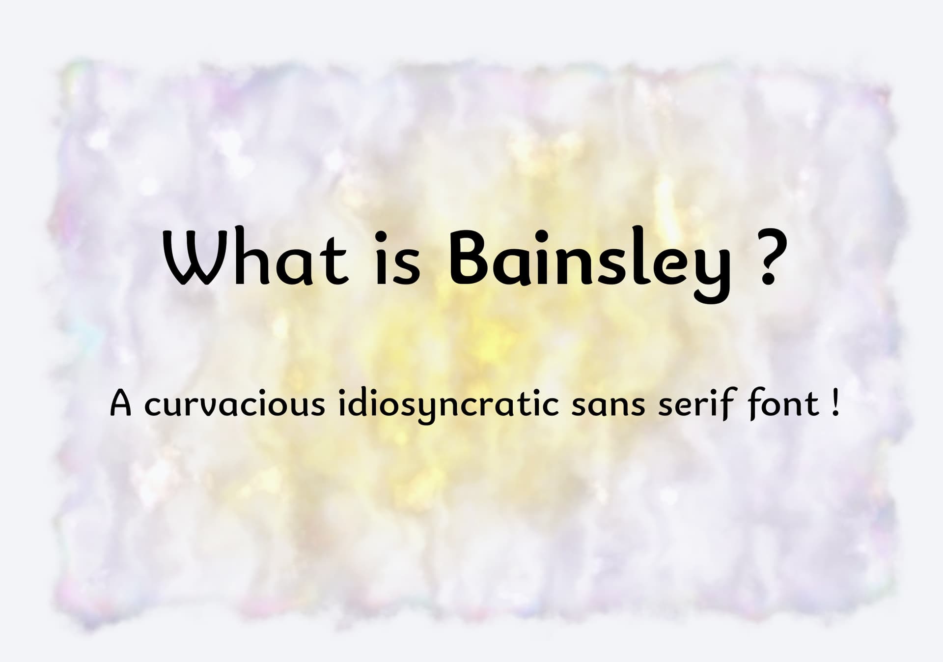
Perhaps I ought to do one for Bainsley because it is at least as good as Munson and Cadman, just different.
1 Like
IMO, too much information, not enough inspiration. I look at the previews on Letterhead Fonts, and that’s the type of presentation that always sucks me in as a buyer. I don’t have the patience to read about features, I want to see applications. My entire life is spent processing images, that’s how you would get through to me as a buyer. Don’t tell me, show me. I think most graphic designers think like that. We’re visual first, textual second.
1 Like
@PJMiller, Mojo got right to the heart of what I was obliquely getting at. When it comes to typography, most graphic designers are largely concerned with how this or that typeface will look in whatever project or layout they’re working on.
Before downloading or buying, they’ll see if it comes in a good selection of weights and, maybe, italics. They’ll notice kerning sloppiness too. If they’re from non-English-speaking countries, they’ll check whether or not the typeface contains the needed language-specific glyphs and diacritics.
Obscure glyphs from the far-off corners of Unicode are all but irrelevant since they’ll likely never be used. Variable type, math symbols, dingbats, do-dads, stylistic sets, alternate glyphs, and OpenType features don’t typically enter into the decision. Of course, there’s the rare situation where someone is looking for precisely these things, but that’s the exception.
I probably sell 95% of my fonts as one-off purchases to individuals or agencies of one weight within the larger family. Since my primary job is that of a graphic designer, I understand how these one-off purchases are made; they’re basically impulse buys made because that one weight or width in that one type family met the needs of someone’s specific project.
If I remember right, you focus on free-to-use fonts, so the dynamics might be different since money doesn’t get in the way of downloading everything instead of only one weight. Even so, I suspect the decision to download most free fonts is typically made based on how the type looks and its presentation — not its list of features or how big its character set might be.
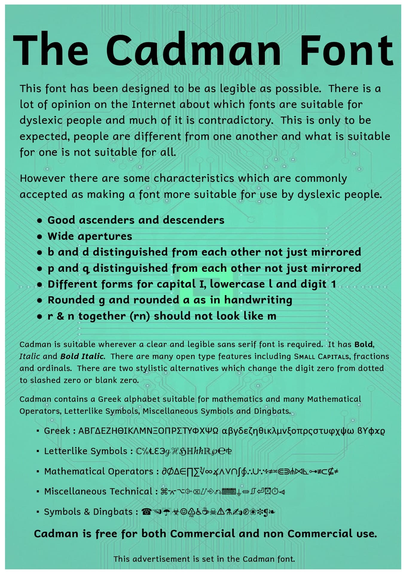
All that said, maybe your fonts fill a niche for those people looking for the very things you’ve included in your fonts that 99% of other fonts lack. Cadman, for example, contains over 2,500 glyphs — it’s gigantic and could be spot-on for some jobs because of it.
My intent with the advert panels was to show the font in several different sizes and to show the italics, small caps and a wide selection of different characters. I guess I overloaded it a bit.
I will bear this in mind and maybe prepare some lees wordy examples.
Cadman contains a lot of glyphs because as well as the normal coverage it also contains the Unified Canadian Aboriginal Syllabics (Unicode block) for all the Inuit languages.
If it helps, I can try to break down how I look for fonts into two steps:
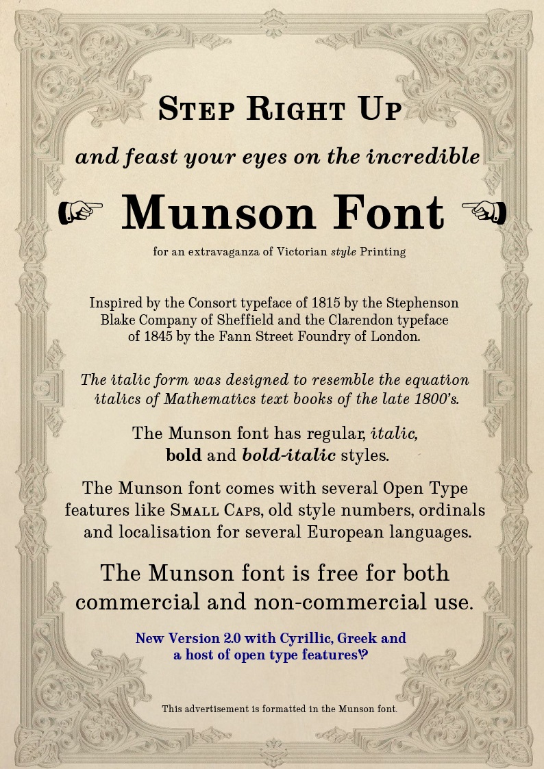
First, is it the right tool for the job? Using your two as examples, if I were looking for a font to set type for a math textbook, Cadman would be the better contender - it has all kinds of advanced glyphs, and the attention to detail for Dyslexia would definitely help when reading complex equations. But if I were setting type for a storefront sign, Munson would be the better choice because of it’s formality and weight - Cadman looks a little childish in comparison. Similarly, if I were making a banner for a kids birthday, I’d probably keep looking for something more decorative, and if I needed a character that wasn’t in that font, then I’d keep looking, too. You could call this a qualification round, I suppose: If I need a hammer, I’m not going to stop and look at a saw.
Second is when the styles and features would get looked at if I had multiple contenders and I could only pick one - because I can adjust or work around things like tracking/kerning and styles, they’re not qualifiers in the same way, but when these things are done by the font designer they have the advantage of saving me the time in fiddling with it, and they usually look a lot better when they’re made right, rather than me having to fix them. If I had to rank the individual characteristics, I’d put weights and styles above the others, simply because those are usually the most problematic ones to work around - it’s pretty easy to tell a faked bold or italic from the real thing because the characters are distorted.
This all ultimately boils down to “does it look right” and “how much extra effort is it going to take to make this look good?” The first one is pretty contextual, but the second is a matter of attention to detail.
Putting fewer words on the poster goes against the grain somewhat. But on the other hand I suppose all that is necessary is enough characters to give a feel of what are getting. But it feels as though I am not giving enough information.
This shows you the look of the font but it doesn’t give any information about the open type features and language coverage.
I think you’re now headed in a better general direction, though I don’t know if that background helps for this particular font.
You’re making the fonts available on the free fonts sites, I guess my next question would be, how many advert panels do they let you have? Can you have multiple?
On the commercial font sites, it’s usually multiple, and the foundries make use of the panels to show the extent of what’s possible. For instance, on fonts.com, the multiple panels for Georgia, Heading Now, give an idea of what’s in the font set as well as possible uses.
I wouldn’t normally use my own work as an example, but this is typical of my promotional images on the commercial sites where I sell my fonts.
Like most graphic design, identifying the target audience is a crucial step before designing something to resonate with that audience. If you’re targeting a group that’s looking for a large character set, you want to stress that. On the other hand, when targeting graphic designers needing a specific look for a project, the equation is a little different and will likely be driven as much by emotional appeal as it is more practical concerns.
3 Likes
Nice presentation. Poking around on myfonts… all your fonts your sweet. Trying… hard… not… to… impulse… buy… everything…
1 Like
Well, there were no more votes so I closed the poll.
I guess having a large family of weights and having an adequate coverage is the answer.
The aesthetics of the font is both very important and very unimportant. When I design a font I have an idea of what I want it to look like and I try to stay true to that idea whilst at the same time letting it develop into what it wants to be. I know this sounds crazy but sometimes a font takes on a life of it’s own and pulls the design in a certain direction, it is difficult to explain but some of the best projects come out of this.
For the person choosing (or not) the font the aesthetics are either right for them or not. I have no way of knowing what the potential user wants so I design it the way I want it to be. Unless I get feedback on what the users want or I have a specific remit to fulfill.
As a side note the projects where someone else is calling the shots are the worst projects I have had to work on and as I am not getting paid for any of this I tend to avoid them like the plague.
So I guess my next project will have a greater family of weights, not just the regular and bold. The coverage will be just as comprehensive as always.
I think the poll sample wasn’t large enough to draw that conclusion, and having to choose between aesthetics and weights likely distorted the importance of each. If you had rephrased to question to say, “the right look or personality for the job” instead of “aesthetics,” I think the responses would have been different.
Aesthetics can mean several different things to different people. A typeface can be aesthetically interesting and well-designed, but if those aesthetic qualities are inappropriate for the job at hand, a designer won’t choose it. No one will pick a typeface that doesn’t have the personality or look they need, despite the number of available font weights.
For example, when a designer needs a modern-looking, geometric typeface for a corporate client, they won’t choose an aesthetically elegant script face just because it comes in more weights. On the other hand, there are many contemporary geometric faces to choose from, so the deciding factor between one and the other could be that one comes in ten different weights while the other only comes in four.
That’s true, but it is possible to know which general type styles are most popular and what kinds of typefaces or font qualities are needed to fill new niches. Monotype’s yearly Type Trends book, for example, provides much information on what people are buying.
Really the aesthetics should not have been part of the survey at all. The original question was “Given two fonts which are both equally suitable for a project how would you choose between them ?”
I see now that I should not have included the option about aesthetics in the possible answers, I just wanted to know if coverage was a deciding factor or if having lots of clever open type features was a big influence on peoples decision or if lots of weights was the thing that attracted people, things like that.
To me the aesthetics is the way it looks, the visual attractiveness, including it’s style and character.
In general when I design a typeface I design it for myself, the way I want it to look, then I release it just because someone else might find it useful. This survey was to try and find out what more people find useful.
The book is interesting and I will give it a read. Thanks.
I don’t think I explained what I was getting at well enough.
For me, and I think for most, the right aesthetic qualities are always paramount when choosing a typeface for a project, but what is aesthetically appropriate in one instance might not be for the next.
For example, Franklin Gothic is an aesthetically appealing typeface for a newspaper headline, but maybe not as much for a formal wedding invitation. Type designers tend to think in terms of making aesthetically pleasing fonts. Graphic designers, on the other hand, think more along the lines of how this or that font can be used to help create something else.
My point was that you, a type designer, might be asking about a font’s inherent aesthetics, but a graphic designer might be more inclined to interpret the question in terms of the appropriateness of this or that typeface for the project at hand.
I’m sorry for misinterpreting.
I would always classify the aesthetics of something and it’s suitability for a particular purpose differently, after all an orchid can be very beautiful but if it is in a field of potatoes it is a weed.
I am not trying to correct you, what you said is completely correct, I suppose the way something looks depends on where you stand to look at it.