Give me clean serif text book fonts

I have an upcoming printing of a lot of books, and 12 pt Times New Roman is my default on my word processor when I edit. But I think it’s kind of aged and heavy on the eyes for printing purposes. When I pick up new books, it seems that it’s been abandoned, because today’s 10-12 pt. text seems more readable than the 10-12 pt. text from the books that were printed quarter of a century ago… Adobe Garamond comes to mind; it looks cleaner and lighter. Any other suggestions?

I looked up some suggestions from the web: Libertinus, Adega Serif, and Playfair Display… okay at 50-100 pt. size, but when I get down to 10-12 pt. size, that’s when it counts; that’s when it needs to be light and easy to read.

My go-to serif for larger blocks of copy is Goudy Old Style.

For me, the choice of serif body text in a book that’s meant to be read for hours at a time depends on readability and the personality of the book.

I avoid Times Roman for three reasons: First, it was designed originally for letterpress printing on newsprint, which requires legibility under less-than-ideal circumstances. Second, it’s way too common since it’s a default typeface in most operating systems. Third, there are better typefaces.

Garamond is a beautiful typeface at larger point sizes, but the heightened contrast between thicks and thins rules it out for the text of an entire book that’s meant to be read from cover to cover — at least for me. Garamond is so old that there are dozens of variations of the typeface, so I can’t universally dismiss it since some versions work pretty well for body text.

The different variations of Goudy can be good, and I like it for books that need the classic look of something from the past. I could say much the same about Meridien, Adobe Caslon, or Janson. Each has a different personality from the others, but each manages to have its own style of a classic look.

Minion is a nice, contemporary, and highly readable typeface, but it is a bit overused (even by me). Sabon is nice for the same reasons, and it lacks the overuse of Minion. Hoefler Text is a nice typeface with a more contemporary and easy-to-read look, too.

If it came down to picking serif faces that work for the body text in a book 75% of the time, I’d probably choose Sabon or Minion.

I would absolutely stay away from any free or cut-rate versions of any of these type families.

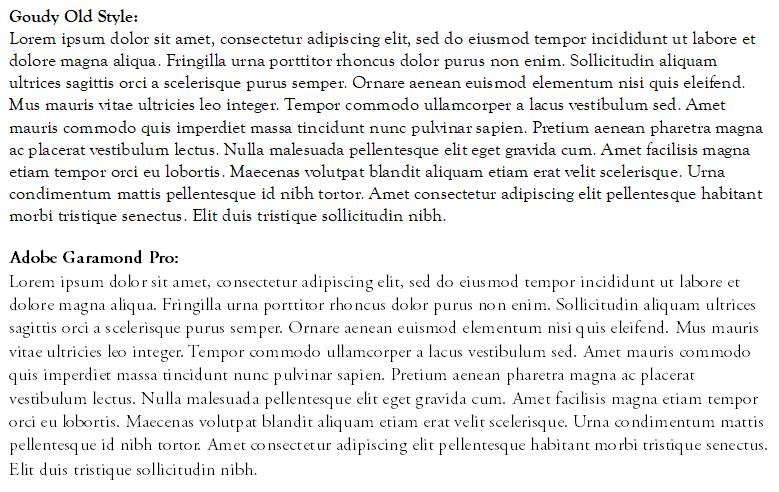
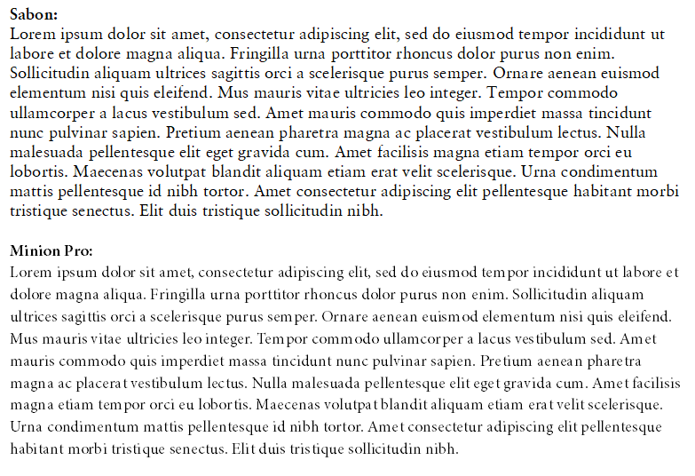
Just-B has pretty much said verbatim what I’d have said. Salon is a lovely font for text. A couple more I’d add to the list are Bembo and Baskerville.

That said, there are many other beautiful and legible body text fonts. If you can, pick one with a book version (as Bembo does).

However, the choice does come down to more than just legibility and readability (not, in any way, to sideline their importance). The other hugely critical factor, that Just-B touched upon, is the personality of the book. The tone of voice of the font needs to match the timbre of the text itself.

For example, to use very broad brush strokes to illustrate the point, a book about, say, a spate of late Victorian murders in foggy London will have a very different tone of voice to one about the taxonomy of alpine mosses.These are pretty diverse examples and of course, there is everything in between.

It depends also on the demographics of the targeted readership. The requirements for a book aimed at 15-year old girls is very different to that of middle-aged men.

Also, it’s it a text book, or trade?

Chosimg the correct font to match these criteria can be critical, or at least material, to the book’s success.

I am in the middle of designing a book at the moment. Between the author, project manager and publisher, we tried visuals out in around five or six different fonts (only after hours of my testing and selecting these front-runners) before we settled on the right one to hit the tone of voice the author intends – and this is an author I know well, as I’ve designed his non-fiction, illustrated titles for a good few years now.

I hope this doesn’t scare the living daylights out of you, but, as you can see, font / typeface choice is a far more subtle process than a simple A-B-C drop-down menu choice. There are many more factors governing it than most people even realise.

Typography for books is all about getting the thoughts, words and emotions from the author’s head to yours as seamlessly as possible. As Adrian Frutiger once said – and regularly over-quoted by type-geeks like me…

‘If you remember the shape of your spoon at lunch, it has to be the wrong shape…’

Hope this helps. Good luck.

Once it starts getting below 12 pt., from graphic design we go to engineering, and the purpose of the engineer is to make things work. So, when it comes up to ease of reading on the eyes, I am getting dragged toward Minion even more than Garamond.

My work is fiction, nonfiction, semi-autobiographical books, humor; and I will try a different typeface on all of them.

(I have to check out my screen-shot program, because when it saves a PNG, it looks like it doesn’t give me the option to control the compression of the image. It looks like the images I posted have some artifacts.)

Caslon is very clean too.

Baskerville seems heavy on the capital letters; each capital letter is popping out. Hoefler looks like it’s been squished slightly.

Arno Pro is a good serif typeface which I find comfortable to read in long passages.

Or if you want to try Kelvinch for free. ← Shameless self promotion!

I failed to be more diligent when I posted the images of the comparisons, because I skipped to compare the italicizing. I haven’t done layout editing in many years and I am starting to eat my own mistakes now… So now I am changing my position on Adobe Garamond Pro, because the italicization is way too stylized and unreadable. I am even starting to wonder how did it become so popular if the italicization is so heavily applied on it. (As if a lawnmower with bad blades went over it.)… Or maybe it’s just me that struggles with quickly going through scripted text.

Adobe Caslon seems to have similar issue with the italics.

I am actually in a lucky position to be printing several books, and I am promising to myself that I want to experiment with different fonts on each one of them.

So far, I really like Minion Pro and its italicized version too is very easy; of course since I haven’t done layout editing in many years I had to do the biggest blunder; I had zoomed it on my monitor at full screen while I was editing… and I forgot to look at it at 6 x 9 size to realize that at 11 pt. my point size was too small to be legible for the average reader. Please correct me if I am wrong on this, but I think 11 pt. Minion Pro on text book paper is a no go for the average book reader, right? I am fine 11 pt… can’t complain about my vision, but I think it’s too small for the average book reader. Now that I will be increasing the point size by 0.5 or 1.0 points, the whole reworking of hyphenation, orphans, widow control, and Shift+Enter issues I am having, will cost me many more hours of work.

I like the regular of your Kelvinch font, Paul!

1 Like

That depends. For example, the text in college textbooks is typically smaller than the text in novels or biographies. The text in a hard-bound book is typically larger than in a paperback. Newspapers are often set in 9.5pt text, and the same is true of magazines.

Minion has a fairly large x-height, which makes it appear larger than, for example, Garamond, which has a relatively small x-height. Also consider the leading (space between the lines), which affects readability.

If I were you, I’d open several books to find the type sizes and leading that seem to match what you need for your books. When you print out your layouts on a printer at 100% size, check to see if they match. If they look similar, with similar readability, you’re probably in the ballpark.

Yes, I haven’t done the test printing yet because I don’t have a printer at home. But I am using a hand ruler to measure the 6 x 9 page on the PC screen. So, when the layout of the book is setup exactly at 6 x 9 on my monitor (and I measure it with my handheld ruler to verify the size), it seems that the text would be tough to read for the average folks. Would you disagree that doing the screen measuring trick is not an accurate evaluation?

As I mentioned, it depends on the font, the book, the audience, and how long someone might be expected to read the book in one stretch, but in general, no I wouldn’t say that 11/12.5 or 11/13 Minion is too small.

(Cutting through the typography jargon,11/12.5 is saying 11-point type with 1.5 points of additional leading.)