I am making a logo for a hydroponic business, retailing indoor growing equipment supplies such as nutrients, pest control, grow lights, grow tents, pumps, heaters, ventilation etc.
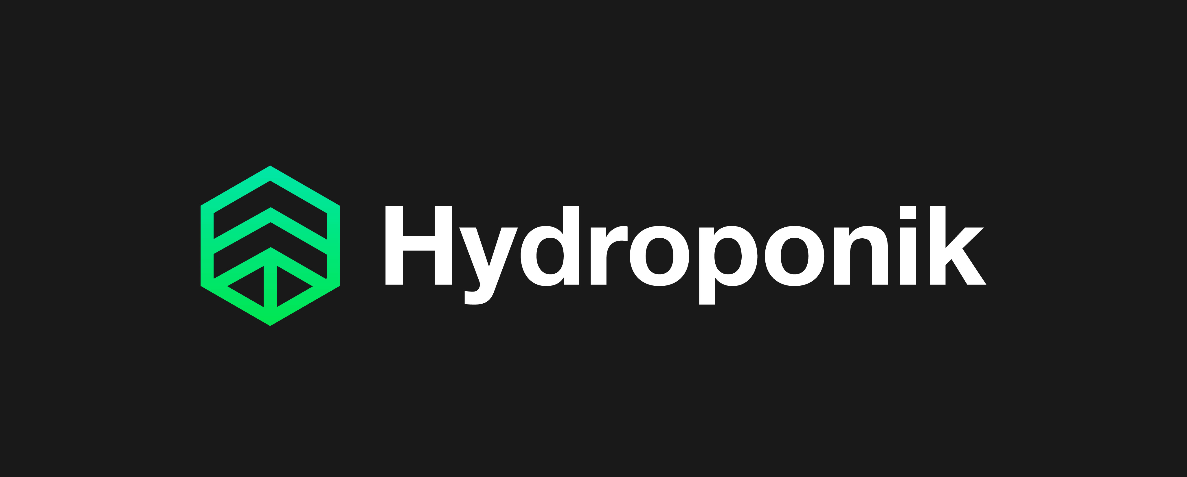
The business will be called Hydroponik (with a ‘k’)
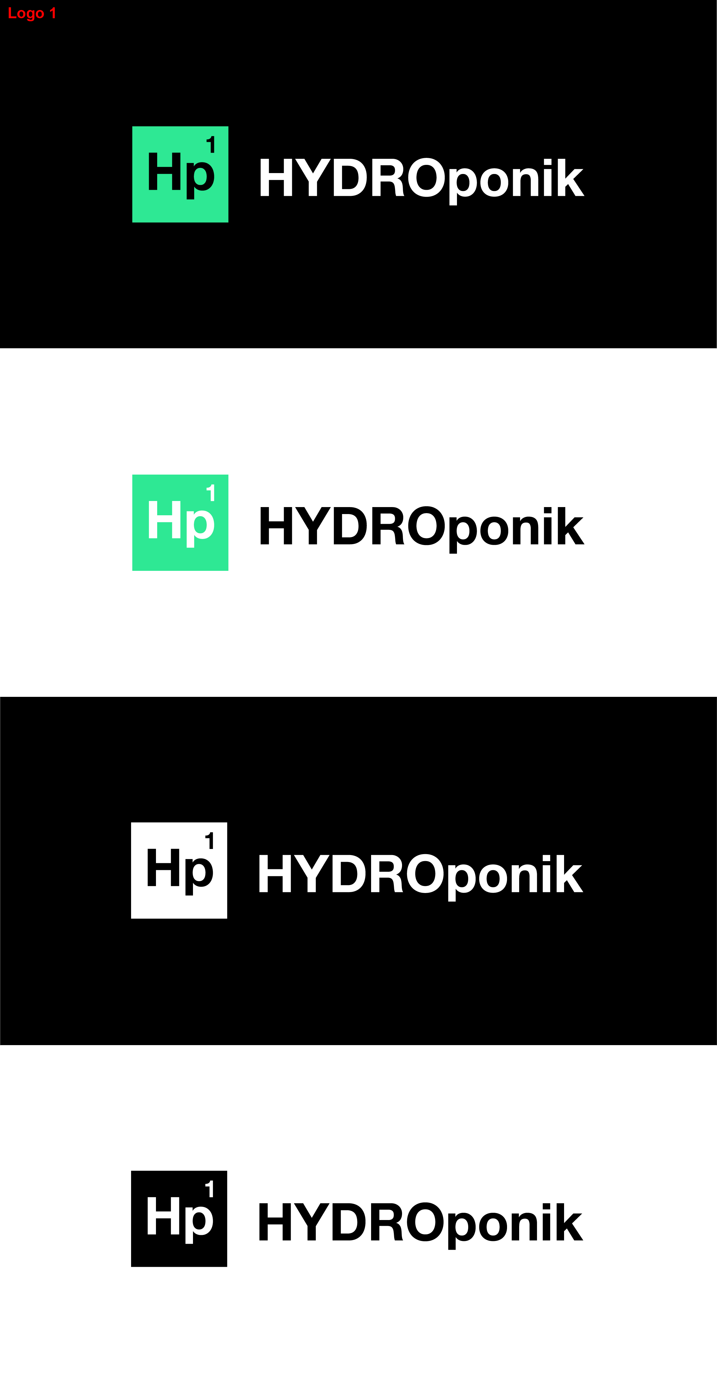
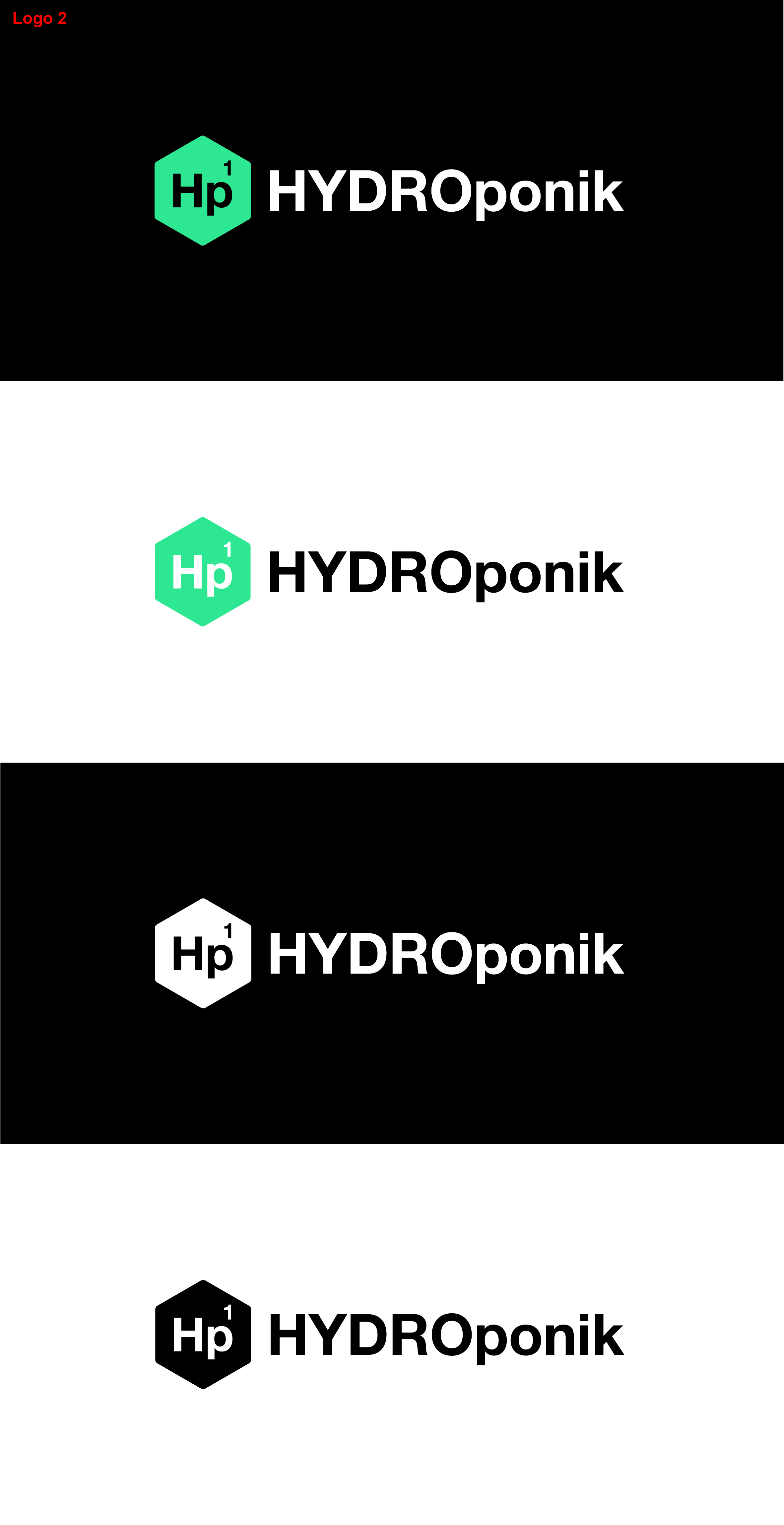
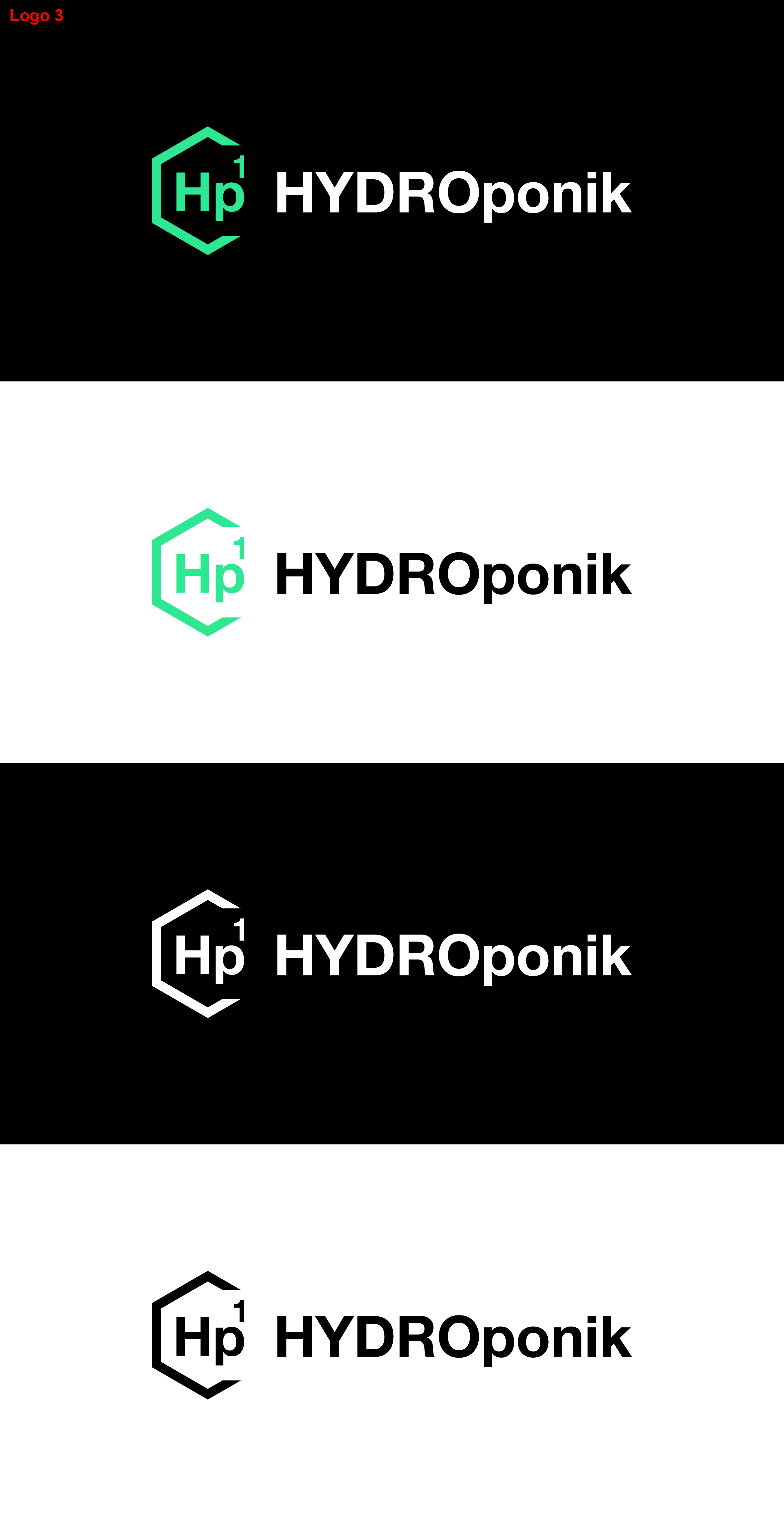
Attached are 3 Logos ideas. All shown with dark and light backgrounds, and also Mono.
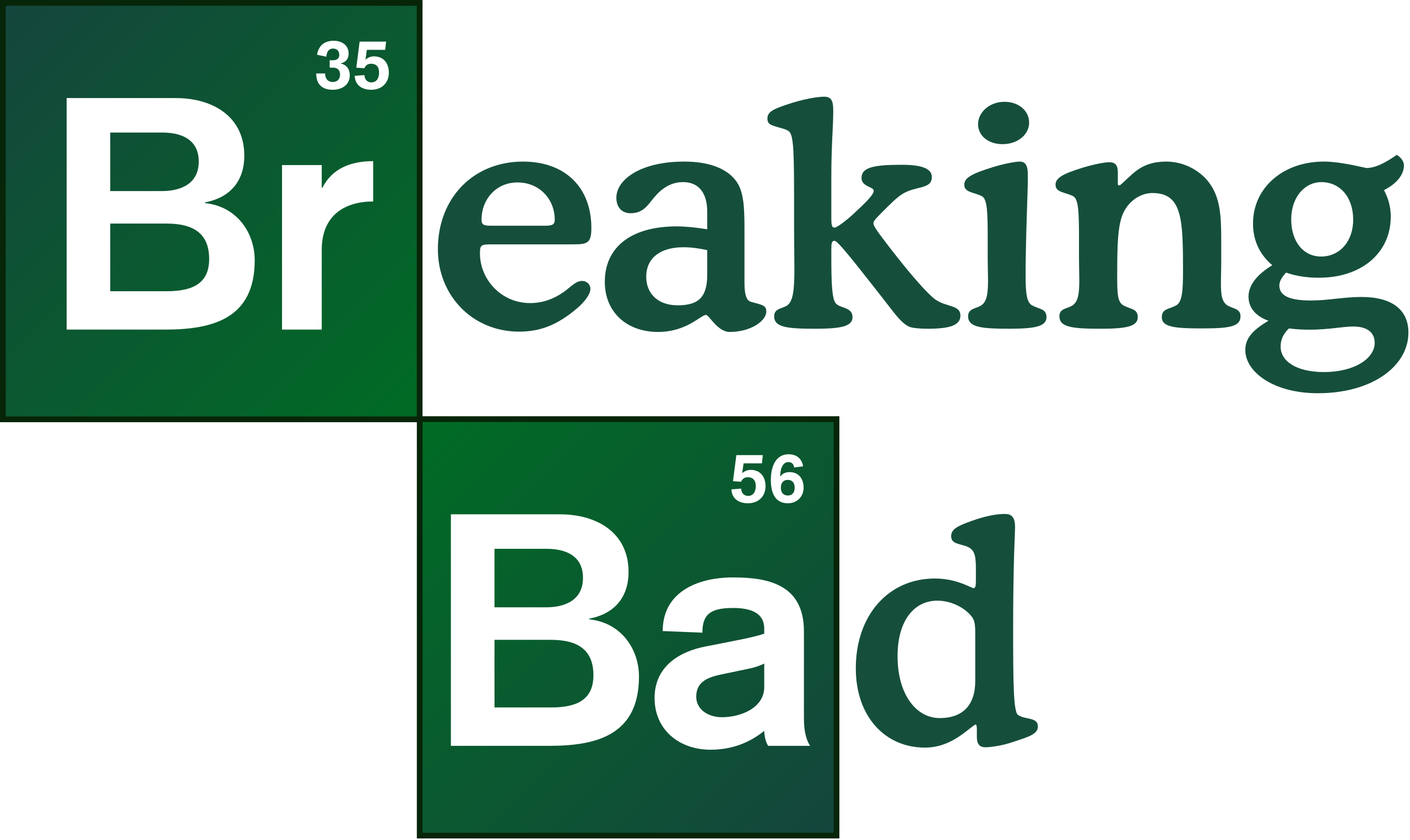
I would like to go with the scientific theme, so my idea for the icon was a periodic chart style (hence the uppercase ‘H’ and lower case ‘p’, and number 1)
(The chemical element symbol for Hydrogen is number 1 on the periodic chart and is usually shown in green, and as it starts with the word ‘Hydro’ it kind of all ties together nicely)
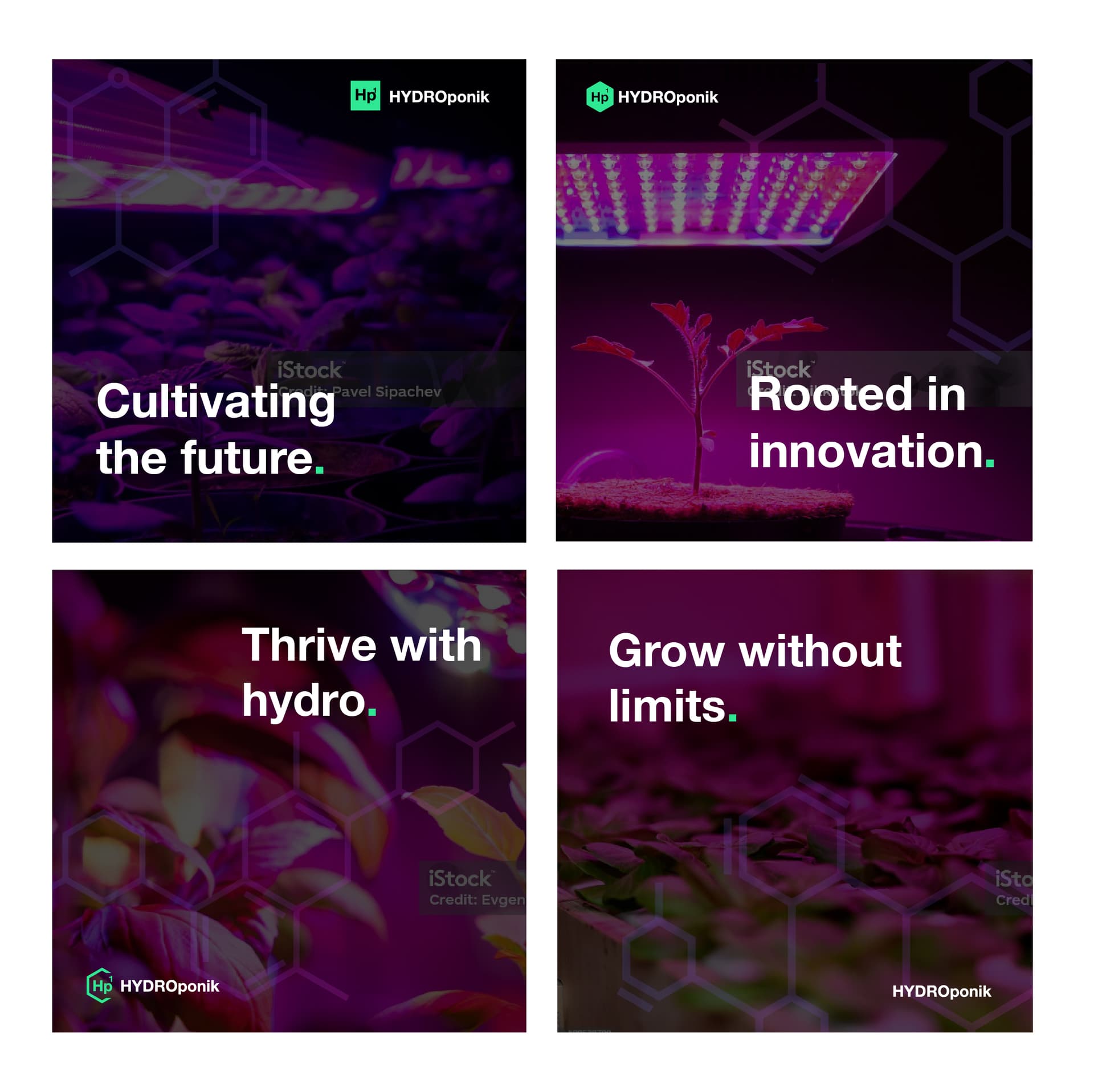
Also attached are some ideas for graphics to be used on printed material such as flyers, letter heads and also social media posts etc which involve the hexagon shape chemical compound graphics. This is not meant to be part of the logo but will be a part of the overall brand identity.
With this in mind, which logo do you all think works best? 1, 2 or 3
In Breaking Bad , a chemist and chemistry played pivotal roles. Does your client want to stress the role that science and chemistry (nutrient solutions) play in hydroponics? If so, I like the idea. The periodic table reference might be less appropriate if your client is primarily a hardware retailer with little concern for the science behind what they sell.
Luckily, most of their customers are probably aware of the science involved and will understand the periodic table reference. The square, the color, the typeface, and the upper and lower case make it pretty obvious to anyone who’s ever taken a chemistry class.
If it were me, I’d drop the atomic number. Yes, it always appears in the periodic table, but the table also includes the element’s atomic weight, which you’ve omitted. In addition, the atomic number usually occurs in the upper left instead of the right. Positioning it on the right makes it appear more as a superscript. All this considered, I’d drop the 1.
I like the hexagon’s look, but it implies carbon and organic chemistry. The reference is appropriate for plants grown in a hydroponic solution, but the hexagon loses the periodic table associations, so I’d lose the 1 since it no longer makes any sense.
Despite my comments, I like the idea (if it’s appropriate for the client).
I quite like this. Have you searched to see if you can find a similar logo in use?
I’m not sure the gradient is needed, but it could easily be left out and printed solid as needed. I like the mention of science, which helps support the organic molecule overlay. The upward arrow in the tree logo is great. I even like the green period after *The science of a greener life."
However, the green color lies outside the CMYK gamut, but it works well for RGB uses. I suppose a duller green would suffice for CMYK purposes
I too really like this. I also wasn’t bothered with your first versions, the criticism of the periodic chart just seemed a little too narrowly focused. That said, I think this version is better. I really like the word all the same cap treatment, and the symbol is both precise, had the nice nod to organic chemistry with the use of the hexagon and the little tree element is surprisingly effective. It also appears from the other posts, that even though similar - I mean, these days… what isn’t similar to something - it appears to be unique. Love the color palette.