How can I set the object under the text?
Hmm. Interesting situation. I like it. Is LESSON CONTENT set in black? If so, could you set the blending mode of the anchored object to Multiply to achieve the same effect as having it underneath the copy?
It is possible, but only using the inline option, them annually move it into position. I did just this today using a photo of paper as background to text. It can take a bit of fiddling, but it does work.
I’ll fiddle away tomorrow!
I’m going to try Sprout’s suggestion tomorrow (currently the anchor is set to Custom) but that’s a possible workaround too. You’d think this would actually happen more often than not in print design?
I don’t know why you’d use an inline graphic here.
If you want it under the text the inline graphic has to go after the text (then use custom positioning and apply the correct offsets and settings there) (Adendum - I cannot remember if it needs to be anhcored before or after the text in this scenario.
Easiset solution is to convert the frame to a text frame insert the text directly into the frame. Then anchor the entire lot.
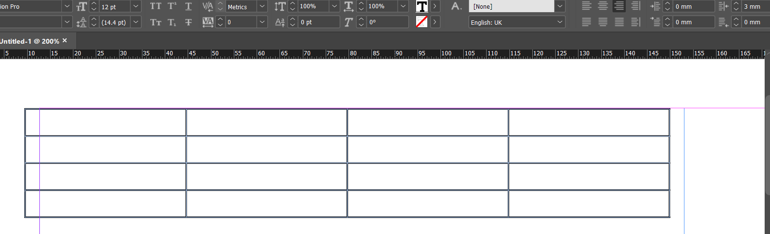
Another solution instead of inline graphic is to use a Table and add the gradient to the fill and add the text to the table.
An anchored object could be problematic.
3
Another solution would be to use Paragraph Shading instead of an anchored object
Not a great tutorial but shows how to
And I’m sure there are more ways that are easier than an inline graphic.
2 Likes
To be on top, the text would need to follow the anchored object. However, unlike CSS in web design, InDesign has limited support for negative values. For example, a style that shifts the position of the text up by a fixed number of points is doable, but that shift would not apply to the text that follows, leaving a big empty gap (once again, unlike CSS positioning).
I also don’t know of any way to anchor an object in a text frame while specifying a negative value that positions the left edge of the anchored object outside the text frame.
As @sprout mentioned, there might be workarounds. Even so, it gets awkward for something that could be easy if only InDesign had a better implementation for assigning negative positioning values, including negative leading and positioning outside the text frame.
Maybe I’m missing something obvious that you know about. If so, it wouldn’t be the first time. ![]()
2 Likes
You don’t do it as an object. Do it as a very thick underline, with a negative offset, and the underline is a gradient. The text will be on top in its own color, separate from the gradient.
- Create a gradient, linear, teal to white.
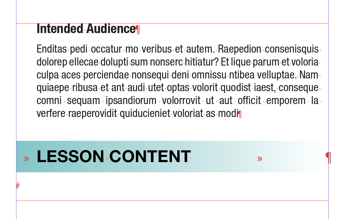
- The text for Intended Audience and the description get indented to .25"
- Set the size of Lesson Content to 15pt. NO INDENT on the Lesson Content line. Instead, put a Left Justified Tab before Lesson Content at .25", and a Right Justified Tab after it, at the end of the frame.
- Highlight the entire Lesson Content line (the entire line will highlight because of the tabs… otherwise just the text will highlight)
- On Mac, hold down the option as you click the Underline tool to get its dialog, then choose Underline On, set the Weight to 30 pt (double the text size), Offset to -5 (which moves the underline up and behind the text), and the Color to your gradient color.
And then of course, save this as a paragraph style so you don’t have to repeat these steps in the future.
6 Likes
Yeh - I use Rule Above for this too - there’s many ways to achieve it.
1 Like
This requires indenting all text in the linked text frames except for the no-indent on the Lesson Content line, correct? That’s a great hack, but I wish Adobe would address it directly by allowing negative values that enabled the selected text to exist outside the text frame.
No, nothing has to be indented anywhere. I was just replicating OP’s layout to show how to get the description text to line up with the Lesson Content line.
OK. Now I’m confused.
I’m not trying to nitpick, but I’ve encountered this problem several times on various projects and have resorted to hand-positioning boxes and images behind or to the side of the text (which is a huge hassle when the text changes cause reflows). For that matter, I have one client who insists on something similar to this in a 60-some-page booklet, so I’ve been looking for workarounds.
If you’re thrown off by the indent, ignore that, and try it with just steps 1, 3, 4, 5. That shows how you get the color band behind the text in a way where you don’t have to worry about anchoring or reflow.
2 Likes
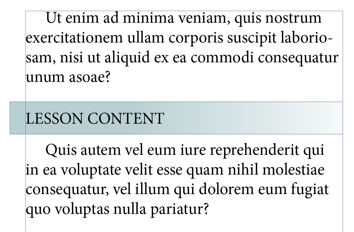
To clarify, although a great solution, if you want the gradient block to go outside the current text frame (in my case, “Lesson Content” is NOT indented, it’s flush left) there’s no way to do this because without an indent, the underline style is going to start at the “L”…correct?
A table can go outside the text frame.
A paragraph rule , shading and other methods I mentioned all can
1 Like
Just to illustratte table outside text frame
align right with right indent pushes it outside the text frame
1 Like
Partially correct. You seem locked on the idea that your gradient block has to go outside of the frame. Let go of that. This workaround is to create the illusion that it’s outside of the frame.
My gradient block is in the frame, along with the Intended Audience line and the description, but Intended Audience and the description are indented .25". That’s half the illustion. Then Lesson Content gets tabbed, not indented. The Lesson Content line begins with a left justified tab, then the words Lesson Content, then a right justified tab. That’s how that entire line can get an underline. You can put an underline on words and tabs, but you can’t put them outside of an indent.
1 Like
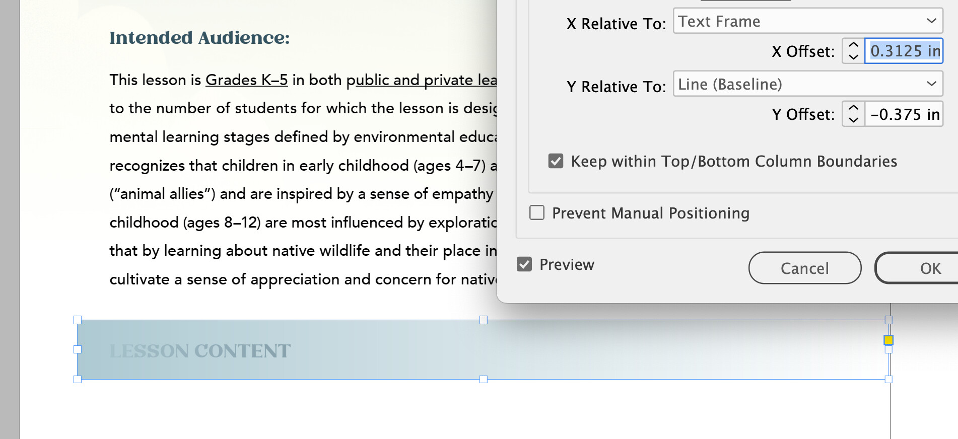
I finally managed to make this work, and it includes an outdent from the text frame for the green box.
- Flow the text in with a blank line above the LESSON CONTENT line.
- Change the blank line from flush left to flush (align) right. This is important.
- Increase the paragraph spacing above the blank line to X. (X represents whatever numerical value you might need.)
- Remove any paragraph indent from the blank and LESSON CONTENT lines.
- Create the box with the fill, then paste (anchor) it into the blank line space. Because that line is set to flush right, you’ll be able to pull the box to the left, beyond the edge of the text frame. If the outdent doesn’t work, make sure the paragraph is set to flush/align right.
- Reduce the leading of the LESSON CONTENT line to 0 (zero).
- Increase the paragraph space beneath the LESSON CONTENT line by X.
- Increase the character shift upward by X
You’ll need to play around with those X values to get the line spacings you want. They’re all adjustable once you’re finished with the steps above, which don’t need to be done in the order I’ve listed them.
If you can assign all this to a style or two, that would be great. However, I haven’t tried that.
1 Like
It’s really not hard to do
1 Like