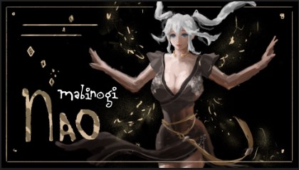
Hey all, Im helping someone to design a thumbnail for a youtube video.
So far the layout has been established and i had a placeholder for text on the top left
What Im going for is big med small w the fonts, but since I want to make sure the illustration is most dominant, I decided to make the biggest font at the bot, and then med and the smallest onces was supposed to be onthe top left.
To solve this, first I’d find out what this Youtube video is about, who it’s aimed at (the audience,) and whether or not there is already established branding that would aid in overall recognition of the characters involved.
Trying fonts randomly doesn’t work.
If there is already branding in place, you need to work within those guidelines.
You could try a different crop of the character that would still be a feature piece, but gives you more room for text.
Since we don’t know anything about this youtuber, you’re not likely to get much response here. Design is all about communication, so with a lack of details, there isn’t much to say.
Assuming everything that PrintDriver mentioned is in order, and if it were me, I’d use legible typography that looked like a headline instead of looking as though it’s a nearly illegible part of the illustration.
Placing the main headline in the lower-left corner is unusual, but there’s no reason it can’t be done if it clearly appears as a dominant element that contrasts with the illustration rather than blending into it. Do that, and the subordinate lines of type in the upper-left will work better, assuming, of course, they’re also handled in a way that works.
Unfortunately, these prerequisites you’ve unnecessarily imposed on yourself are getting in the way of the best solutions.
The only thing I would add to the good advice you’ve already been given, is to remember one of the basic principles of design and that relates to communication (readability) and to limit the number of fonts you use, especially limiting decorative fonts.
Since this thing will most likely be viewed on a phone, I’d question any typography smaller than what you’ve got for the “large” version. Most of the Youtube videos I see with text on them are the “WOW LOOK AT THE STUPID THING I DID” type of videos. No one needs that.
It sounds like you’ve got a solid plan for your YouTube video thumbnail! Placing the largest font at the bottom ensures that the main message is prominent and readable, especially since viewers tend to focus on the lower part of thumbnails. This hierarchy, combined with a well-designed illustration, will grab attention effectively. Just ensure the top-left text remains legible, even in smaller font, to maintain a cohesive and visually appealing thumbnail.
Eye-tracking studies have shown that people tend to look at the upper left corner of web pages and newspapers first unless there’s something visually interesting enough to draw their attention elsewhere.
Do you know of evidence that people view thumbnails differently? Or were you stating your personal observations and opinions? I did research on this subject in graduate school years ago, so I’m sort of interested.