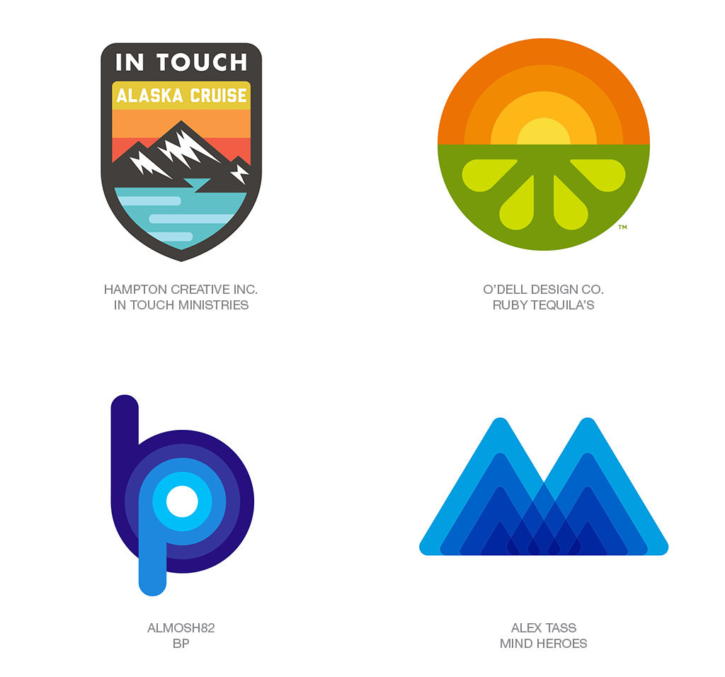
This year’s logo trends were influenced by a pendulum shift that’s starting to swing from clean, modern aesthetics toward curvy, retro designs that reflect a new attitude through color and embellishments. Read more on logolounge.
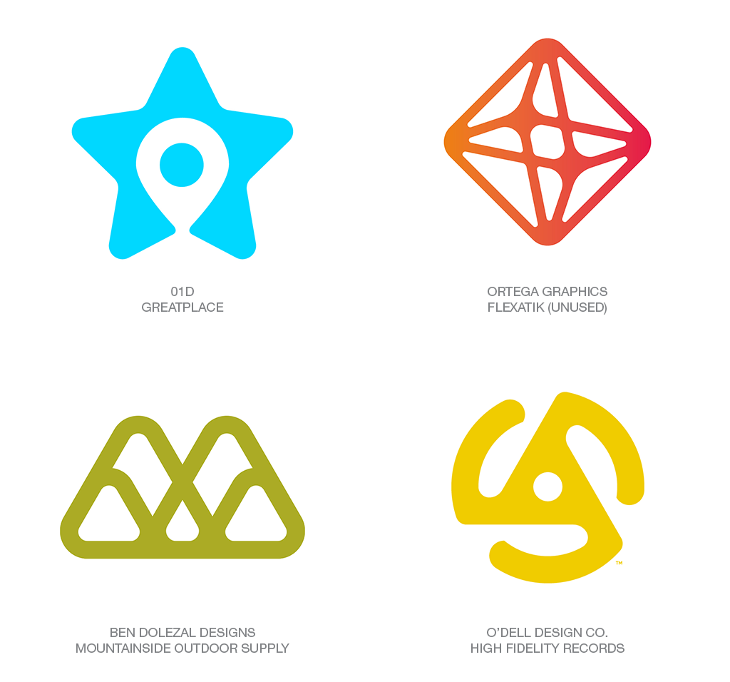
I wonder how hard it was to come up with the design for High Fidelity records, considering that is the shape of the little plastic spindle adapter you used to convert a 45 record hole to a 33.3 spindle, neither of which had anything to do with high fidelity recordings. LOL.
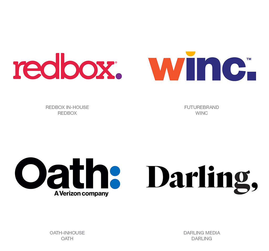
Did Redbox do a redesign within the past year? My wife and I get a Redbox movie about once every couple of months and I noticed the last few times the entire interface was purple and pink; I don’t think I saw any red at all. I remember it was in February when I first noticed it so I thought maybe it was for Valentine’s Day. But I remember seeing it about a month ago and it was still purple and pink.
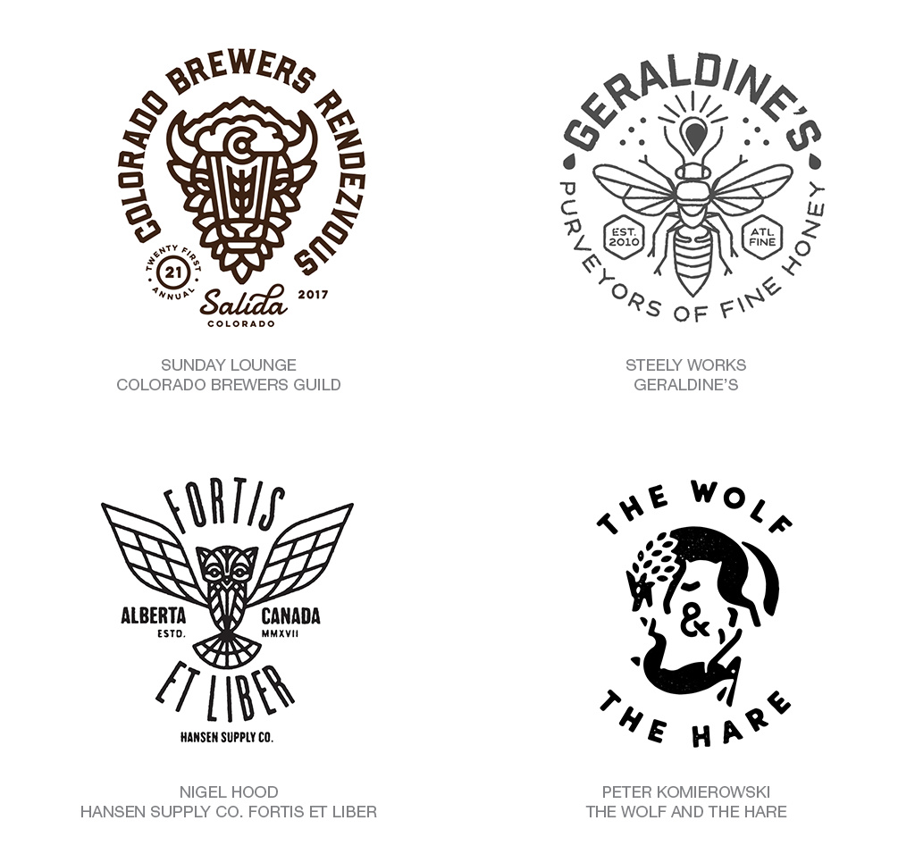
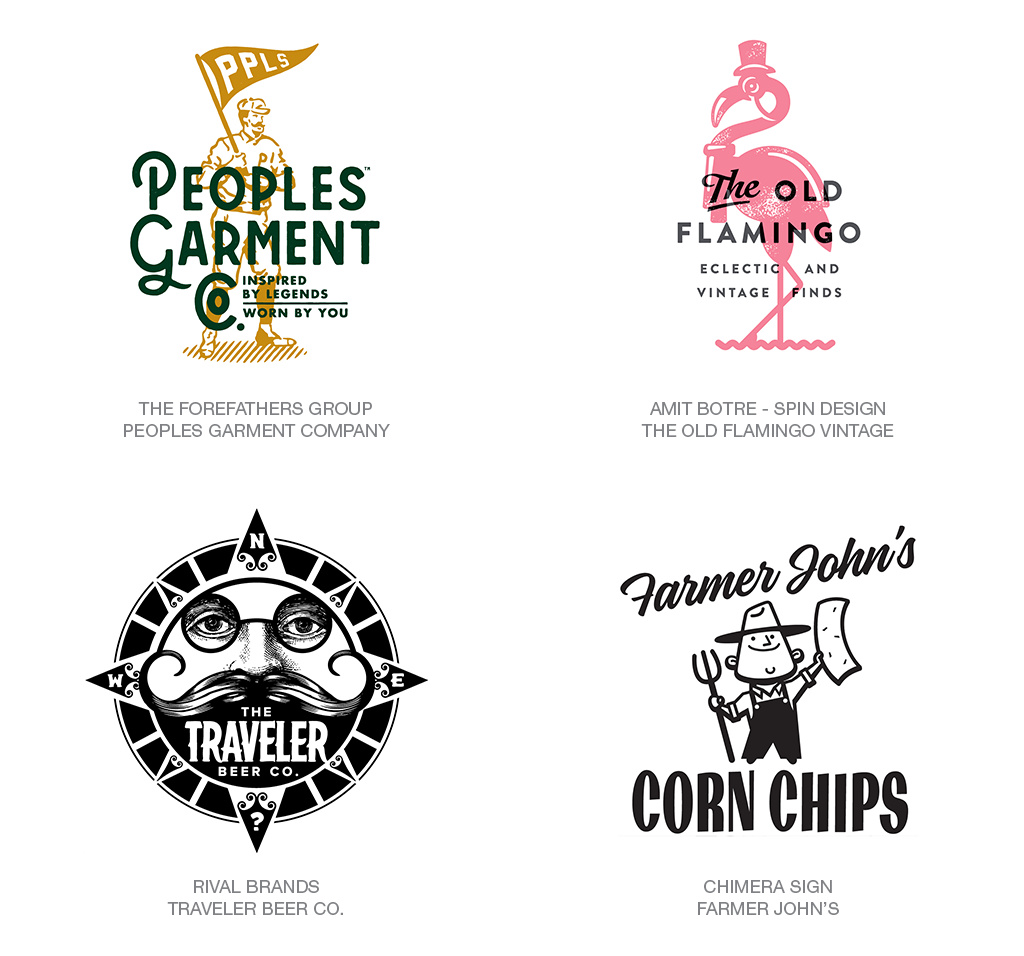
The hipster logos are way to wordy and detailed for my liking, I really hope they never become a trend that big corps follow.
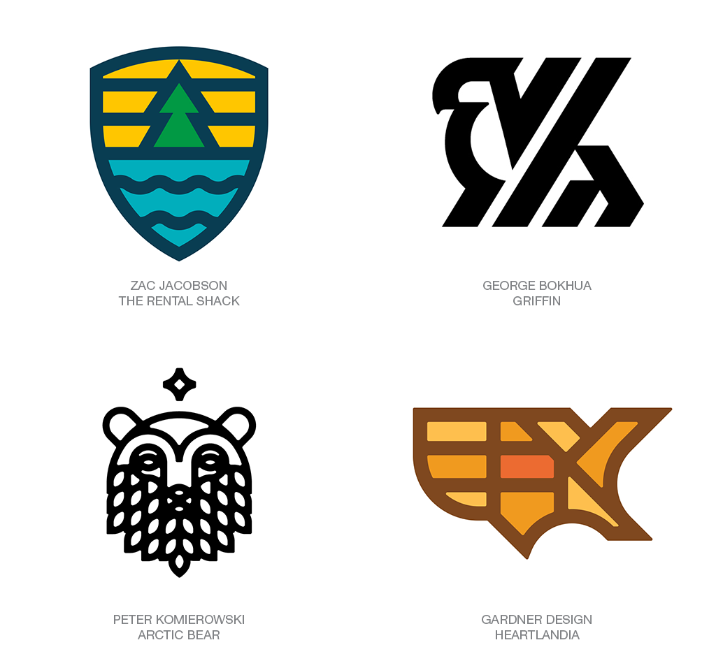
Out of all these logos I really like the Heartlandia the best! Just something about that shape of the U.S. and how the designer cut up the states is very pleasing to the eye. The colors are spot on assuming that company has something to do with agriculture.
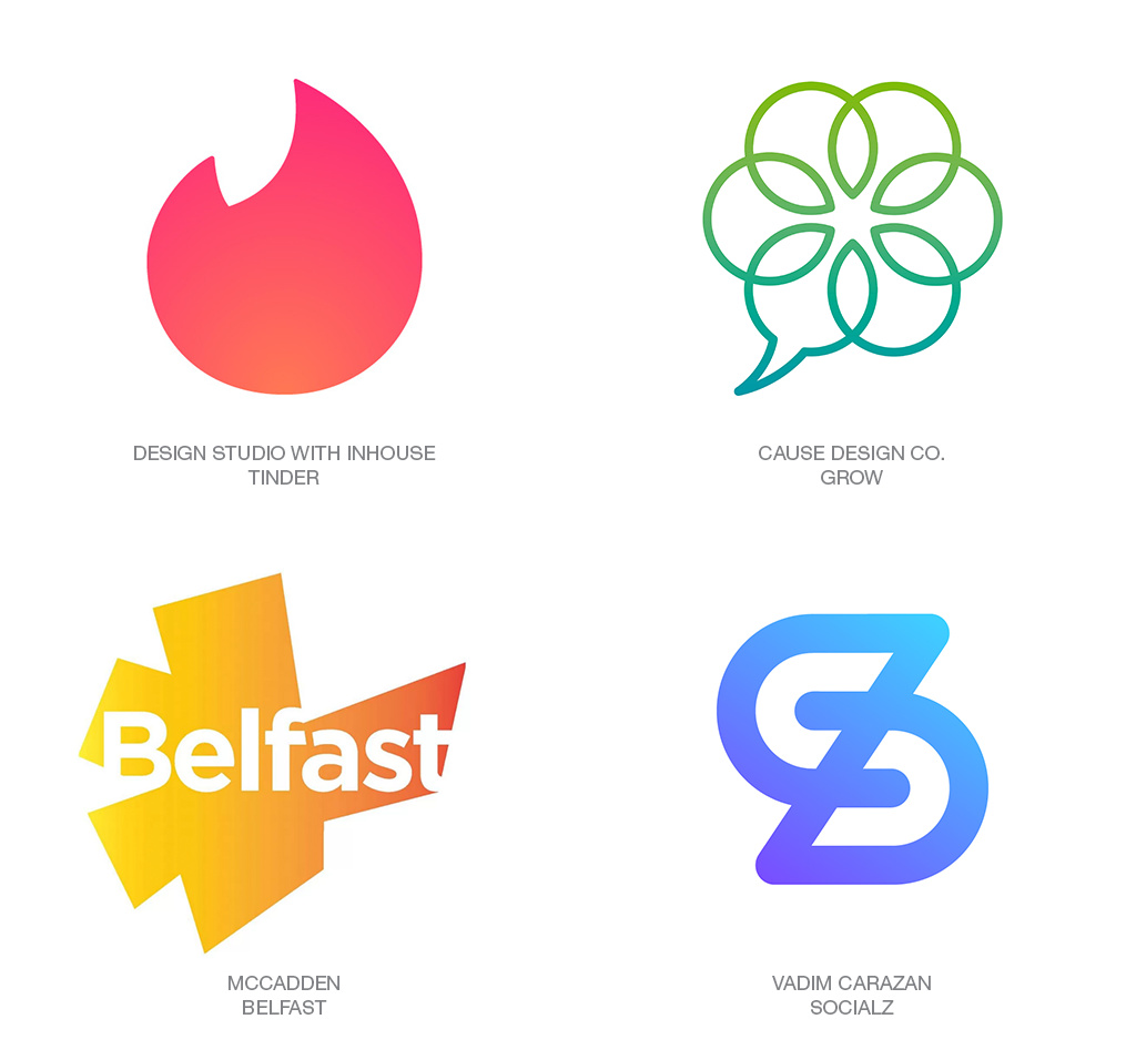
Also, I have a new found respect for Tinder for using an in-house design team. I’m sure that current logo is different from when they were just a start-up. It’s refreshing to see them not try to hire some hot shot agency and instead invest in their own talent.