2 Likes
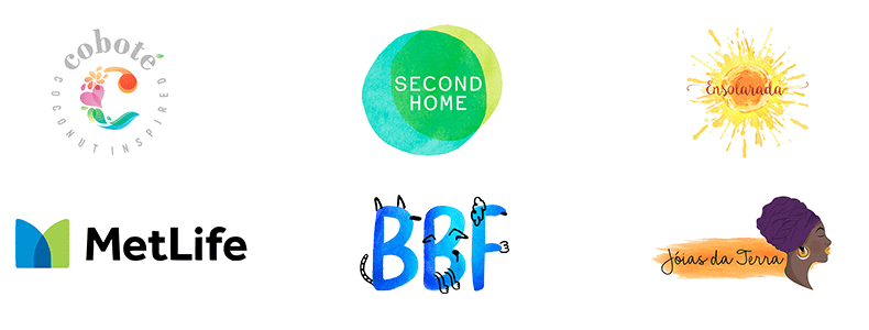
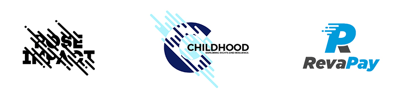
Met Life isn’t hand drawn. And they had to spec a third color for that transparency overlap making it a 4-color logo.
A lot of these just do not work.
Printdriver has to work the holiday and is not a happy camper today.
2 Likes
Neon Colours - good luck getting them out of cmyk lol
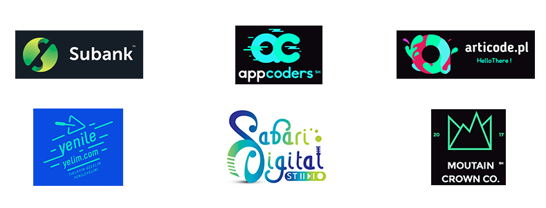
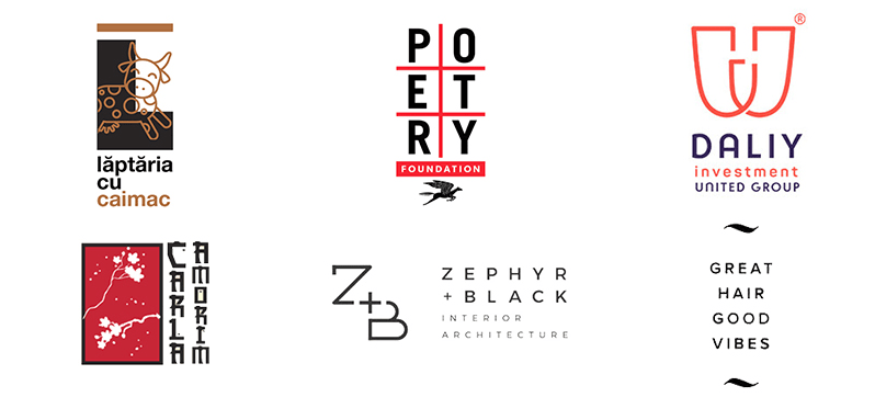
Nice collection of styles @iraszl thanks for wrangling these up together, its a good way to analyze over arching trends.
I agree with PD that some of these don’t work at all from a printing perspective… Also some of these logos just aren’t good memorable brand identities. IMO when you make a brand image deeply intertwined with a “trendy style” it will likely die with the trend and struggle to ever be “cool” again.
Remember the early 00s Grunge and Web 2.0 trends in logos… remember all the brands that used those styles? me neither.
I’m not sure you are giving examples of trends or not, but call me old fashioned, I’m not a big fan of the designs of most of these (shape composition-wise). The colors are easy to change, I really enjoy adaptable logos. Some of these are so cringey to look at, especially the broken circles. Also, because there are so many stock websites for logos, they look too generic, and it’s probably because people like to copy styles on stock websites, but it makes them lose individuality.