2D / 3D Design

Greetings fellow graphic designers,

I am working on an assignment to produce a 2D / 3D design to be installed in a graphic design studio reception area to showcase the business and style.

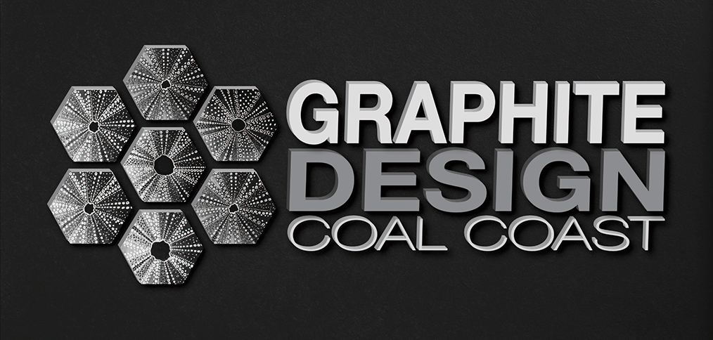
My business is named GRAPHITE DESIGN COAL COAST. The primary focus is “Graphite” as the tool used in the first stage of any design and represents creative thinking process. Graphite is one of three forms of the element carbon one of the building block of life. Graphite has a layered 2D hexagonal structure compared to coal which a loose and diamond 3D tetrahedral structure. The location of the design studio is in the Coal Coast which is known for the coal mining of black diamonds, its stunning coastal tropical mountain environment and close knit active and creative community.

The logo design involves a group of hexagonals with a hand drawn texture from one of my art works and simple clean logo type. This is to be produced into a 3D sign with a super dark graphite laminated backing board and 3D plain coloured lettering and 3D digitally printed shapes.

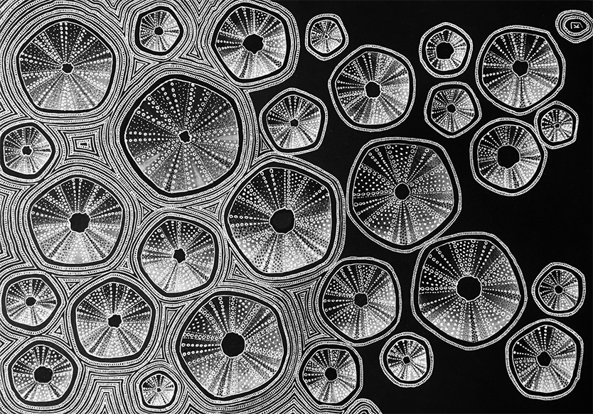
I have chosen to place on of my artworks on the adjoining wall as a large digitally printed wallpaper mural. The work selected is title washed up - sea urchins which was hand drawn white ink drawing of sea urchins on black card. The hand drawn element provides the personal touch and represents my unique black and white line style. It also provides linkage to the coast environment where I work and live.

The texture and pattern of the urchins has been used in my logo which provides continutity between the wall art and business signage / collateral.

I am seeking constructive critique from design student peers and experience designers.

I am specifically interested in effectiveness of the design concept to represent the studio persona and aim attract local community small business clients from the professional, service and hospitallity sectors.

I am also interested in technical advice regarding production of the concept in 2D/3D form. Specifically how to prepare digital artwork for the signage company for large scale and 3D printing.

Thanks Kathy

First Kudos to you for actually attempting to identify materials to use in your signage. You’ve gone far beyond what most examples of this assignment do.

To preface, this is what I do. Signage, wide format graphics printing and occasionally this sort of office decor.

Lets start with the logo.
Is the urchin art your own painting or is it a stock purchase? 99.9% of the time you cannot use a stock image in a logo per the EULA of the stock site. The urchin art makes this a “print only” type of logo. While solid black and white art can be etched in some fashion to give you a 3D texture, it’s pretty much limited to silk screening or printed.

How well you will be able to realize the lettering depends on the size of the sign. To make delicate letters like “coal coast” you have to use a laser, not a cnc. Lasers melt plastic or metal to cut it. Skinny fonts like that tend to wizzle up from that heat. You would be able to do them in 1/8" thick material if they are about 2" tall (with the rest of the sign proportional) but not much thicker. You also have to consider how they attach. The could be bonded to the backer if the backer is some kind of plastic that WeldBond works on. Otherwise you have to tape them on with VHB tape (very high bond) They would be easily cranked off if this were a sign in any other place besides behind the desk in an office lobby.

Are those letters 2 color? Darker sides, lighter faces? That’s twice as expensive as a single color paint because the lighter color goes on first then all the faces have to be masked and the sides sprayed with the second color.

The hexagon prints on some kind of thick substrate I’d recommend direct print as the lowest cost alternative with silkscreening being a much higher cost. Depends on what those are made of. The edges would have to be painted. Don’t forget your bleeds. Die cut items have to bleed off the cut path at least 1/4"

File prep for this sign is all about the cut paths. Lettering should be defined as text converted to outline. The colors should be Pantone Coated colors (even the grays) so paint can be matched to what you want. Monitor matching is out.

If you are looking for deep blacks on your printing, you need to ask the printer for their Rich Black mix for the material you are printing on. It isn’t always 25/25/25/100. Alternatively you could create that mix and call it Rich Black and instruct the printer to swap out their material specific mix.

Same holds true for the wallcover. 0/0/0/100 black is sort of gray.

Wallcover generally has a 53" printable width. That has to include the overlap bleeds and crop marks so figure your panels will split on 50".
Adhesive wallcover requires physical overlaps of up to 1/2" on either side of the “seam for a 1” total overlap. Some installers will do 1/4" each side. Depends on the flatness of the wall. You will have a visible bump where the panels overlap. Adhesive wallcover also requires and overlam. Can be gloss or matte, but if you go matte, ask for a scratch resistant one so the mural can be installed without damage. Get a proof with the lam on it so you can see what a matte lam will do to your black inks. Sometimes it dulls them down.

Traditional Paste wallcover still requires 1/2" overlaps to be built into the file but on install the installer will do a french cut that removes the two overlaps and creates a near seamless look.

Bear in mind with either process there is some material slip. Not much. The design will be matched at eye level but expect maybe a 1/16 to 1/8" out of register at the top if the wall is much over 14’ high.

Another thing to bear in mind is that large graphics are never an exact science.

Just gonna point out, your wallcover urchins have 5 sides in the wallcover, not 6…:wink:

A very nasty case of missing the forest for the trees.

Any design that requires explanation, much less that much explanation, is probably not an effective design. Graphic design should ideally enhance communication and meaning.

1 Like

I don’t particularly mind a student explaining the research behind their logo development.
The average client isn’t going to get it.
But that’s the way it is with most logos anyway. They don’t develop into a brand for quite some time.
But at least the student is digging (maybe a little too deeply - or not.) Personally I’d lose the Graphite and just call it Coal Coast Design. Easier to say, one less element in the stack. Probably already taken.

I totally missed the white gradients in the urchins. Those won’t translate to etching. There are issues with designing in transparent white in conventional printing. You have to be very careful with your overprints. Wide format doesn’t seem to have these issues. Other than the usual issues of transparency and spot colors. But I ramble.

Graphite, urchins, chemical structure, coal, are all rather disparate elements, and too many elements. I can’t see how it would appeal or in any way be meaningful to someone interested in graphic design. My first guess was that it was a logo for a graphite manufacturer.

If just ‘graphite’ were used, it would need to be supported by something that connected it to sketching, like a pencil, and sketching to graphic design. People may not realize the value of sketching in graphic design, and that could be a good avenue to develop a brand narrative. So just ‘graphite’ could be used to create a powerful brand.