Hi everyone
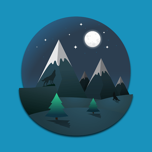
This is my latest project using Adobe Illustrator.
The concept was to take nature’s beauty and apply it into 2D illustrations with a unique new style.
I hope I did a good job and I’ll be very happy if you like it 
Please check out the full project here :
https:// www. behance .net /baccarhamouda
Thanks a lot 
You definitely need to pick a light source. The trees are really out of place for me. The moon is behind them yet they are lit up in the front and still casting a forward shadow  You also need to watch your tones. Everything is so dark I almost missed the wolves.
Overall I like the concept of what you are going for though. I really like illustrations like this 
I’m not sure if you were looking for a critique … If you want more comprehensive critiques from the members, feel free to post this in the Crit Pit
2 Likes
I like it , the colors may not be well chosen and the blue background is ugly but it’s not bad!
1 Like
thanks for your reply, I always look for critiques and notices just to improve myself.
I’m always having a problem with colors as I have a slight problem with my eyes, I can’t make a difference between two or more close colors, like light green and yellow, blue and violet, etc…
But It’s a problem I’m trying to fix and I hope I get the point where I can handle colors properly.
Thank you very much for your notices I really appreciate it.
Thank you so much, yes I’m trying to improve myself with colors as I have a slight problem with my eyes, but I’m working on it.
Thanks for your notice
It would be very hard to find a unique style doing 2D flat art using Illustrator in this way. People have been doing this kind of thing for over 30 years using this software.
On your art,
Faux Pas #1, you have a raster outer glow on the moon, a drop shadow on the back and some kind of hazy something around the perimeter of the back circle. Transparency/raster effects = Total fail as 2D flat art.
Faux Pas #2, your moon is on the right, and so are your shadows. If the moon is there, artistically, the shadows should throw left.
I had no trouble seeing the wolves on my work monitor, but the contrast could be improved.
I didn’t particularly have a problem with pines being lit from the top. They are thinner up there and let light through, though again, they should be darker on the left side as well as the bottom. I do have a problem with your use of a gradient . They are out of place as flat art. (see #1 above.) Though they seem to be more commonplace than they used to be.
Moon mountains and trees seems to be a common theme for this type of art.
So classic and beautifully designed landscapes. Color choosing and howling wolf really great job.
1 Like
Thank you so much
But I need to improve myself with colors
here are some others
https://www.behance.net/gallery/73879089/2D-Illustration-Landscapes
![]()
![]()
