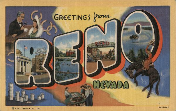
I am designing marriage-annoucement postcards for friend’s who just eloped in Reno. They want a 1950’s travel postcard feel, something a little kitschy, like this postcard.
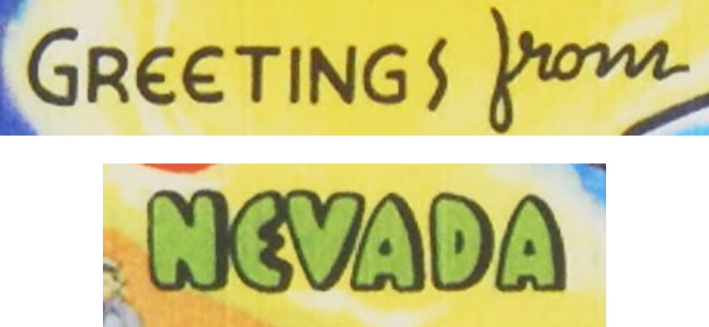
I am starting to research fonts that are similar to the ones used here (primarily in “Greetings” “from” and “Nevada”. There are so many garbage ‘retro’ fonts out there on the web, but I am looking for something that looks a little more authentic. I am also considering hand-lettering some of the copy, using a period-accurate font as a base. Are there any good internet resources for actual fonts from the 1950s? Or could anyone recommend fonts from Adobe Fonts that might be a good place to start?
I’m certain the type on this and many similar postcards was hand-drawn as part of the illustration. Enlarging the type shows that all the E’s and A’s are slightly different from each other.
The trouble with locating digital versions of obscure typefaces from decades ago is that most of them never have been digitized. Hand-lettering skills were a whole lot more important back then, and they account for many of the quirky faces from that era. Lots of hobbyist type designers look for these typefaces and create digital versions based on them. Most of them aren’t that good and end up on the free font sites.
You called them “garbage fonts.” I wouldn’t paint them all with such a broad brush — some are pretty good — but what difference does it make if they’re not perfect for the purpose you want to use them for? Just convert the letters to outlines and work with them. The hand-drawn type on these postcards wasn’t perfect either, which is part of their appeal.