Wow.
I take exception to most of that infographic. Don’t even know where to start.
If the words are right, the examples are iffy. If the examples are right, the words are iffy. Or both.
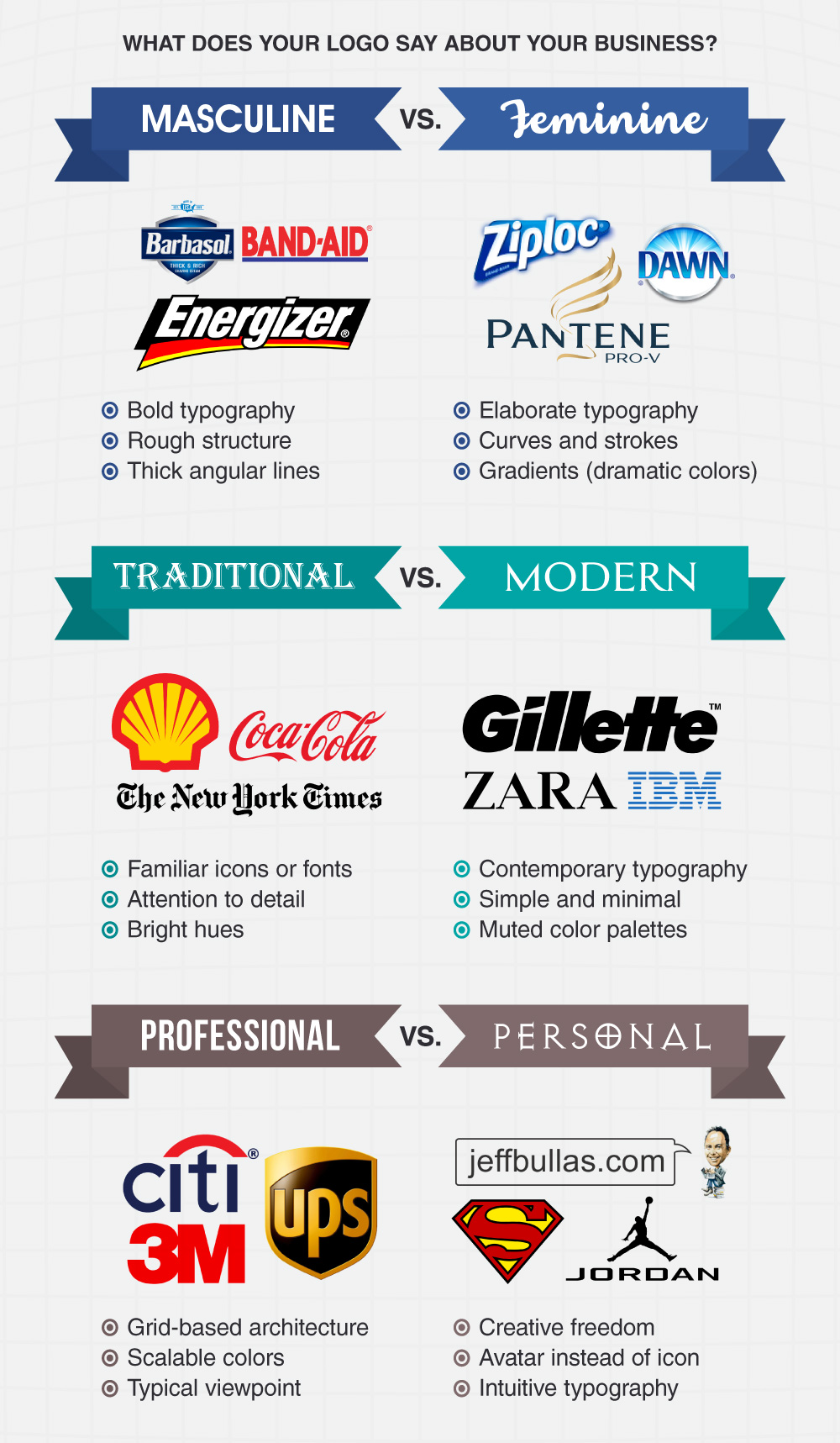
Barbasol, BandAid and Energizer are masculine? The Cat and the F1 logo belong there instead.
Ziploc and Dawn are feminine? Pantene is iffy too as far as feminine logos go. Barbie belongs here.
IBM has been stuck in the 60s since that logo’s inception. It isn’t Modern. Gillette is also a traditionald type logo. Zara, just changed theirs.
UPS is sometimes a pretty unscalable logo, depending on how it is used. Glows and drop shadows have their program limits (usually up to a 2" offset.) Try scaling one larger and the logo loses integrity.
Basic black is definitely a neutral color. LOL.
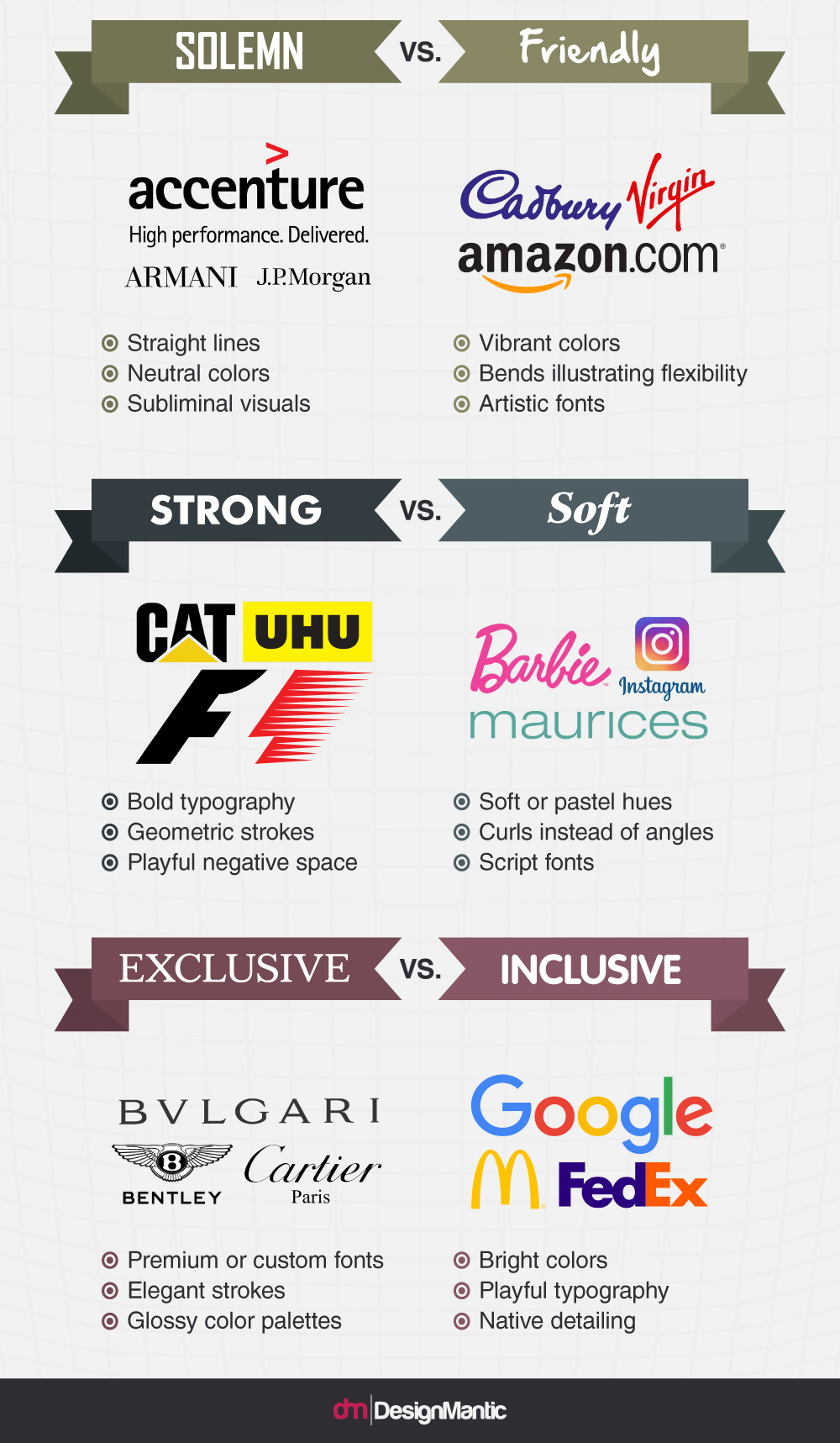
What’s the difference between “soft” and “childish?”
Glossy color palettes?
FedEx is inclusive?
2 Likes
Heh. I’m still off exploring exactly how I’d define “native detailing.”
“Scaleable Colours” ?
“Intuitive Typography” ?
1 Like
Interesting approach. But it seems a lot more subjective than it could have been.
I’m interested in how you would develop this information? It seems like there was a lot of guessing that could have been better developed with a survey. If there was a survey, maybe it needed to be a bigger, broader, and more diverse sample.
There’s much room for improvement on the language. Some adjectives are more subjective than others, and a bit too subjective.
“Masculine vs Feminine” seems redundant compared to “Strong vs Soft.” “Personal” and “Professional” are not mutually exclusive. “Organizational vs Individualized” or “Personalized” would be more to the point. “Solemn vs Friendly” should have been “Formal vs Casual.”
1 Like
If you go to the website noted at the bottom of the graphic, you will learn all you need to know about the caliber of the creator…
Just sayin’.
2 Likes
Shell Oil Company’s logo is traditional. IBM’s logo is modern? No, I don’t think so.
I’ve never thought of Ziploc as being either feminine or masculine.
What is “native detailing?”
“Playful negative space” makes for a strong logo, while “playful typography” creates an inclusive logo? Huh?
I don’t disagree with everything in the graphic, but there are enough things wrong, missing or selectively mentioned for me to question some of the wisdom as not being all that wise.