Declaimer: this is not my article. All the credits are to this talented and amazing London-based product designer Zander Whitehurst
Find his profile here:
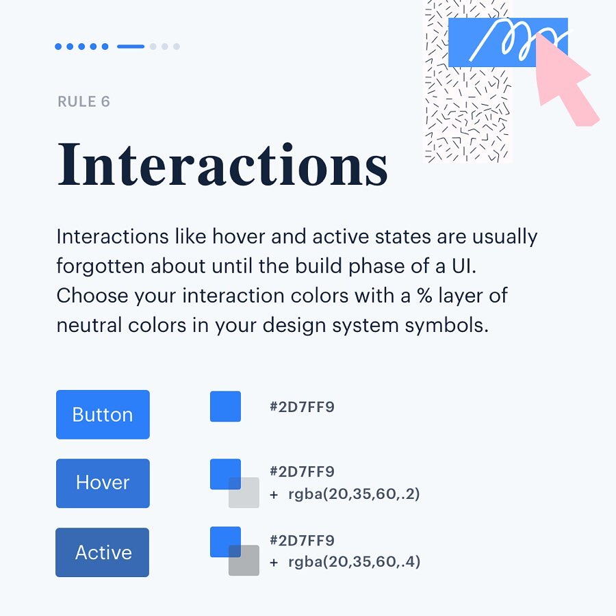
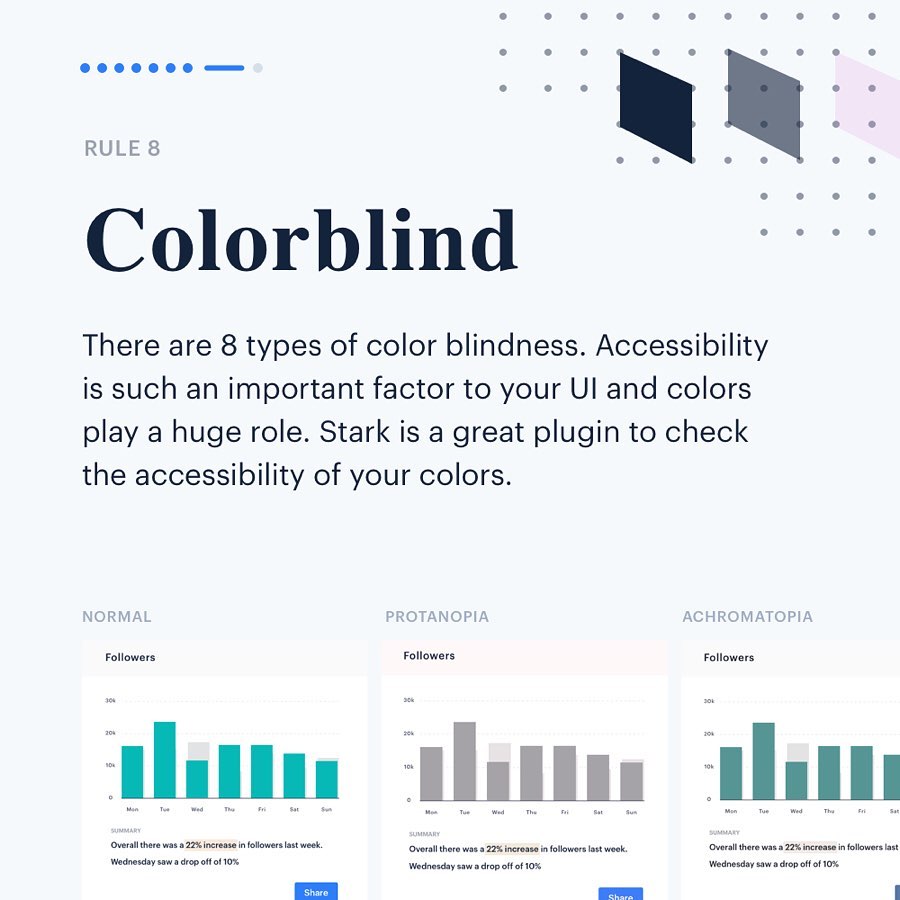
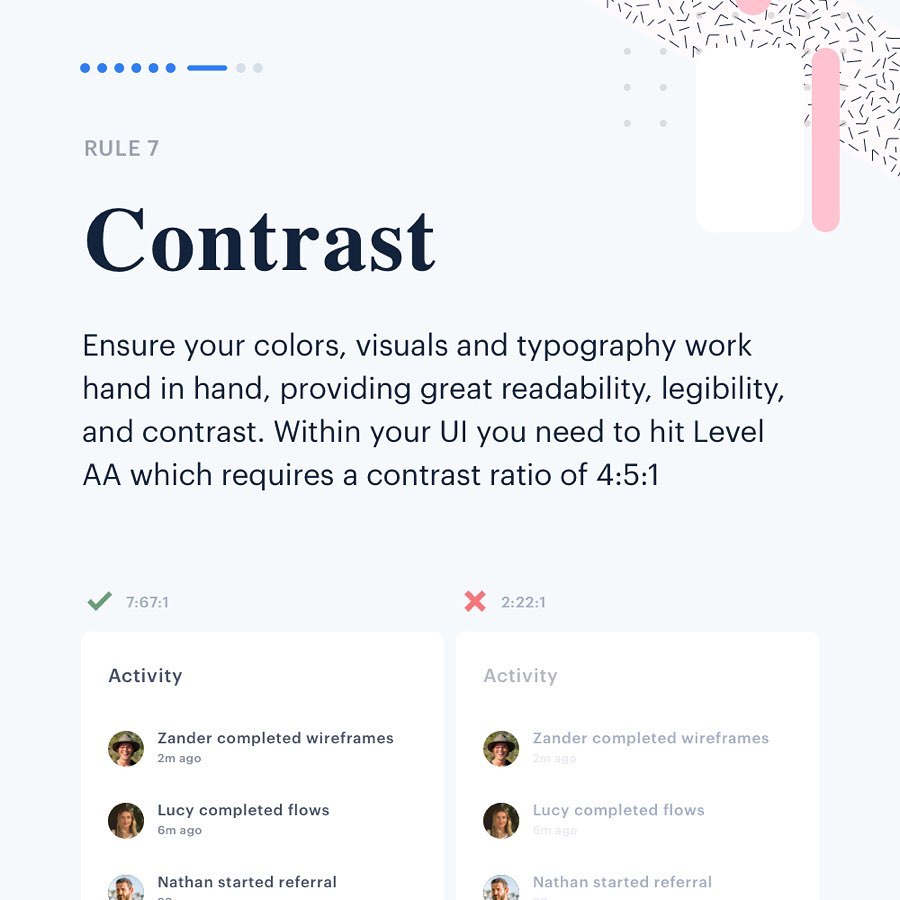
Color is one of the most important elements of UI design. Most rookie designers find an elegant palette online and incorporate the colors into their design, without considering branding, functionality, and accessibility issues like color blindness.
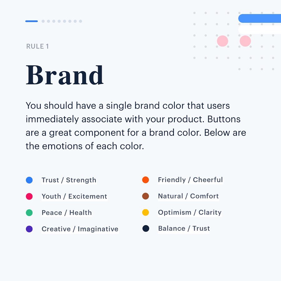
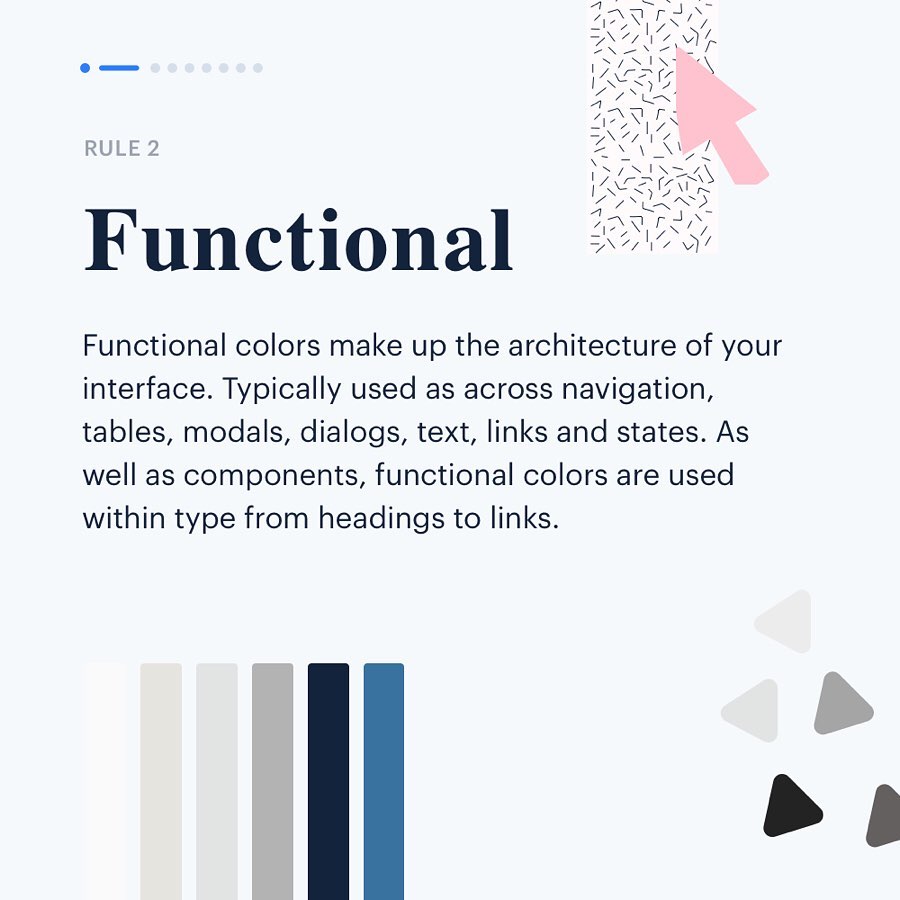
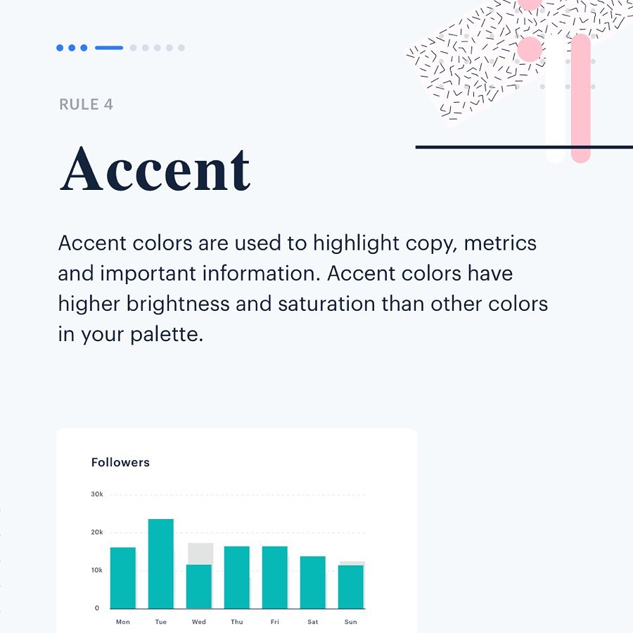
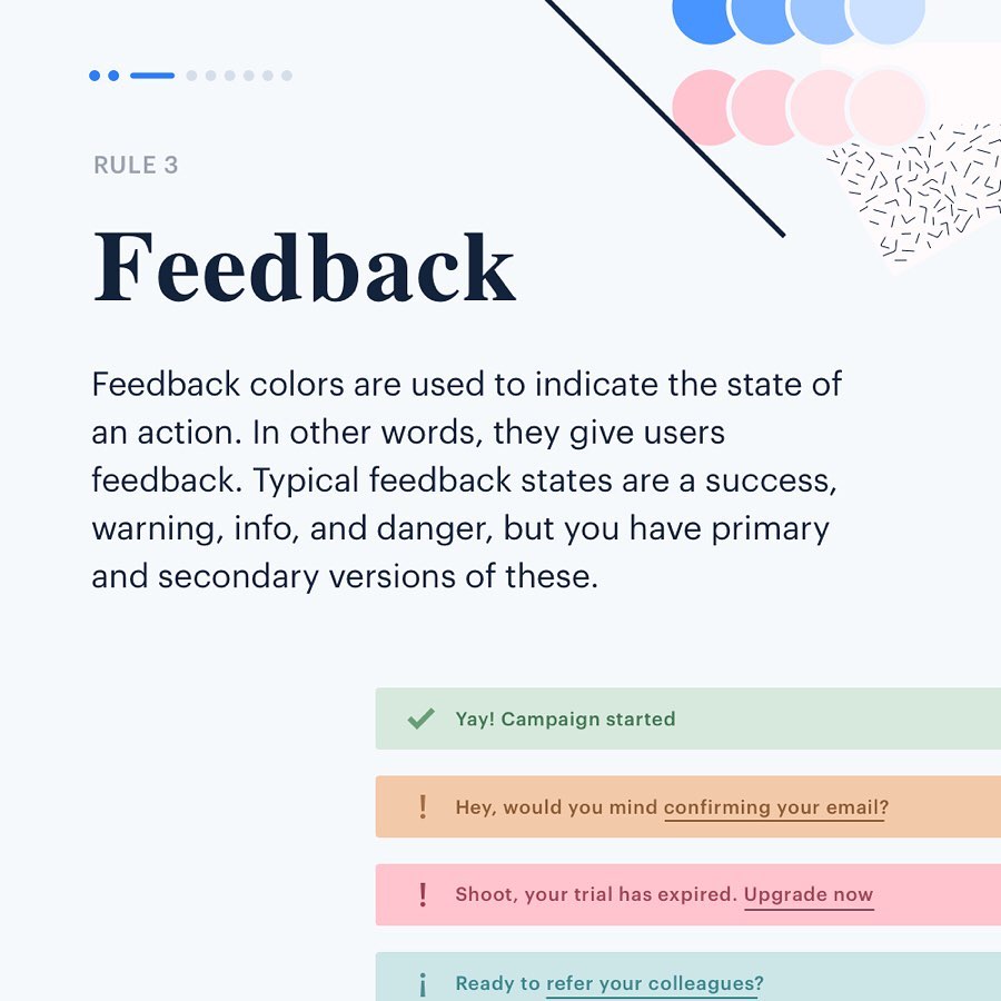
London-based product designer Zander Whitehurst has come up with a handy list of color rules every UI designer should know. He advises to categorize your color palette into brand, functional, feedback, accent, and neural colors. Zander also covers some important points on contrast, legibility, and color blindness. Check out the rules below.