I was sent to an account the other day to assist our technician with some schematics and solutions for a Canon W1 finisher unit.
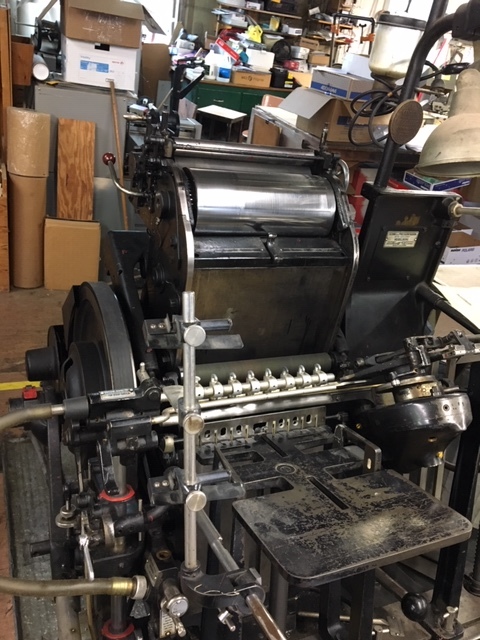
Much to my surprise, this shop owner had equipment that dated back to the mid 1940’s (or earlier).
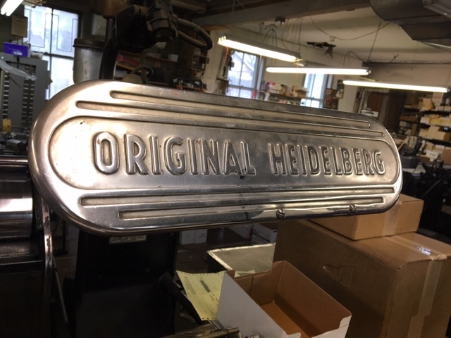
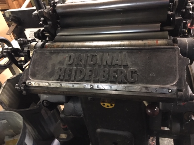
These original Heidelberg ‘windmills’ are still being used on a daily basis. and still produce a phenomenal print.
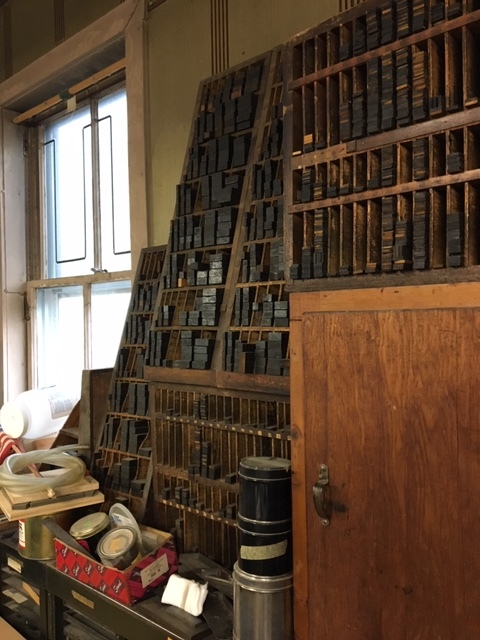
He even had a full portfolio of linotype/letterpress typeface on his walls
Did you discuss your appreciation with press guys?
Woulda made their day to have someone recognize the art.
(unless they feel they are being chained to the past…)
We had one of those until about 2 years ago. We did mostly cutting block work on it in the end.
I used one in my first job in print, they had 5 all in a row just for printing envelopes. While I was there one went away for refurbishment, and when it came back it was like new and it had a 200 year guarantee on it
I was just at a press approval with a printer that had been in business for 120 years and they had one of these there as well (not in use, but on display).
Also found out some interesting history behind some terminology that we use today … apparently since capital letters weren’t used as much, they were often stored in the “UPPER-CASE,” while the letters that were used more frequent were stored in the “LOWER-CASE” for easier access.
@silence04 : Similarly, the english expression, “Mind your Ps and Qs,” which means, “Mind your manners” had similar origins in printing. When retrieved from drawers full of metal letters, lowercase Ps look like Qs, and lowercase Qs look like Ps, so it was always important for printers to mind their Ps and Qs.
Ps and Qs sounds a heck of a lot better than Ps and Ds.
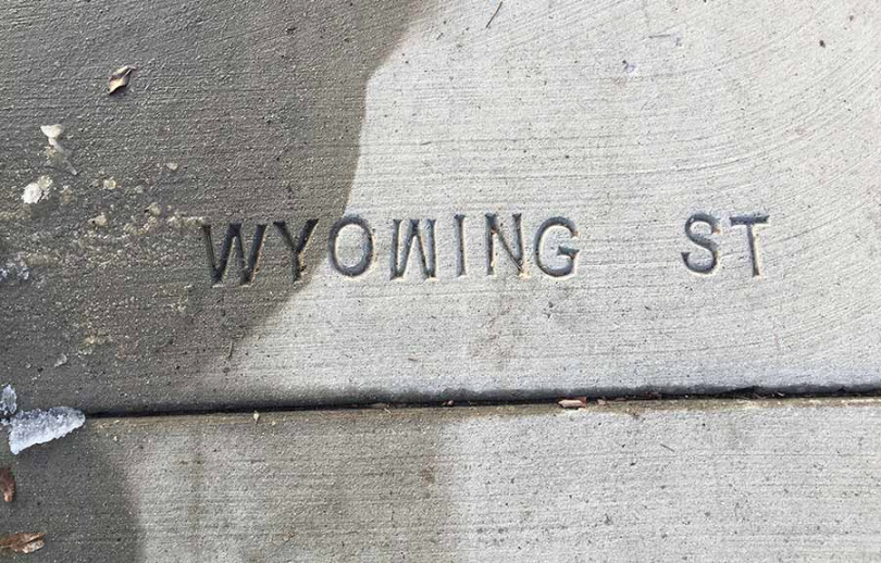
When doing dimensional letters I’m always getting those mixed up (which is why we vary the stud pattern. Ns and Us the same. That and getting Ss right side up. You can’t always discern the larger bowl. I hate seeing a sign somewhere in public that has upside down Ss (like my dentist’s office for instance. I sit with my back to the office wall branding. LOL.) Number 8s are another pet peeve.
Along these same lines, here’s a piece of a new sidewalk the city installed in our neighborhood. I shot the photo earlier this winter while walking our dog.
Of course. The machine is a marvel, and functioned remarkably well. And the print quality was fantastic.
He impressed me with his presses, and I impressed him that a gentleman my age knew so much about a machine long before my time, and has appreciation for it no less.