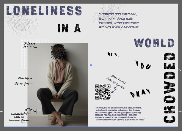
This is a small practice project I’m working on,a book titled The Echoes of the Unsaid. It explores the emotions that people often find difficult or impossible to express. Some individuals have voluntarily shared their personal messages with me, which I’ve included anonymously using code names like “Ophelia,” etc.
I’ve created one page in the book to visually and emotionally convey this theme, but I’m not sure if the feeling truly comes through. I’d love to hear your suggestions, feedback, or any advice on how I could improve this page.
This is a very interesting idea. Will you use different layouts, fonts, colors, styles, etc., for each page that evokes the relevant emotion for each page?
I agree with you that a grunge look for the early '90s doesn’t really suggest loneliness in a crowded world, at least to me. Instead, it suggests chaos.
For me, the visual equivalent of the qualities suggested by the following words and phrases might convey the appropriate emotional tone.
Small
Insignificant
Fading away
Sad
Blue
Isolation
Apart
Alone in a crowd
I wanted to depict the inner turbulence of a lonely mind..in this world full of people. On the outside, a person may seem calm or isolated, and it might appear that ‘nothing is happening.’ But if we look closer, their thoughts and emotions are in constant motion, Especially when triggered by certain events. That internal chaos is what I aimed to represent through the grunge elements in the design..Its almost like those thoughts are filling up those empty spaces.
My thoughts on this aren’t a critique; they’re just my thoughts.
With that in mind, loneliness and internal turbulence are, to me, two different things. I associate loneliness with feelings of sadness, melancholy, and emptiness.
I’m not suggesting that some people living in a crowded environment don’t feel a combination of loneliness and turbulence. Instead, I’m suggesting that it’s a complicated emotional combination that few will relate to, and conveying that emotional experience in a layout to them would be difficult.
On the other hand, conveying less complicated emotions that aren’t muddled by comorbidities would be easier and more successful. Of course, I’m not entirely sure what the purpose of your book is.
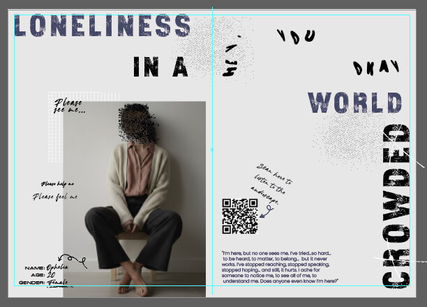
I think you’re off to a good start, but I think it could use some more work and that you could push this further. I believe these are two options for the same two-page spread, correct? A couple of comments.
Some people might read this as “loneliness in a world crowded.”
I like the font you choose for “loneliness in a crowded world,” but I don’t think the other fonts are working very well. Look at the work of David Carson or Art Chantry for type inspiration.
You don’t want the type to be perfect to achieve a grunge sort of look, but the left alignment and lack of hanging punctuation could be addressed.
Hi Hello, and really nice work !, may be you should not to include more than 3 different fonts (as a graphic designer project) but also you may be interested in a style called as “Brutalism”, check on the internet about this movement. Some information about Brutalism here : Brutalism and Antidesign - NN/G
Hi! Thank you so much for the feedback, That’s a really good point about limiting the fonts — I’ll keep that in mind.
'I’ll definitely check out the NN/G article you mentioned. Thanks for sharing that reference!
Hi ! No problem, I have seen the fonts that you use and it remembers me the style of Brutalism. Just check the link that I sent you before and you will see what it is about.
Normally, I would agree about limiting the number of font families used, but, for this type of design, rules go out the window. It’s not the number of fonts in the work sample I find objectionable, it’s the mix of fonts that aren’t working together.