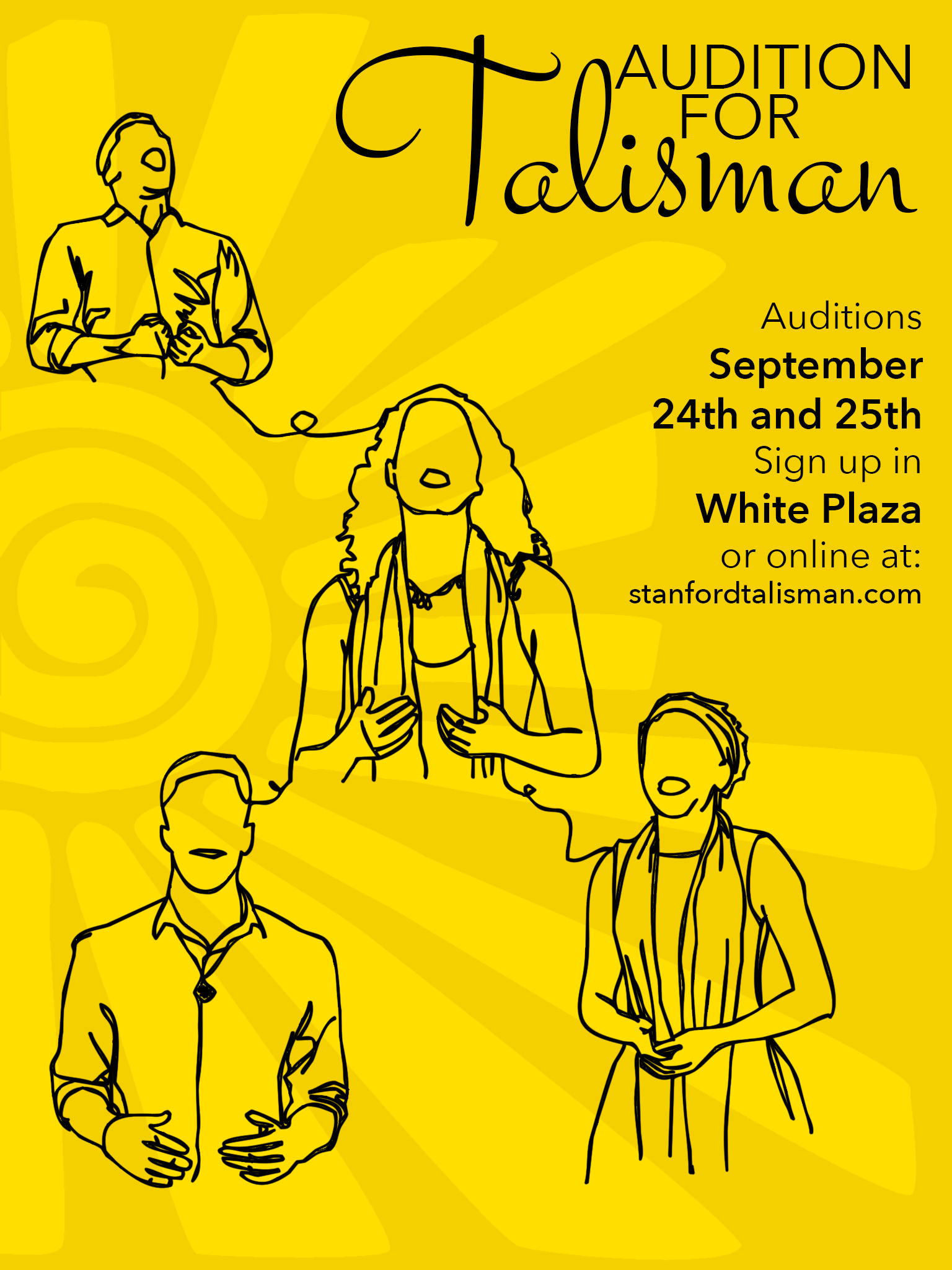
Any tips, criticism, suggestions? We want something that will POP on a bulletin board, that communicates the unified, “one voice”, the heartwarming sound that is Talisman. The sun in the background is our logo, I extended the arms to cover the page. The singers are members of our group but the faces are obscured because the “individual” is not the focus.
I like it.
The only change I’d suggest is the “Audition for Talisman” part.
Maybe make “Talisman” larger, with an easier to read font, and bring it farther down to separate it from the “Audition For” part.
And add a word or two to make it clear what exactly “Talisman” is. A band? Singing group? Don’t assume everyone knows.
Id probably adjust the placement of the illustrative elements slightly.
I would agree to specify that Talisman is Band Auditions.
Id also change on of the fonts, it looks like myriad pro, and thats a default. It just doesnt seem as pleasant to read.
If you really wanted it to pop, maybe try more bright colors under the illustration. Yellow is vibrant, and you have a shade of it and black. Maybe adding two more colors could help.
Thank you both @DocPixel and @Billyjeanplxiv !