Hey everyone,
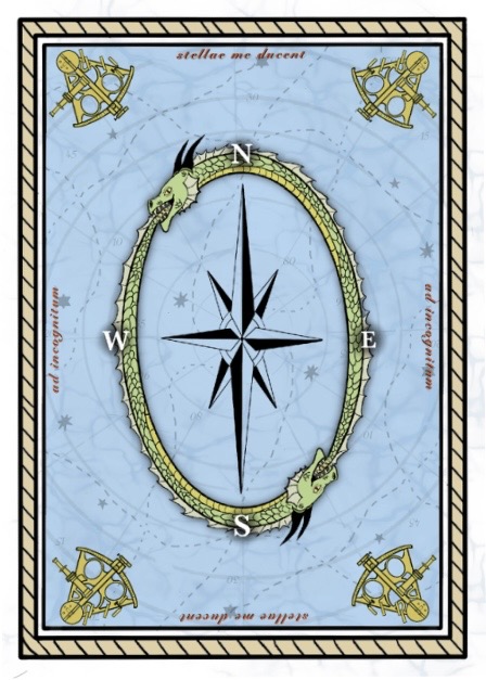
I’ve been enjoying learning the trade in school, the picture is a playing card back design that I made in procreate a while back. I tried to increase and decrease its sized before I had learned not to do that with a raster image, so I’m going back through and creating it in illustrator so that I can be sure the scale won’t be a problem. If anyone has any thoughts on the design or any tips, feel free!
Nitpicky things, as your art is your art.
The compass rose is squashed, making the NE,SE,NW,SW spikes in the wrong position. If you want to elongate, that’s fine, but fix the locations of those to the halfway point.
Think of something different to do with E,W,N,S letters. No cheesy drop shadow over or under your most interesting dragon element. (besides antique maps don’t use cheesy drop shadows  )
)
An antique sextant has the tube on the left side.
“rope” border is uneven (but maybe the bottom border is thicker on purpose?) and is a fairly amateurish representation. Practice something maybe along this line. Doesn’t have to be as machine perfect as the example, just something to study.

Maybe study some early maps to see the ink style used.
1 Like
Great work! You do a great job of using proximity and balance to get your design’s message across to the viewer without it looking too cluttered. I would agree that spacing out the compass a little more could help, as it currently looks a little stretched. I would also suggest using a different font for the North, East, South, West letters. This could help unify the compass with the red script on the sides. Otherwise this is very nicely done, great job!
This is a really nice direction, especially for a card back. I like the symmetry and the way the repeated elements create a consistent pattern without feeling too busy. Rebuilding it in Illustrator is definitely worth it for something like this since you’ll have much more flexibility with scaling and making small adjustments. I’d also experiment with slightly refining the spacing and alignment of the smaller details to make the pattern feel even more balanced. Nice work!