Hello - I am new to the forum. I was hoping to get some input into a project I am working on.
What fonts do designers believe are best for both print and digital media? I am working on a brand update for a client and wanted to know which modern and contemporary font they could use to work across their brand. Something un-serifed and clean with excellent legibility and accessibility for users is a must. There is just so many fonts to choose from around the standard well known options.
Your recommendations would be much appreciated please. TIA
Verdana and Georgia (a serif typeface) were designed specifically for screen use by Matthew Carter. Of course, that was over 20 years ago when computer displays were of much lower resolution. With today’s displays, I’m not really sure that differentiating between screen and print use is warranted. What works for one typically works for the other. I still stay away from typefaces with lots of picky little details for screen use, though — at least for text.
As B said, technical issues with the differences between the two have narrowed. It is far more important to consider brand consistency across all media.
Just adding to what I wrote, subpixel rendering technology has bumped up the apparent resolution for digital display type even higher. Apple and Microsoft handle it different — Microsoft’s rendering is a bit crisper and arguably slightly more readable, while Apple is more concerned with displaying the type more accurately. Each is different, but each has its advantages and disadvantages.
Computer display text has come a long ways over the past 20 or 30 years.
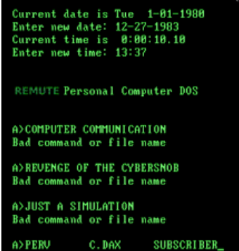
I didn’t mean that exact screen and there is no mention of DOS. Just a screen with white machine text on a dark background that gives me flashbacks to my old green and black monochrome first monitor. LOL.
It’s still very anachronistic and quite a turn off, actually.