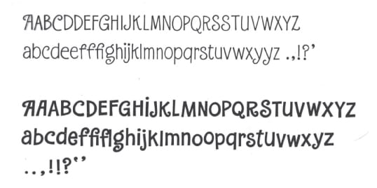
“Probably my first two typefaces,” Parkinson wrote of these, created for Halmark Cards in about 1965. “Designed and inked in maybe a week or two, photographed and made into two-inch negative film strips for a machine called the Photo Typopositor. These two were in the Hallmark font collection for decades.” He called them “Iduno and Iduno Fatface. I liked to imagine that when a Supervisor would ask a Card Designer what typeface was on their card, the designer would be obliged to answer….” (Parkinson Type Design)
Parkinson studied advertising design and painting at the California College of Arts and Crafts in Oakland, graduating in 1963. He was quickly hired by Hallmark Cards, working as a lettering artist. But a connection got him some freelance work: in 1971 he was brought in to work on issues of Rolling Stone magazine, which was then based in San Francisco, creating lettering and drawings. In 1977 the publisher asked him to make a new letterform logo for the cover; it was used until 2018, and then he worked on a “flatter” version that was used for four more years. The current logo retains much of his design, including what the magazine calls “the now-iconic elongated tail on the ‘R’.”


