A small thing I like about Affinity Publisher

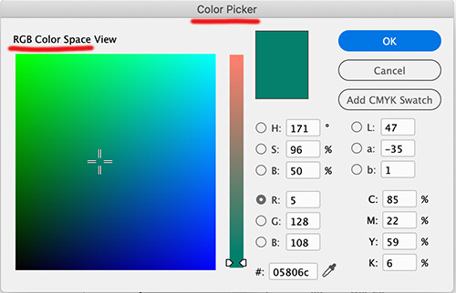
Adobe’s weirdly intransigent insistence on giving InDesign an RGB-only color picker drives me bonkers.

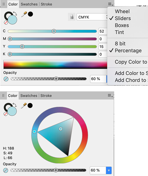
Affinity Publisher wisely gets it right — A default CMYK color picker that can easily toggle to RGB, RGB Hex, Lab, HSL and greyscale. Just as conveniently, the color picker also can toggle between different visual representations: wheels, sliders and bars.

1 Like

What do you mean an RGB colour picker?

InDesign’s Color Picker (no CMYK unless it’s entered manually)

image

Some of Affinity’s color selection options

image

I’m not sure what value a CMYK viewfinder would be on a RGB screen.
If you click the Circle between the LAB values the colour view changes to Lab Color Space View.

The LAB viewer would be far more accurate.

I can’t see a point to having a CMYK viewfinder, one simply inputs the cmyk values - or adds a cmyk swatch by clicking inside any of the CMYK values.

You get a tiny CMYK slider in Window>Color>Color

I see what you mean though - Affinity have tackled it differently.

There’s a good read here about it actually

The original post was a real “Wait, what?” moment for me, and then I realized why:
I never use the color picker.

I’m sure some might think that’s weird. Hell, maybe even I do, now that it’s occurred to me. Just so happens my typical color-spec workflow is entirely swatch based, with CMYK values and/or spot designations already known. I realize now, even in Illustrator, where I routinely call up the color picker by clicking the Tools panel color wells, I only ever use it to enter values in the fields, and frankly wouldn’t even know what space the color ramp is showing in any given instance. I never look at it. :flushed: Habits are a crazy thing.

1 Like

This is interesting and shows how differently people work.

It’s a rare situation where I’m working with a predefined set of colors or trying to match colors. Color choices, for me, are almost always based on feel and intuition, which involves visually shifting colors, tints, shades, saturation, etc., around until the composition of colors feels right to me.

This is impossible using InDesign’s color picker since there’s there’s not a good way to see the color choices and all the tints, shades and values associated with that color.

For example, let’s say I’ve decided on a certain red that I think will look good when paired with an ochre. The first red I pick doesn’t look quite right. It’s too dark but the hue is perfect, so I want it a little lighter without changing the hue. Or let’s say, I’ve set black type over a blue background, the visual balance of contrasts between the black and the blue isn’t right, so I need to shift that blue just a little to the left, while mixing in a bit of this and that, and reducing the saturation until it, again, feels just right.

I can’t do anything of these things visually in InDesign’s color picker because it doesn’t show things like shades, tints or values of colors. Instead, I’m looking at an RGB color space that has no visual relationship to what I need to see in order to fine tune the colors short of manually figuring it out and manually entering the CMYK percentages.

For example, in that instance where, based on how the layout looks, the red is just a bit too dark next to the ochre and I need a tint of that same color, I need to guess at dialing it back to a tint that’s, say, an 80% tint. In InDesign’s color picker, I need to figure out what 80% of each of the CMYK color are, then enter them manually. If it’s still too dark, I need to go through that process again or multiple times instead of seeing all the possibilities right in front of me. In other words, the color picker, for me, in InDesign is nearly useless.

Both Photoshop and Illustrator have CMYK color pickers that are a whole lot more intuitive since the color space view box shows tints and values of the color that’s selected. Only InDesign does it differently and in a way that seems more akin to how an engineer would choose colors than an artist.

When it comes to Affinity, they do it absolutely brilliantly. If I pick an initial violet to look good with an overall color scheme, I can visually adjust hues, values, shades, tints, saturations and color mixes of that red independently of one another to the point where it looks and feels just right. If I need to, I can also enter the colors manually. In other words, Affinity has thought through the problem from the position of how its users choose colors and provided them with nearly every option for doing so.
Go to Window>Colour and there should be three options one of them brings up a colour theme picker.

I really don’t use the colour picker at all. Might be niche enough request.

But you can always post in the Black Hole Adobe Feature Request site and see if you can get it upvoted.

It took me about five years to get footnotes to span columns.

And finally after about 10 years they are working on allowing a cell to split over pages/columns.

If Affinity works better for you, go for it.
Whatever works.

Yes, that’s part of the way there, but those functions (and more) should be integrated directly into the color picker and with more options regarding shades, tints and values.

I had just assumed everyone chose colors like I do, so it’s something of a surprise to me that this isn’t the case.

On this forum, I’ve always been a little puzzled when it comes to comments about matching colors and color accuracy because it’s not typically a big issue for me. There are times when I’m confined to using certain specified brand colors, but even there, I tend to shift shades and tints around to compensate for the effects adjacent colors have on how those colors are perceived.

I’ve never found myself in a situation where I’ve needed to precisely match color or had rigid color parameters I’ve needed to work within. I think I tend to approach graphic design more like illustrators approach their work and have always had jobs where this is possible.

Yeah, surely it’s circumstantial as much as it is rooted in work style. Many of my current habits are the result of designing primarily technical materials, which are often 100% type+vector graphics and destined for print in black-only, or black + spot color(s). The labels I design for the same client are almost all printed via a flexographic process, so again, spot colors. But even when I have color freedom now, I’m more inclined to adjust color value sliders than hunt across a picker. “I want less blue and more yellow” is a more typical mindset. Fortunately, there’s always more than one way to get it done.