I am new here so I apologize if I’m doing something wrong. I have a problem with a project and maybe someone could give me an advise or help me somehow. I’m working to a banner 120’’ x 94’’ and the people who will print it need Pantone + Color Bridge Coated or Pantone + Color Bridge Uncoated. I am a beginner in this field, just so you know, and I designed the banner using CMYK but I don’t know and I can’t understand how to create the colors for Pantone. I have only 2 solid colors, gradient and a picture. I’m using the last version of Adobe Illustrator and I have to give the .ai file or .eps or .pdf.
Thank you in advance and again I’m sorry if I’m doing something wrong here, I’ll learn everything I have to learn, you’re doing a great job here.
I’ve never heard of a printer asking for Pantone colors for a machine that is most likely a 4 color (or ,6,7 color) but essentially a cmyk color process.
I’ve been printing for nearly 13 years now (not as a wide format specialist however)and i’ve never requested my clients, or have had my vendors request of me, a Pantone designed piece.
Besides if you have a photo in place, there’s no way to accurately spot color a raster image.
You spoke to person on the phone or in person regarding this matter? or are you viewing print specs from a website?
We do have a wide-format/signage specialist in our midst (Print Driver) who may be able to shed more light on this situation.
With wide format banner printers, all the media is profiled on each machine by the media manufacturer (sometimes the printer manufacturer as well) to simulate Pantone Solid Coated colors to the best ability of the machine on the media. In order to use a canned profile for Pantone Solid Coated the swatches have to be applied.
BTW, the canned profiles are just a base. A lot of places do their own in-house tweeking to get them better, and many do their own custom matching to get critical colors spot-on. Or about 80% of them anyway.
That all said, we NEVER ask for Bridge colors.
Are you sure you heard that correctly?
What it may mean is that they want you to look at a bridge to see what a straight up CMYK profile will do to your colors and select the appropriate Pantone + color to get it right on a CMYK profiled press.
So with a bridge, the left side of the swatch page is the pantone color number, the right side is what it will look like when printed straight up CMYK. They may want you to use it in reverse, find the correct color on the right, and apply the Pantone to the left.
What country are you located? If one of the EU countries, this makes more sense. They use the Uncoated deck a lot more than the US, especially on fabrics.
Another BTW, not a lot of designers invest in a Bridge, though they should.
I’ve had some printers tell me to leave colors in PMS since the printer hardware / software will do a better job converting the color that Illustrator will (particularly on printers that print in more than 4 colors). That’s fine if you are, for example, dealing with a corporate color that’s specified as a PMS color. However, if you’re artwork is in 4CP, it doesn’t make a lot of sense to convert it over to PMS.
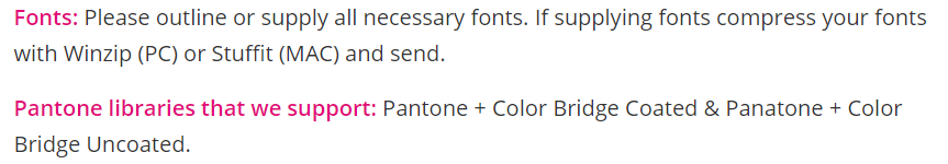
Thank you so much for your responses. Now that I read your messages I realize that maybe only if I use Pantone colors .. Pantone + Color Bridge Coated or Pantone + Color Bridge Uncoated is what they support. Attached you have a print screen from the part where they say this and the client is from the US and she will print it there.
Applying pantone colors in large format is usually only done when something is color-critical. There are usually, sometimes, maybe additional charges involved in confirming by eye and hand matching a specific spot color. While there’s a pretty darn good chance running a job on the profile for the machine/media will come close, if high-profile-company Marketing Police are involved, use the Pantone callouts.
Nothing can fill you with more horror than a Marketing Policeman with a Pantone swatch deck. Even better if the swatch deck is out of date.
It is always prudent to check a Bridge when running 4-color. Even though it is only a rough representation of what you might get on a straight up CMYK press, if something is totally crazy, best to know before spending your money.
Side note, this color mess is why you will often see in Brand Guidelines different Coated, Uncoated and CMYK values for the same color. Where you might think the coated and uncoated color would be the same number, oftentimes it is not. When dealing with Wide Format do not guess. Always ask the printer. We don’t deal with Uncoated too often in the US, but the EU does. It’s all media dependent over there.
As for actually applying colors from the onboard Bridge color library in the layout software, that is very very odd in my experience. But if that’s what the printer wants for accurate output, best to do it.
Thank you for all your messages, now I can say that I understand a little bit more about these Pantone colors. I talked with someone from the printing company and they said that only if there are specific PMS colors then the pantone must be applied in the file so I’m good for now.
Thanks!!