Did this for a local restaurant/bar for both print and social media purposes. How can I improve this advertisement? I get the middle colours are a bit ugly, what would you use?
and I get the art style of the crab is completely out of demographic, the client requested and approved it.
Are you a student? You posted in the student part of the forum, but you’re also saying this is a professional job.
You’re good to go if the client approves it and pays you. You might not be entirely happy with it, but the main goal is to do your best under the circumstances and get paid.
If you’re looking for a critique, I don’t know anything about the seafood bar, its personality, decor, or customers — consistency with the general brand is always important. However, the logo looks a bit more upscale than the fun-and-games martini-drinking lobster and wacky typefaces might indicate.
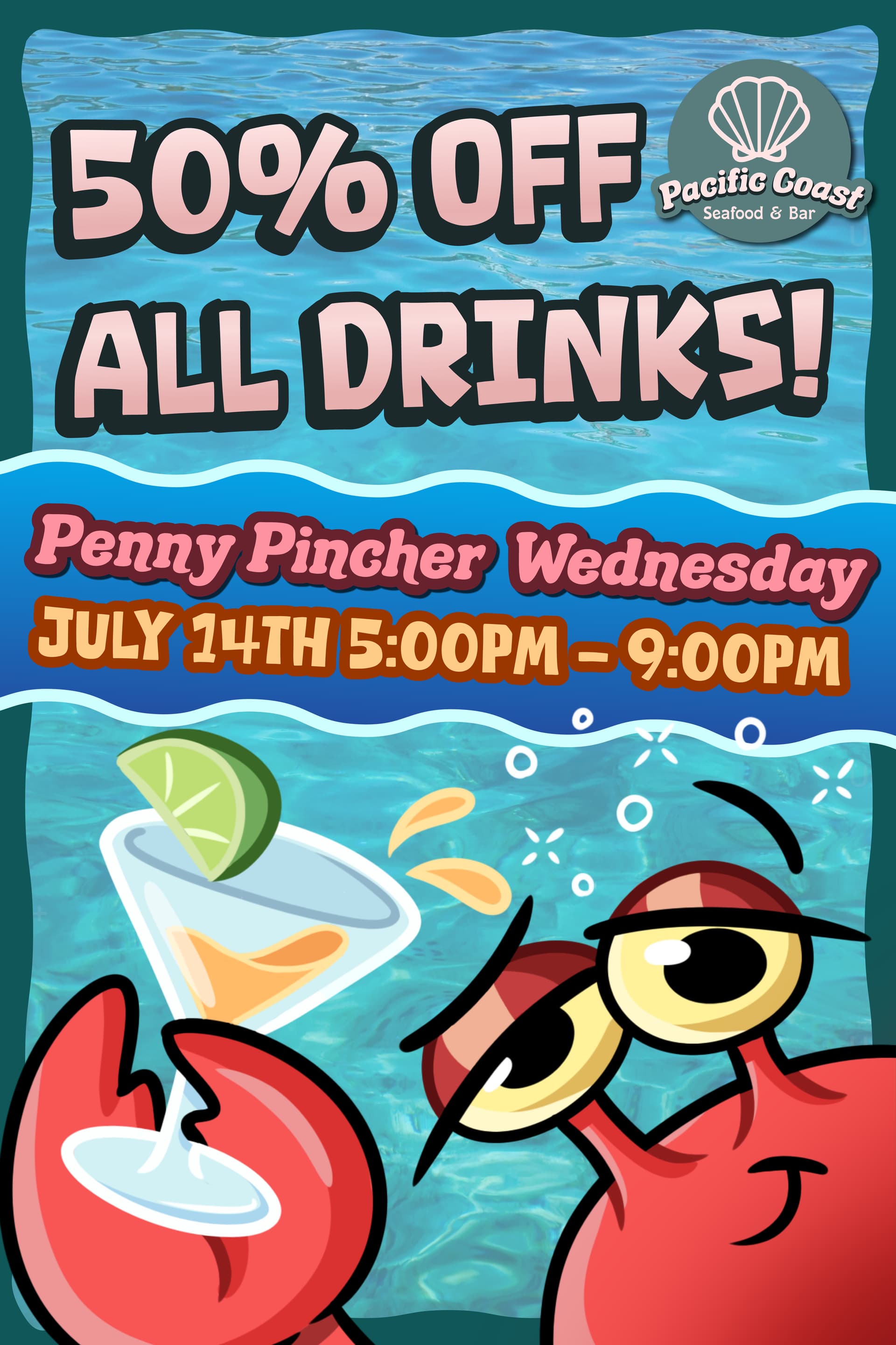
You have to go back to 2021 or go forward to 2027 for July 14 to be a Wednesday. So you either have a very forward-looking client or this is old work.
Either way, this makes me think of Bikini Bottom and Mr. Krabs.
More importantly, what cocktail is orange, garnished with a lime wedge, and served in a martini glass? Asking because it’s Friday, I am thirsty, and I dig cocktails.
Personally, I feel all ads should have a person in it looking at you. It’s 100% Must have.
At the top:
50% OFF
ALL DRINKS
Put a 21 year old attractive woman on there holding drinks. Since they asked for the crab dude, Have the crab on there with his claw around her like they’re buddies(Don’t need his whole body so if he gets cut off somehow that’s a-ok!). Put the other stuff down at the bottom smaller.
Include the address, web address, contact info and a QR Code at least 1 inch .
Putting border lines around text is unnecessary and only makes things more complex. Get rid of the borders, just make the background contrast with the text in white.
Woman gets the attention, double fisting drinks you know what;s up, 50% OFF who doesn’t want a deal? High contrast, easy to read.
The ad looks good! To improve the middle colors, you could try using softer shades like blue or green, which fit the seafood theme better. A gradient or light texture might also make it look nicer.
For the crab, even though the style doesn’t match the target audience, maybe making it a bit simpler or adjusting the design to fit the restaurant’s style could help. But if the client likes it, that’s what matters most!