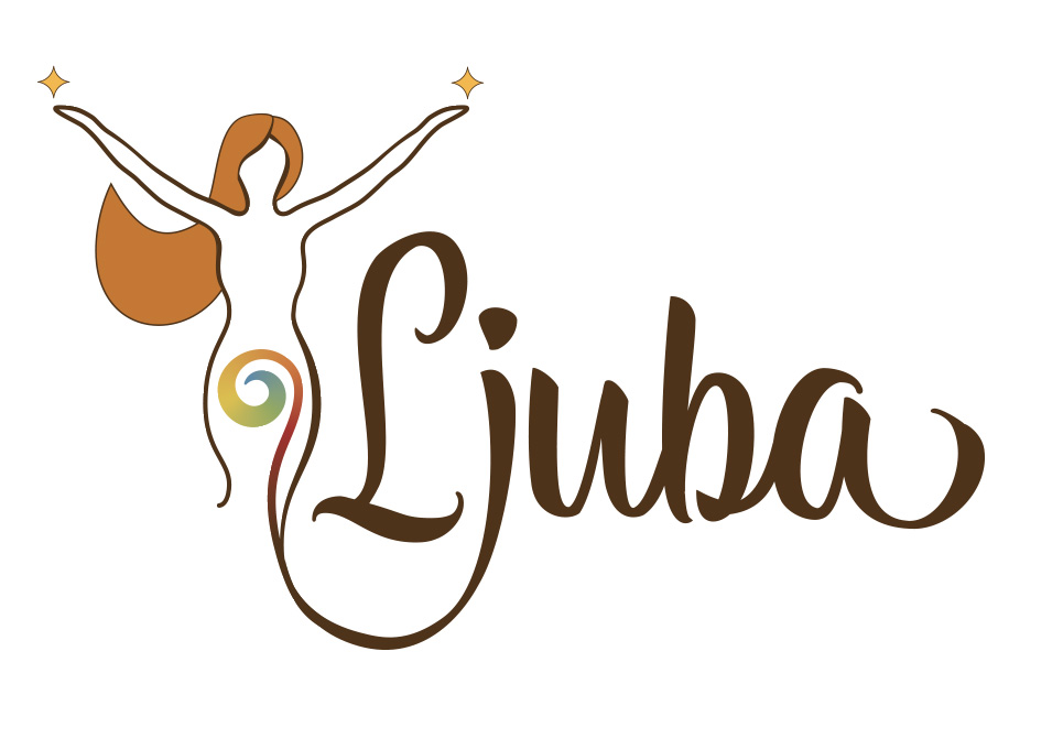
First of all, as a logo you have far too many colors and gradients going on there, in both your version and the additional art you’re trying to use as a background.
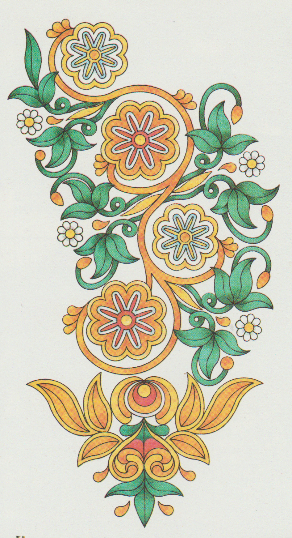
Second, look up the term “60s floral” and you’ll see that ain’t it.
Third, where did that art your client likes come from? Looks suspiciously like a modern “coloring book” image. Chances are if stock, you can’t use it in a logo. Chances also are it’s already proprietary or copyrighted and you either have to get permission from the artist or don’t use it.
top logo that swirl is, um, oddly placed, unless it has to do with fertility, pregnancy, contraception.
But if the client likes the style of the bottom one, you can mimic quite a bit without the gradients. The multiple outlines, the simple leaves, the swirls, etc. Don’t put it in the background, but mimic the style.
Hi PrintDriver,
Thanks for the feedback. The client wants it colourfull, but isn’t sure about specific colours only a ‘rainbow’-gradient in the logo. Art is a scan from some old embroidering pattern. I just tried it ‘as is’ to see if it makes sense as a background.
Second, look up the term “60s floral” and you’ll see that ain’t it.
The flower shapes are definitely sixties as the embroidering pattern is from the sixties.
There ws a creative explosion in the 1960s and there were many different styles being used. I imagine that you want something that means ‘60s’ to us now. Check out Mary Quant, Biba, Star Trek TOS, Sgt Pepper, Monkees, Grateful Dead album covers (they never really left the 60s), Bridget Riley, psychedelia.
Flat colours rather than gradients, lots of floral and lots of abstract around at the time.
Fonts - your script is too modern. Standard fonts would have been blobby traditional like Cooper Black, Souvenir or Goudy Heavyface through to newer sans serifs like Kabel and Gill Sans. A lot of the display fonts were art nouveau / Art Deco like Arnold Böcklin or Busorama. A lot were hand drawn and there are fonts around now that give you the look of these - Bell Bottom, Action Is, Lazybones, Groovin.
It’s a big target to hit so check out posters from the time - film, fashion, cars and music all give ideas.
Thanks, a lot of what you say makes sense, but I can’t alter the font or (letter)shapes, (logo is not my design, only digitized it from a drawing). That’s what makes it so difficult. I also looked (a lot) at sixties psychedelic artwork, concert posters, pop-art, logo’s and what not. A distinguished style is hard to determine, besides from the use of flowers, swirls, typography. and simplified/loose art-deco.
But discussing here helps me to try things, I’ll keep on going until I find the right feel.
There are huge differenced between the '60s and '70s (I lived through both of them). For that matter the late '60s had an entirely different look from the early '60s. The second half of the decade was a period of huge, unprecedented and explosive creativity where everything changed from hair styles to music. Even regional styles were completely different — the San Francisco look differed enormously from what was taking place in New York or London. There is no one style that says '60s, but there are certain looks that have come to be associated with that decade, and @StudioMonkey did a great job of mentioning them. Also look up Peter Max. To me, his artwork from that period has become what we think of as archetypical late '60s, even though his style was not especially common at the time.
Clients can be obstinate and typically know little about graphic design A rainbow gradient is a bad idea for aesthetic and practical reproduction reasons. Have you tried talking them out of this? Remember, logos can’t always be reproduced in color and if the logo depends on full color to work, it will cause constant problems for the client.
Complex colors were difficult and expensive to reproduce in the '60s, so everyday printed color tended to be flat, simple and clean. Four-color printing was much less common and primarily letterpress or rotogravure. Any kind of gradient had to be airbrushed, photographed, scanned and stripped, which wasn’t cheap. Flat colors were more easily reproduced since they only involved cutting film instead of airbrushing and drum scanned color separations. A great deal of what has come to look like 1960s style is simply the result of the technology used at the time. There were no color inkjet or laser printers. There were no computers (in design) or color monitors other than primitive color televisions that had barely just arrived. Any attempt at mimicking a 1960s look needs to consider what would have been possible, practical or common at the time.
Just because something existed in the '60s doesn’t mean that it’s typically associated with that time. Embroidery is many hundreds of years old. Most any decade is visually defined by what was new and temporarily trendy at the time — embroidery patterns from the '60s looked largely the same then as they did 40 years earlier or 40 years later. Embroidering blue jeans became popular during the later '60s — something associated with the whole San Francisco hippie thing — but even that was a traditional craft just used in a different way. If you want to see typical flower motifs from the 1960s, look up the Mike Douglas Show, which was a daytime television talkshow during the time. Its branding used typography and flower motifs that were quite common and typical of the time.
That’s too bad because that style of typography — although common during the early '60s — was on its way out and more closely identified with the 1950s. If authenticity is a consideration and you really are stuck with that typography, I would not look too much at the late '60s and definitely not the '70s, when that style of type had gone completely out of style. The earliest years of the '60s were a holdover from the '50s, so considering the typography you’re stuck with, I’d concentrate on looking at magazine ads from those years and watching the first couple of seasons of Mad Men to get a feel for the early '60s (or at least how people today remember it).
Thanks Just-B
A lot of useful information. Client has very specific idea’s. I already made several suggestions with different type and completely different shapes.
Still about the flowers in the embroidery patterns; I think at least they are somewhat similar of the style of John Alcorn.