1 Like
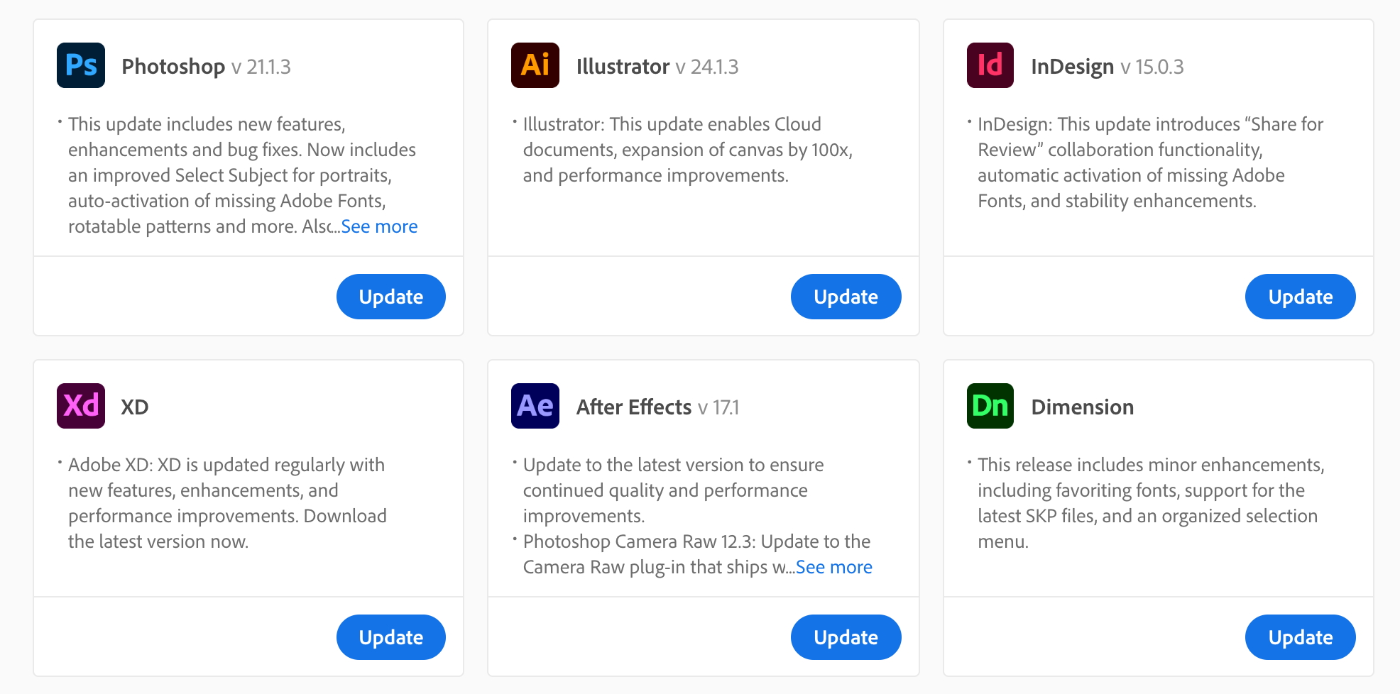
So it looks like they’ve decided to round all the corners? ![]()
I wonder if they’ll ever bring the outlier Acrobat and Media Encoder icons into conformity with everything else. Also, it seems the Creative Cloud icon still has sharp corners. Maybe Adobe’s website just hasn’t completely caught up with the changes yet.
Icons are not important to me. I hate that you can’t seem to change that scattered layout into a list format like it used to be. Too much visual garbage there.
Dreamweaver is purple now? ![]()
In ancient times purple was the colour for emperors and sorcery. It kinda fits.