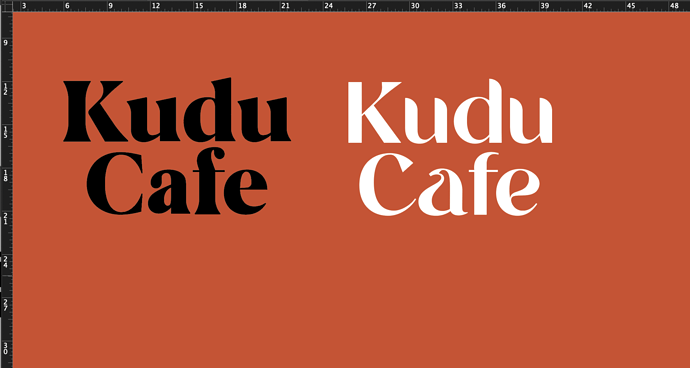
Hi all, jnr designer (and now cafe owner - scary). I’ve been looking for days (if not weeks) at fonts, I’ve narrowed it down to the following I like. Looking for feedback and suggestions
I like the left one but with the a of the right one.
the ‘f’ on the left looks steamy.
I also like the ‘e’ on the right.
I love the A on the right too, thanks for the feedback!!!
I much prefer the one on the right since it has a more interesting personality than the one on the left, which strikes me as rather ordinary and plain. On the right logo, I’d probably adjust the C a bit to reduce the space between it and the a.
However, I have no opinion about either being a good fit since I know nothing about your cafe.
2 Likes
Thanks for the feedback, much appreciated
