I’m hoping someone can advise me on this, I haven’t done a ton of print work.
I have this marketing art image for a client that they would like to use as a printed poster: Dropbox
The hero image is an iphone photo of an old, 4x6 image.
Question is- since this is a somewhat distressed/posterized usage of the image, do you think I could get away with blowing it up around 6x for use in a 24x36 design?
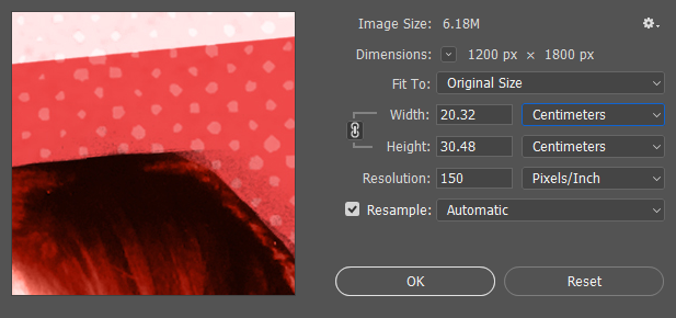
Open it in photoshop, then do Image > Image Size, and check its dimensions (pixels x pixels). Divide each of those by 300 and that gives you an idea of the optimum dimensions in inches. So if it was 900 pixels x 1500 pixels, the max size it would print well is 3"x5". Size it larger and the image degrades.
You can also divide each dimension by 100 to determine the absolute lowest quality to print at. So 900x1500 would be 9"x15" low quality print.
Well, that’s the question. It’s obviously not a good photo, but then it’s not supposed to be. Blow it up to the size you need, then take a look at it to see if it looks OK. It could be that the blurry, grainy, blown-out look could be used to get the perfect artistic effect. You might even play around with it in Photoshop to enhance those things.
I think a possible mistake you could make is trying to get the photo to look like a higher-quality photo than it is — that’s just not going to work. Instead, head the other direction and play up the distressed, grunginess it already has.
I think it needs to appear as though it’s distressed on purpose instead of it being an unfortunate inability to get a higher-quality, higher-resolution photo. Where your photos lies, I’m not sure since all I’ve seen is the small version you posted here.
Sometimes, to make things appear on purpose, it’s necessary to push them in that direction instead of letting them exist in that awkward middle ground of being neither here nor there.
For example, you might even apply a very coarse halftone pattern to it to make it seems like it was copied and enlarge from an old newspaper. There are lots of things you can do with bad photos in layouts that are intentionally made to look a bit crude, rough and distressed.
I really appreciate the feedback! I’ll push it further so it’s clearly a xerox/zine look. I was going for that but didn’t realize it was still in a middle area.