Basically my school signed up for a competition that takes place in Greece every year,every school in Greece can send their representatives along with their very own artwork for the poster competition,the topic is digital creation,here is a link showing the chosen poster from past competitions and here is what i have got so far,and just a quick reference on how it could look on a poster(we dont make the poster it self,just the art that goes on it),i would like to hear any advice and maybe any details to add.
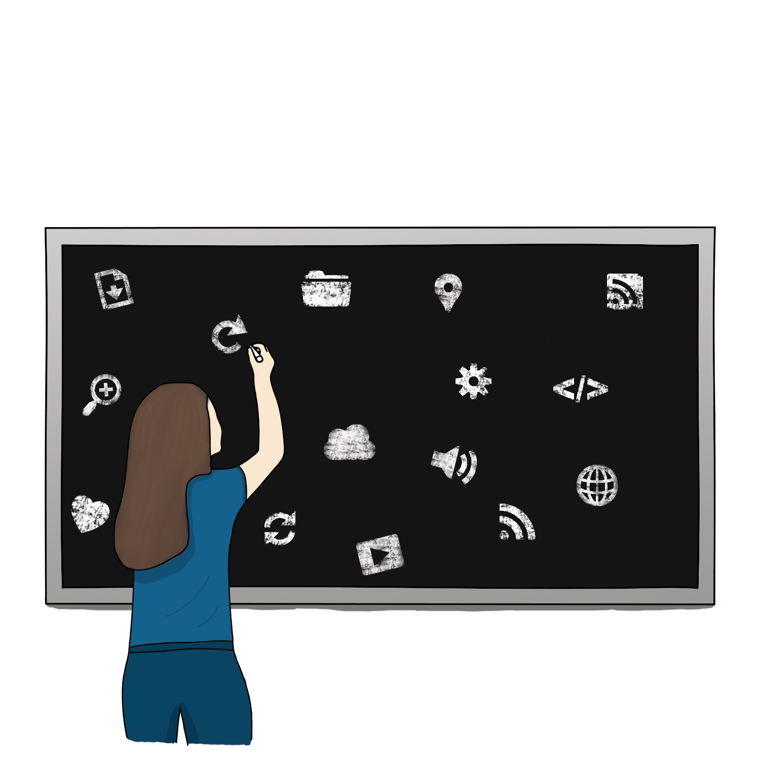

The art styles are causing a disconnect. You have what looks like a hand drawn character, and icons that don’t look hand drawn. I’d suggest that all aspects of the design be that hand drawn style.
Based on the other posters (from the provided link), I can see why you’re using the icons. You’ve already (i’m assuming) illustrated the female character. Why not for example, illustrate a “digital” mockup for a robot interface or something on the chalkboard–something related to “digital creation”?
Also, as a subtle hint on the chalkboard, create a new layer and paste ‘scribbles’ or ‘mistakes’ and then overlay, or lower the transparency to create an erased look–it’ll make the chalkboard look more chalky.
I agree with Sparrow. You need to match the style of the character with the icons. Those icons need to look hand drawn, and it would be better if they are connected somehow. They look like random icons in random positions. The image needs to tell a story. Also, I would add a left arm to her, otherwise she looks like she is missing an arm (what is she doing with her other arm? where is it?).
Thinking about the fact that this art is supposed to go on a poster, the blackboard seems a little limiting in terms of where the other elements will flow around the art. It also looks heavy. Maybe if she was drawing on a faded wall? or the blackboard is outlined? or the wall is outline? some kind of surface that could more easily blend with other design elements when being inserted in the poster.
If it’s about digital creation, the chalkboard is not that. If you had something conveying “digital” (a tablet), it would connect the theme with the image. You could then possibly utilize the screen of it to display the name of the competition, or some other text.
Also, this is a poster. Consider its use: it will be on a wall, needing to be seen from a distance to attract attention so that people will read it. Think about what needs to be large and eye catching to get make someone want to read it to get more information.
I don’t disagree with that. However, I’d argue the chalkboard doesn’t need to be “that”. The image on the chalkboard via digital mock-up of an application or user interface can imply “digital creation”. The use of the chalk board implies classroom/education. The two together may communicate the overall message quite nicely.
Thanks for sharing!