Don’t mean to sound crass - I know it’s for a female lawyer - with pink/purple
And here I go - the roman columns - the more I look at the top of it the more it looks like ovaries.
I know it’s stretching… but that’s connotations people can make.
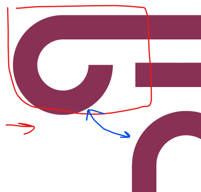
Don’t mean to sound crass - I know it’s for a female lawyer - with pink/purple
And here I go - the roman columns - the more I look at the top of it the more it looks like ovaries.
I know it’s stretching… but that’s connotations people can make.