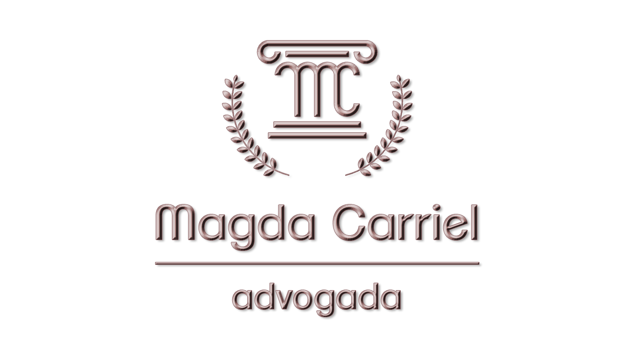
My wife is a lawyer and I designed a logo for her.
I didn’t want to use the classic Scales of Justice, as this is a widely adopted symbol for this purpose.
So, I decided to take a Roman column as a reference (we are Brazilians and our Law is based on Roman Law) and make a stylization based on my wife’s initials, “M” and “C”.
I tried to use rounded shapes to make the logo more feminine. I also adopted a tone close to pink, in an attempt to cause greater identification in women, who are a target audience. To bring a some glamor and seriousness, I chose the metallic look.
For the name and designation, which would come alongside or below the logo, the font would be something like ClementePDai-Regular.
Please I will be grateful if I can get some feedback.
I’d say there’s too much going on. trying to fit too many ideas in. I’d lose the laurel wreath. The column say Roman antiquity on its own. Definitely lose th embossed version. Far more successful as a flat graphic.
I also think you could refine the mc a bit further and lose the first curve off the top left. I think it will hint at the column fluting with just the three and in doing do make the monogram more legible.
Overall with a bit of work, I think it could work pretty well. Simplify.
The lowercase r and e are a bit odd in that font. The shoulder of the r feels truncated at an uncomfortable angle and the angle and weight of the crossbar on the e is off too. The stem of the lowercase a is also clunky. There are many fonts similar to this which are much better drawn.
Sprout’s view mirrors my own, so I won’t repeat what he said.
However, to emphasize a few points, the column idea could work if you refine it.
Absolutely put aside the pinkish, embossed version and never think of it again except as an example of what not to do.
The typeface you’ve chosen is less than ideal. In addition to being a bit peculiar, a sans-serif typeface is a wrong choice if you want to convey a sense of Roman antiquity. If I were you, I’d use a classic serif typeface and set it in caps, as the Romans did. I know you tried to match the type style with the column, but in this case, even though it sort of matches, it looks wrong.
I disagree that rounded shapes are inherently feminine — especially when paired with the sans-serif typeface you’ve chosen, which has more of a wonky masculine quality. Again, I’d choose a classic serif type style.
One more thing - go with purple instead of pink.
Pink can alienate - where purple will give a sense of royaltyish and also appeal to women, if that’s the goal.
First of all, thank you all so much for your support.
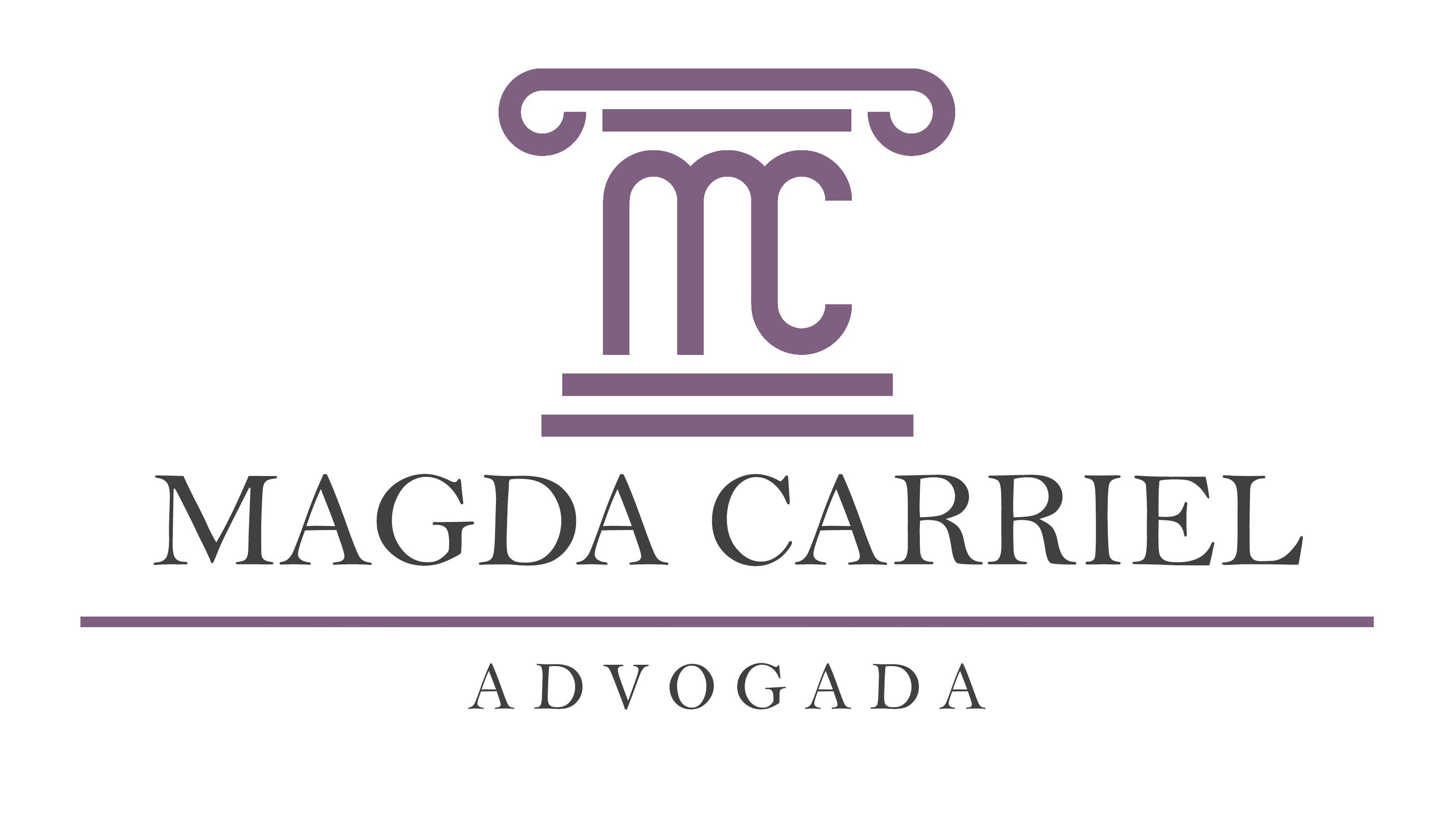
Based on all that has been said, I made some changes to the image, which you can check out below.
In addition, here are some comments on the tips that were given.
I agree with you both, so I decided to take the laurel wreath and keep the column.
When I first drew it, my intention was to make the monogram as symmetrical as possible, so I thought the first curve was necessary. Now that I took it off I think the result is a more compressed monogram and I like how it turned out.
Considering these points, I changed this font for a serif, in capital letters. However, I tried to avoid bold and strong lettering. Do you think it worked better?
Thanks for the advice regarding color feel. I tried to change the hue to purple, as you suggested.
Now, I’m curious about this subject. Is the problem with the metallic effect due to the quality of the prints, or the effect itself? For example, how about using this effect only in specific cases, like a portfolio cover or a business card?
Unless the type in question is a large art head on a poster, magazine, or something along those lines, decorating the type is generally a bad idea.
For that matter, decoration itself is usually a bad idea since it’s typically an attempt to decorate one’s way out of a more fundamental design problem. As the maxim goes, less is (usually) more. The beveled effect is also an imitation of three dimensions, and imitation is, once again, typically a bad idea.
Brazilian graphic design can be very colorful, which I really love. However, pink is a weird color for typography, and isn’t very colorful anyway. It’s just sort of blaaaah.
You wanted to avoid the stereotypical scales of justice (great decision), but then you fell right back into a stereotype by equating pink with femininity. Yes, pink can be associated with little girls, but for an attorney hired to help people with important legal problems, a girlish pink sends the wrong message. I understand your reasoning for wanting to appeal to potential women clients, but the law is serious business and there are better ways to convey the message than coloring the logo pink.
There’s also the matter of legibility and printability. I think you already know the decorative effect makes it less legible since you mentioned only using it in larger sizes, but to a lesser degree, the problem is still there no matter the size.
Finally, the beveled pink letters look gimmicky, which isn’t usually a desirable quality — especially for an attorney where solid, no-nonsense professionalism and expertise are valued traits.
You need to decide if it’s the column or the initials you want as the icon - having 2 in 1 is distracting and too many elements.
You have
Column
Initials
Name
Line
Depends on the color of the pink maybe? https://www.thinkpinklaw.com/
That came up in a web search of pink and law for me, LOL and they are almost local (well, within 100 miles.)
I know. I’m sorry. I just copy pasted parts inside the png. I couldn’t resist. Images are simply way clearer than my text. I deleted it. (too late for editing) What was the reason to write it in the rules by the way?
Do not take work posted for critique and redo it. If your critique is difficult to explain in words, a supporting sketch or example to clarify your words is acceptable. Forum Rules
More distance between column and name and get rid of the line between name and profession. If you want to you can give the color more saturation while keeping it on the dark side. Maybe move mc slightly to the right and the columns foot slightly to the left so everything looks centered. I know that it already is.
You can use the colored part without the rest for merch and stuff.
I just don’t like the MC in the column - I think it looks weak. It’s not subtle, it’s not a hidden factor that one spots later. It’s too much detail for the column, in my opinion.
If it was more subtle and hidden a bit more within the column as a surprise find then I think it would better. Either subtly done or remove it, that’s just my opinion.
I don’t like it - but if you do then great.
The thin lines of the font ADVOGADA might be problematic at smaller sizes or when reveresed out - especially if getting embossed or anything like that.
I meant to suggest rounding the strokes, as below., not just rounding the corners of the strokes. Whether it would make much difference or not, I don’t know. I think it boils down to a matter of opinion.
Another subjective opinion is that the spacing between the column and two lines of type is too much. If it were me, I’d move everything a bit closer together.
An even more subjective opinion would be to close up the counter on the C even more than you’ve done. This, I think, could help make the composition look more like a column and make the MC a little more of a surprise when it was seen.
One thing that’s much less subjective would be to compensate for the optical illusion that causes the bottom of the C in the column to look shorter than the bottom strokes of the M. The tops and bottoms of rounded letters always need to be slightly taller and longer than their squared-off counterparts. This compensation is called an overshoot. By the way, this optical illusion problem likely goes away if you round the strokes as I suggested that you consider.
Perhaps the reason some don’t care for the MC in the column is because it’s too in-your-face, as suggested. Perhaps consider adding some additional details (I know, makes the whole thing busier, but i tried it and it looks pretty good to me)
A small preview, so you know what I mean without posting the entirety of my personal play-editing:
I also experimented with closing the gap in the C to hide it a little bit, and adding curved gaps to the bottom of the M to close those off a little bit as well. Together, these additional little details bring out the “column”-ness of it more than the MC