Hi, I am a very new graphic design student.
I have been asked to design a flier advertising a conference for Agideas.
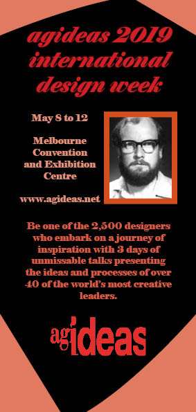
I cannot change the logo, the photo had to be included and I have to use the text provided.
A contemporary, modern look was requested.
Any feedback would be appreciated.
Thank you for your reply.
Unfortunately the logo is really like that.
I have no idea who the person in the photo is, was just told I had to use the photo and I can only use the copy provided.
I did try and find out (for my own interest who he was) but no other information is allowed.
This is the student section of the forum, so I’m assuming this is a class project.
Once out of school, there are times when it’s necessary to diplomatically point out problems when clients ask for things that make no sense or would be counterproductive. A mystery portrait of someone on a flyer would be one of those times since it will serve no purpose other than to confuse people.
Did you stretch out the type on the one side or is that the way the typeface looks? Either way, it strikes me as interfering with readability.
The typefaces you’ve chosen and the way you have used them don’t really have the modern and contemporary look you’re trying to achieve. If I were you, I’d be a little more daring with how some of the typography is used.
Thank you for your input. You are correct this is for a school assignment. I will try some different typefaces, great advice. Really appreciate your help.
This photo has made the rounds here before.
Did they tell you HOW you had to use the photo?
Because I was a jerk in design class, I’d use it, but not as an inset photo, and certainly not framed and calling attention to itself.
In the vein of what Just-B was saying, those fonts are simply not modern.
Google “modern fonts” “new fonts” etc and look at some nice sans serif fonts. Since it’s a school project you can probably use a free fonts site since you aren’t selling your work. That might show your prof that you’re taking some initiative.