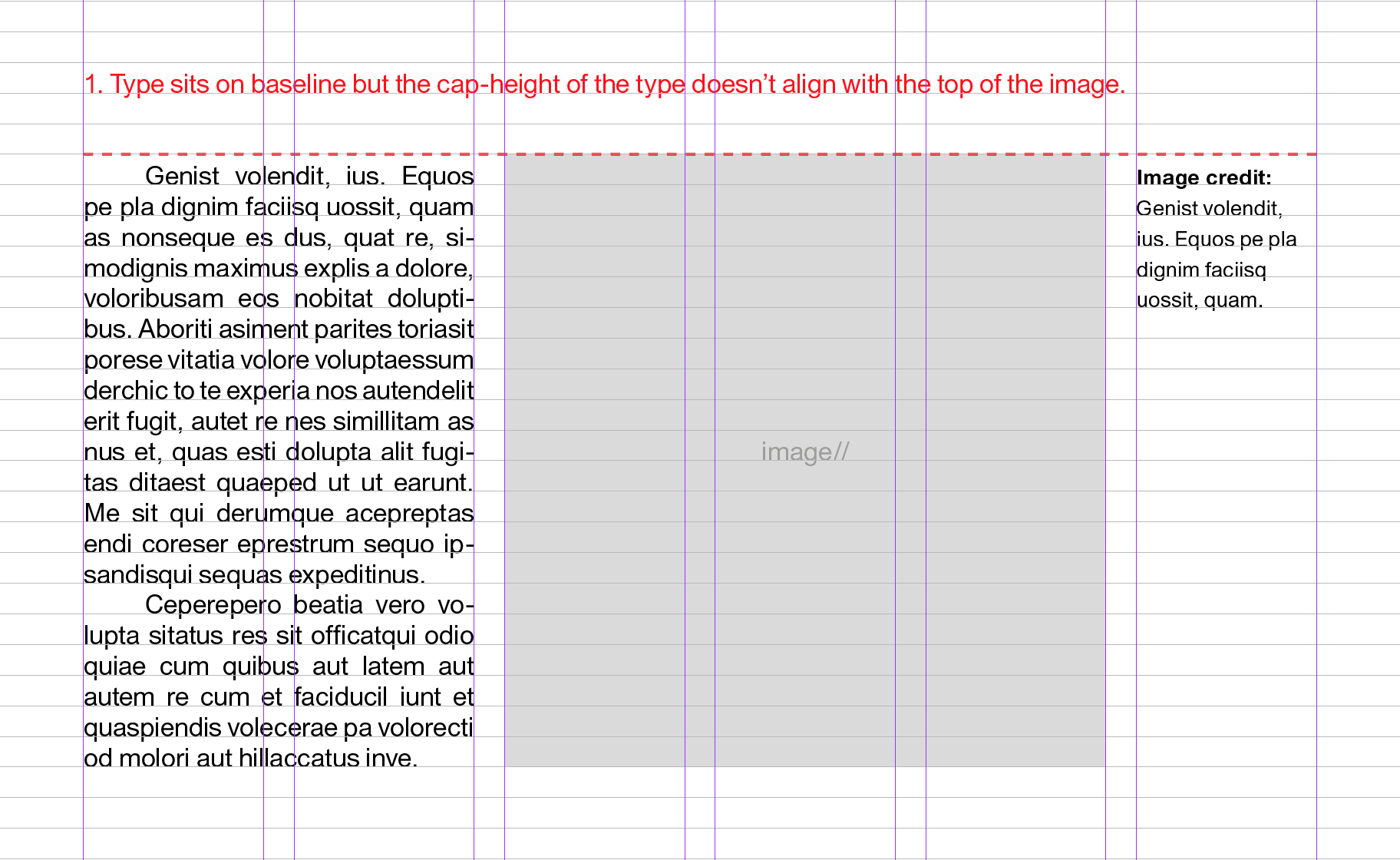
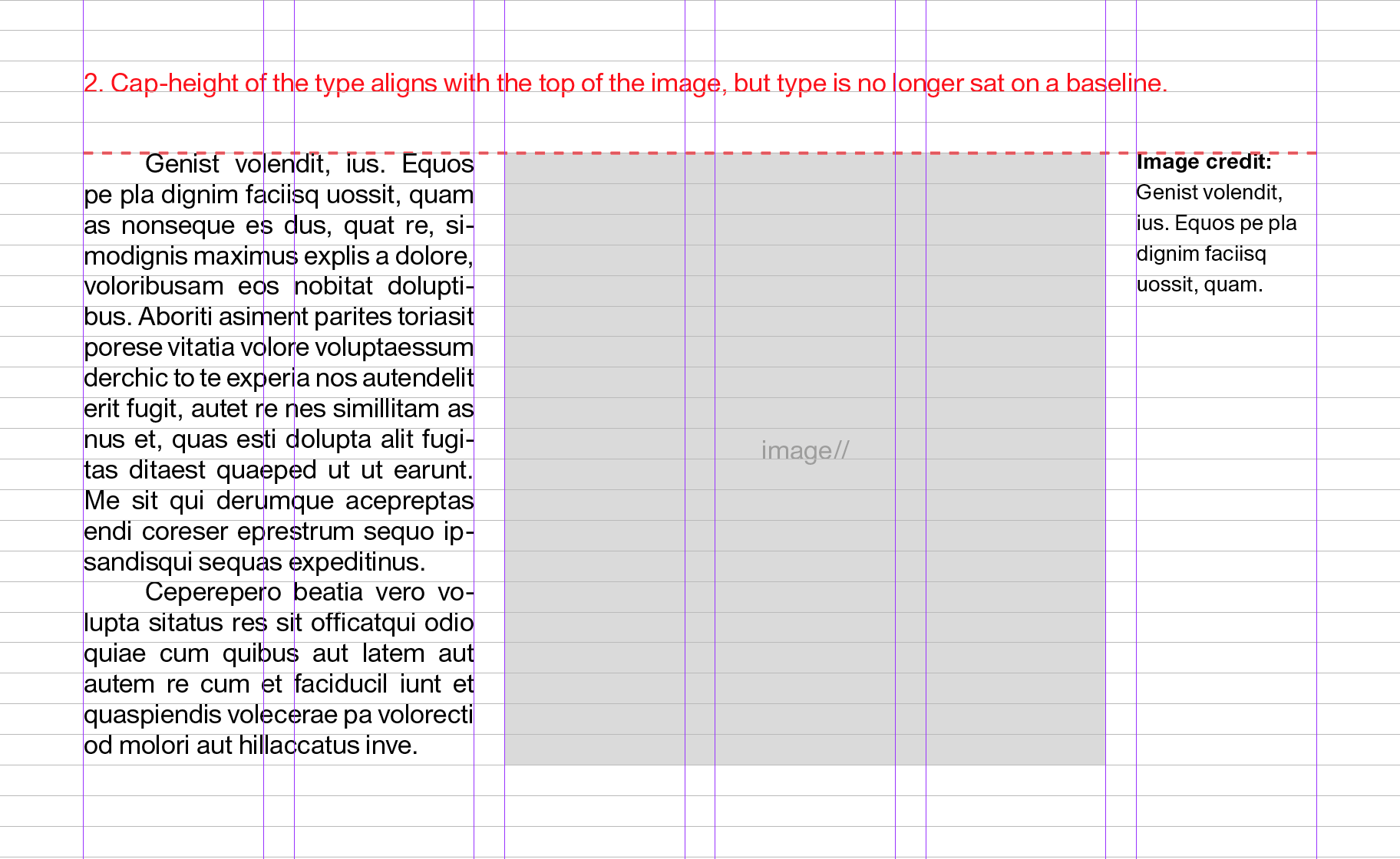
When typesetting copy next to other elements on a page — i.e. images — is it best practice to align the top of the image frame with the cap height of the type next to it?
The trouble is, if your type is sat on a baseline grid then this isn’t really possible (see images).
It’s something i’ve wrestled with for a while. Be interested to hear your thoughts.
There is no right or wrong best practices answer to your question. It depends on a combination of what looks best for the publication in question and what’s most efficient.
I tend not to use baseline grids since they make the fine-tuning of object placement more difficult for those elements that don’t quite look right when locked to a baseline grid built around, for example, the body copy. On the other hand, for publications, like books and newspapers, a baseline grids can ensure things line up in an orderly way that doesn’t require time-consuming placement by paginators. Some periodical publications resort to developing more complicated baseline grids and workaround styles that straddle the difference between flexibility and grid adherence.
If I’m designing a one-off brochure, there are rarely instances where adhering to a baseline grid is preferable to me just aligning the elements manually in whatever way I think works best. If I still worked at a daily newspaper, where every second counts toward meeting hard deadlines, baseline grids might ensure orderliness, save lots of time and eliminate inconsistencies. If I worked at a magazine that depended on lots of freeform style decisions, a rigid baseline might get in the way. If I worked at a scientific journal where visual interest was clearly secondary to the words, a baseline grid could be very helpful. It really depends on all the variables associated with the project — there are many pros and cons either way.
I work in the display text industry (think descriptive panels in museum exhibits or national parks.) Alignment is always with the top of the text, which fits in with Just B’s parameters. All of this stuff is one-off. There is no need for a baseline grid.
I often find that the top of the text needs to be a little below the top of a picture next to it. It is true, sometimes it looks better aligned and sometimes it looks better a little below.
Also - and I know it’s only placeholder text - if you need to use Hyphenation in a column of text, either the column is too narrow or the text is too big. Only use Hyphenation in extreme circumstances.
I go with the first approach and put everything on the baseline. If you go with the second approach, you’ll run into trouble if you put a caption under the image – unless you put a whole line between the image and caption which would probably be too much.