I’ve been designing responsive websites for a while and until now, I feel like I’ve been kind of ‘winging it’ when it comes to responsive grids. And there are a couple of things I have questions about:
-
For desktop, I usually use a 12 col grid with 30px gutter, 375px margin which gives me 70px column width and a content area of 1170px, but I am unsure what the are rules for breaking down to tablet and mobile sizes. How do I calculate what the gutters, margins, etc should be for mobile and tablet? Or do I just do it by what looks good?
-
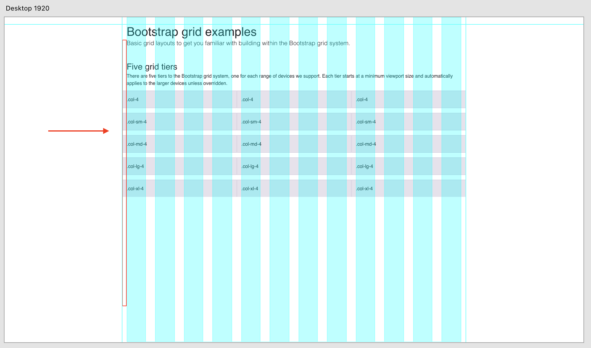
In the example below I found recently - it shows that the content goes outside the grid with a bit of a border. This broke my brain as I have always understood that the content stays within the grid. Can anyone explain why it’s out of the content area here and which is the right way - inside or outside?
Or does none of this matter so much and I can just do what I want? 