The following is the exercise:
I studied the Amazon, Google Drive and LG logo for the first question and thought the LG logo needed to be redesigned it.
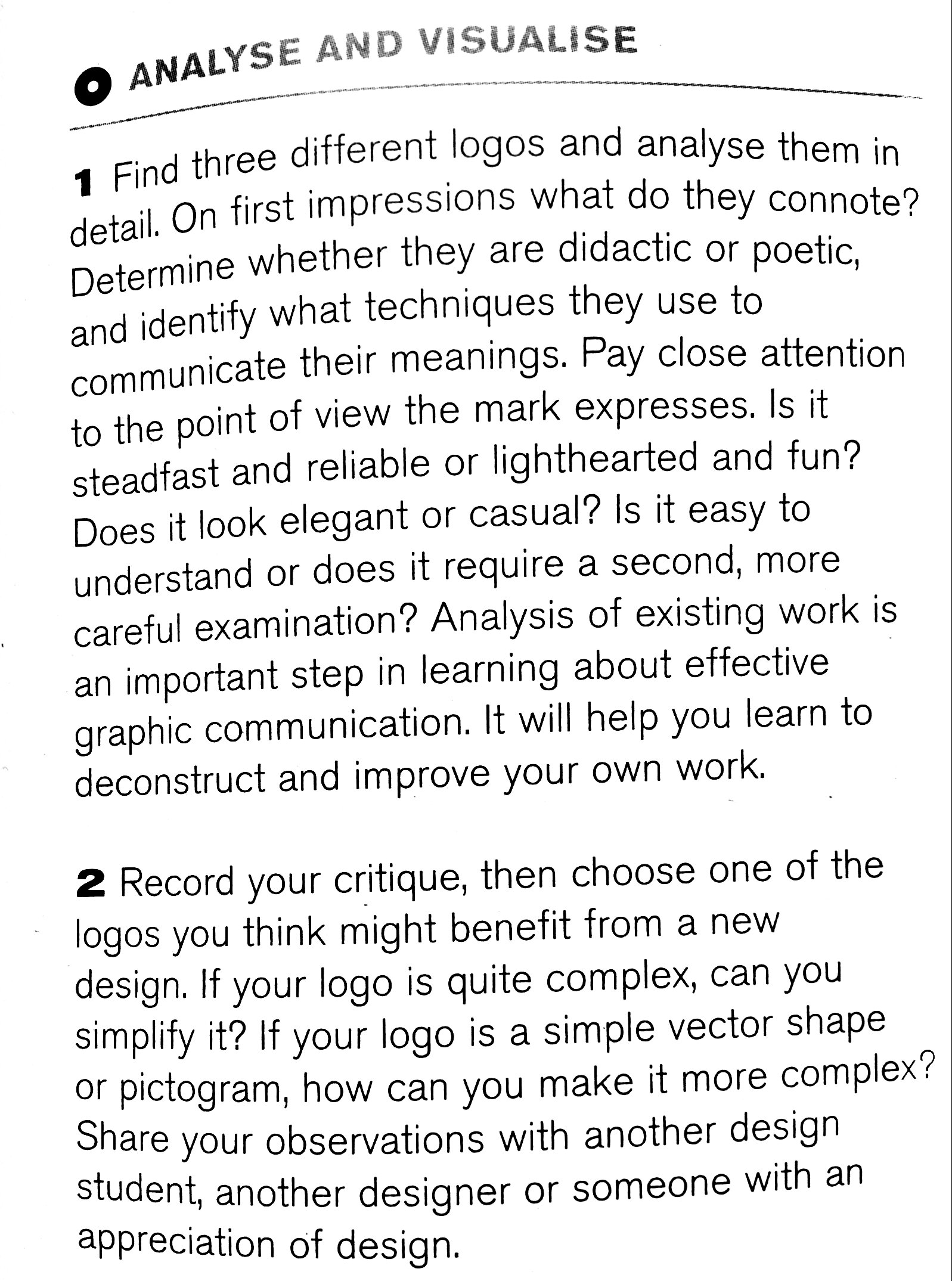
The logo seemed friendly due to the human face and the color. It also seemed trustworthy and formal due to the sans serif font. Only one eye on the face made it seem a bit weird. Anyway, here are a few of the designs I came up with:
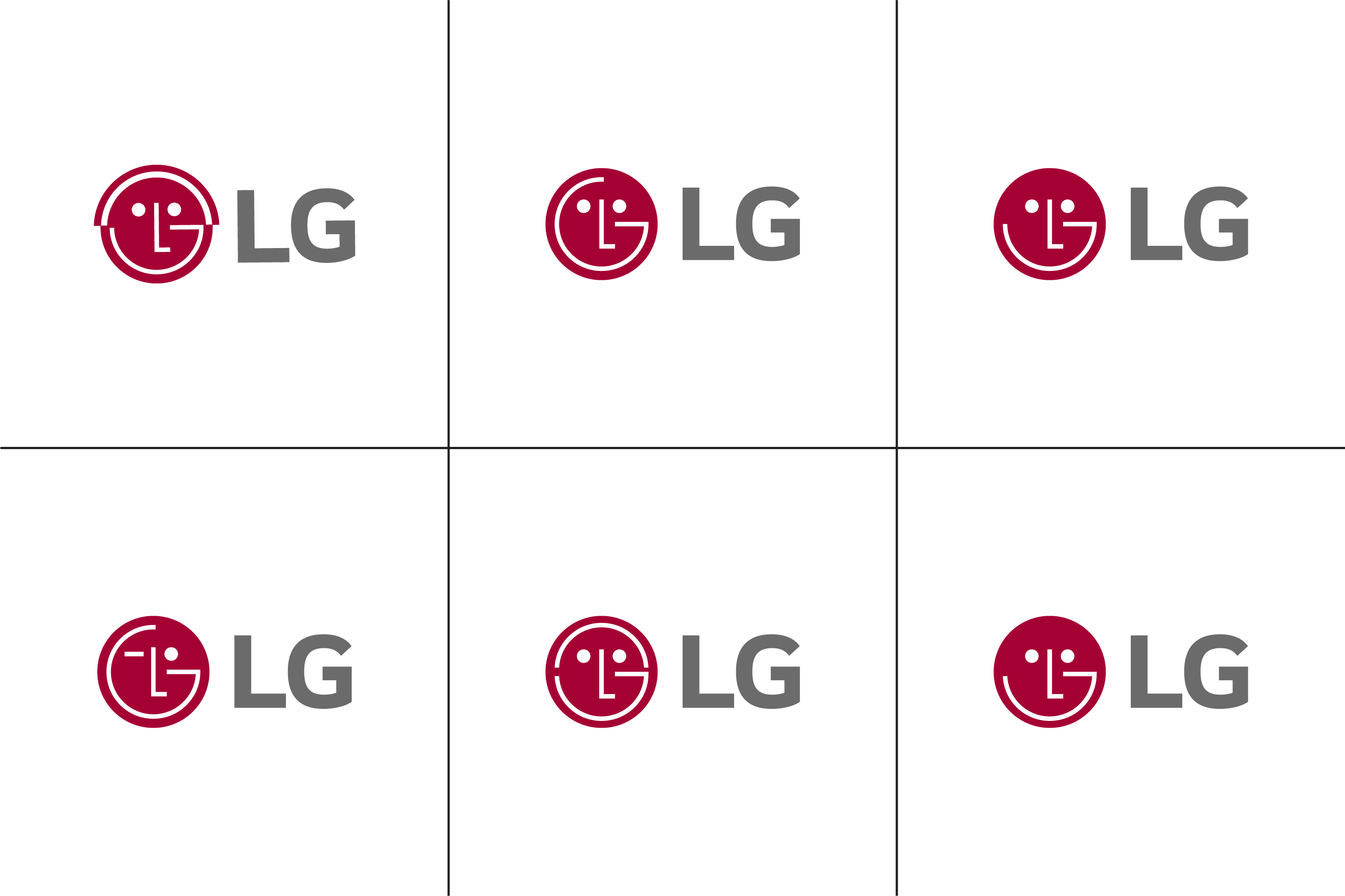
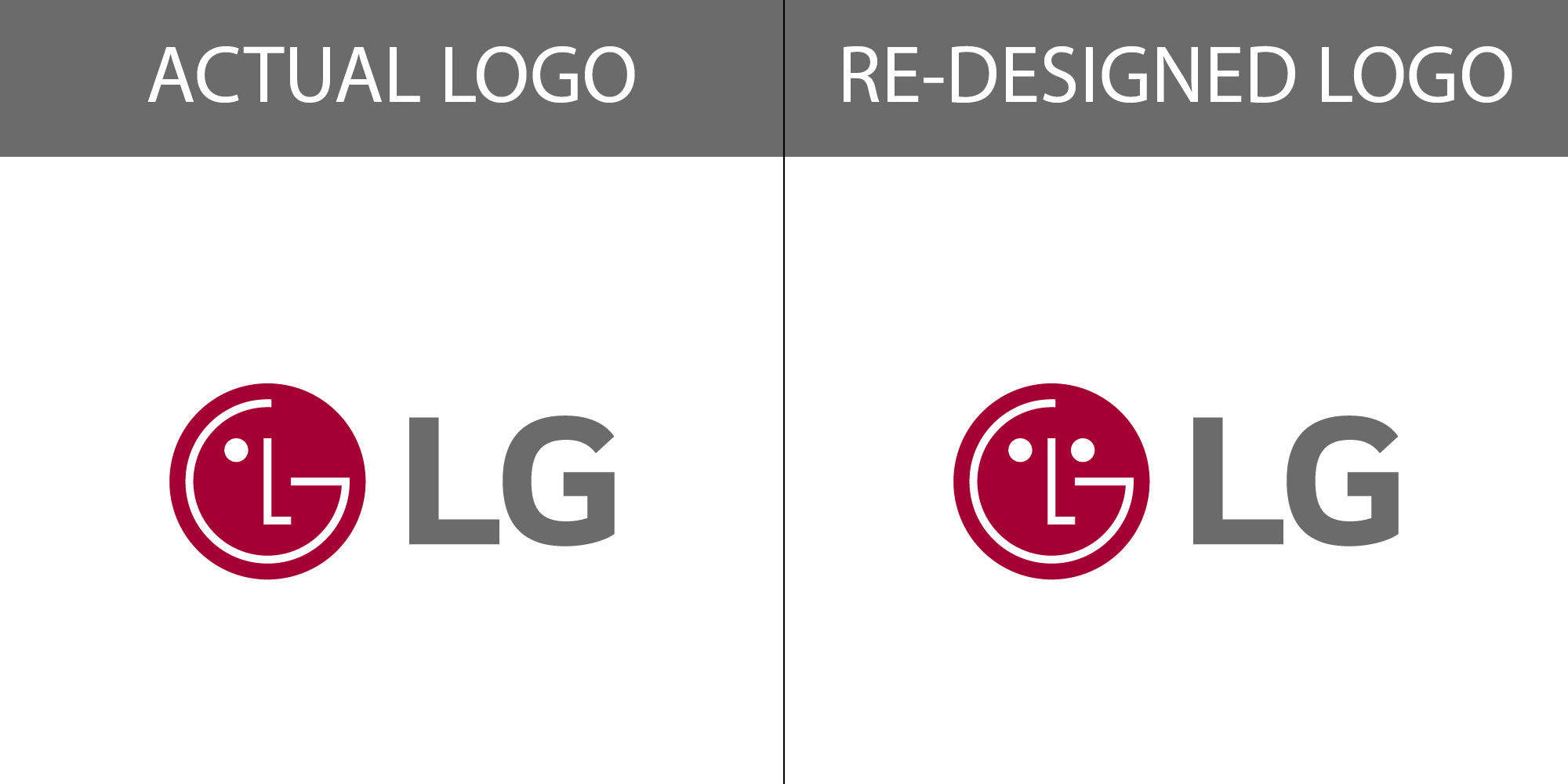
Here’s the actual logo compared to the new one I chose:
I chose this one because the L and G in the mark remained unchanged in this.
Since the second question implied to seek the opinion of people “with an appreciation of design.”
I posted it here.
Thanks to everyone in advance.
3 Likes
I’ve never understood the logic behind the LG logo. I like your two-eyed redo better for the simple reason it doesn’t leave me wondering how their current logo lost its eye.
4 Likes
I wouldn’t call any of these a redesign. A redesign is taking the original design and going in a completely different direction, IMO.
The whole point of the exercise (IMO again) is to make you “solve” the issue of how to brand those companies.
2 Likes
I’d have to agree. The only change is one added white dot. Otherwise, they look identical.
1 Like
When critiquing this kind of thing, I think it’s important to remember that school assignments don’t necessarily match up to real-world assignments.
A real world creative brief that stemmed from a client request would never say something like “Determine whether they are didactic or poetic.” Reading through the instructor’s brief, it seems the main purpose of the assignment is not so much a logo redesign as it is an assignment to help teach the students how to analyze a logo and to deconstruct the processes and thoughts that might have gone into its creation.
I wasn’t in the class, of course, so I’m unsure exactly what the instructor wants, but I don’t necessarily read the brief as a request for a ground-up redesign. Instead, I see it as an assignment requiring a careful analysis of a logo and a well-reasoned modification to improve the logo, which could entail a significant redo or the addition of, in this case, a single dot.
2 Likes
That and some of the “redesigns” (modifications) remove or change the “G” in the face so that it is no longer a G.
1 Like
In my point of view, it needs improvement to redesign… but nice effort
He’s actually smiling and winking, thats why there isn’t a second eye. Still, pretty ugly logo especially for a sister company of Philips.