Ok, so I consolidated under ‘Branding’.
The overall look is excellent. It has a top-notch professional look, but delving down into the details reveals flaws, questionable decisions, and practical issues that you haven’t sufficiently considered.
My MFA is in publication design and typography. I’ve spent 40 years in various roles designing publications of one sort or another and art directing other designers. With that in mind, I’m going to dive down into the weeds. This isn’t because your work is bad. Instead, it’s quite the opposite — it’s so good on one level that it warrants jumping down to the next.
If this were an actual publication, and if I were the design director, here are the down-in-the-weeds concerns that I’d bring up.
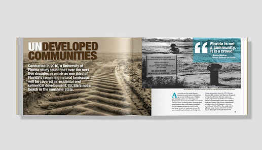
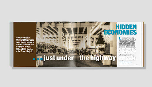
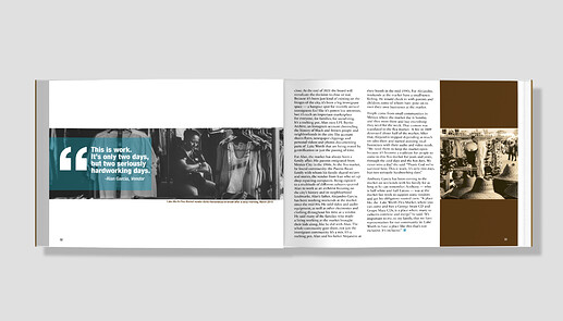
Brown text? There’s nothing inherently wrong with brown text, but in 4-color process offset printing, it will create a registration problem. In small blocks of copy, with excellent printing, text colored with multiple passes of process colors can work. However, it’s just not a good idea with body copy because the registration problem affects the very heart of the publication — the written story. In addition to the registration issue, the text won’t be composed of solid colors. It will most likely be comprised of 150-lpi (or better) halftone rosettes or stochastic dots, which will interfere with the visual integrity of the glyphs. If printed digitally, the details and terminology would be different. However, the problem would still be the same — extremely tight registration over the entire book on the most important element in the book — the body text. The only way I’d ever let colored body copy go to press would be in those instances where the budget allowed for a 5th spot color to print the text.
Typeface. I like the body text face, but probably not for an entire book. For short passages or a brochure, it’s fine. For a whole book or magazine, where the primary purpose of the design is to provide context that enhances the story, condensed, sans-serif type is just too tiring to read for a length of time. Some publications are meant to be looked at and skimmed through, while others are designed for serious reading. With as much body copy as this publication has, the text needs to be highly readable, and condensed type is less readable than non-condensed type. In addition, there’s the problem of contrast: dark brown on light brown might look great, but the decreased contrast, again, is at the expense of some readability.
Reversed (white) type. There’s nothing wrong with small blurbs of reversed type, but they create registration issues that should be considered and evaluated. In this particular case, you’ve reversed cutlines and page numbers out of a light background, which makes them fade into the background and compromises their ability to be seen and read.
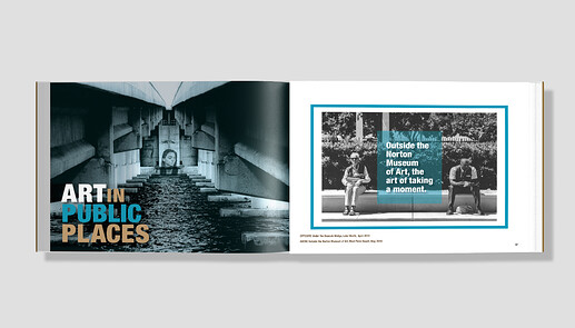
Grid alignment. You’ve done a good job aligning edges and adhering to a grid. However, it’s uneven at the bottom of the pages in some places. For example, the large ART in PUBLIC PLACES headline has a baseline awkwardly between the bottom of the body text and the page numbers.
Headlines. I don’t know the nature of the publication, but it seems to be a magazine. At first glance, I’m having trouble deciding which is the first spread of the story. You have large headlines on every spread. Visually, this looks nice, but the large, subsequent headlines compromise the story’s layout hierarchy.
Entry points. Unless this publication is meant almost exclusively for reading, like a novel (which it isn’t), you might pay more attention to people’s tendency to skim. They’ll look at photos first, then headlines, then subheads, callouts, and cutlines of various sorts. The purpose of all these sorts of things is to provide context and elicit interest to draw readers into the story. You’ve done a good job with this, but only up to a point. You haven’t provided good entry points into the story itself. Instead, the text is a massive block of visually intimidating words. There are no callouts, no subheads, no initial caps, and none of the usual visual devices used to provide these entry points and break up the text into more approachable and digestible chunks.
Cutlines. Photos aren’t just decorative — their primary purpose is to inform and provide visual context to the story. Photo cutlines are essential to providing information, and they’re also important entry points to the story that people will read before deciding to dive in. Don’t relegate cutlines to afterthought status — they’re important. Write them well, make them interesting, and use them to inform and draw readers into the story.
Paragraphs length. Long paragraphs make text difficult to read. If you were working with a good writer and copy editor, they would already know this. In your examples, however, the paragraphs are way, way too long. I’m not sure how this came to be, but if it were me, I’d head back to the copy editor and argue like crazy that the long paragraphs will decrease the number of people finishing the story by at least half.
Page numbers. In addition to them being nearly invisible (white on light background), they’re too close to the bottom of the page. You need to allow for page trim shifts, which are typically about 3mm or 1/8 of an inch. Outside the page, this is the bleed, but you also need to allow an equivalent amount of space inside the page for trim shifts. Everything butting up against the edges of the pages needs to consider that the page trim can shift — especially in a magazine consisting of many pages over multiple signatures that are bound together and guillotined in a high-speed trimming process. Your page numbers are very close to the edge of the live area. I don’t think they risk being trimmed out, but they do risk being uncomfortably close to the edge of a trimmed page.
Why isn’t there a byline? Again, the story is the most important thing, and stories always have authors. Those authors almost always have bylines that go at the beginning of the story.
Just under the highway. What’s the deal with the ellipsis? First, it’s a larger point size than the headline. Second, it appears to be three periods rather than an ellipsis. Third, why is it there? An ellipsis has a specific purpose. It indicates missing or inferred words, but this doesn’t seem to be the case here.
In general, you’re paying a great deal of attention to top-level aesthetic concerns. This is great since those layout considerations are the first things that people see. However, the design shouldn’t stop there. It would help to pay more attention to the design’s role in supporting the story. The design also needs to consider the reader by providing context, entry points, and good readability. In addition, there are practical considerations that can’t be ignored, such as printing limitations.
I think this is the longest post I’ve ever written. Geech!

It’s a matter of opinion, I suppose. I also disagree (to a degree) about the deep indents. There’s a point at which they become too deep, but I suspect we differ on where that point is.
There seem to be some patterns regarding indents and extra leading between paragraphs in the books and magazines I just skimmed through. All the novels, biographies, and typical non-fiction books use paragraph indents. More technical books, such as computer books and textbooks, tend to use extra leading. All the books I have related to web design use extra leading. Around 90% of magazines I looked at use indents, but some of this might be a reflection of the type of magazines I read. Newspapers, as you mentioned, never use paragraph spaces since it wastes valuable page real estate.
There are some instances where I don’t notice the extra space between paragraphs, which is probably an indication that I’m okay with it sometimes. However, those spaces jump out at me as one of the first things I notice in other instances. Like many things, though, it’s primarily a matter of convention and which convention we are used to seeing.
One non-opinionated problem with paragraph spaces (that I think you mentioned) is how, in the absence of a full-line space (which I dislike even more), it destroys the baseline alignment of adjacent columns.
There are sooo many little big/big little things to consider for something that was never intended to be printed, and with my limited knowledge, I don’t think I can rightly execute such corrections(even if I were to digest a whole publication design 101/the likes book right now).
Just-B, I will totally work on and try to address some of your points of concern, because my only “audience” is potential employers in the graphic design field that I oh-so wish give me the most basic entry-level job or internship; and no one wants to look like an absolute fool. This was just a class assignment, that I thought was “portfolio ready”. At the time of making it, I wasn’t thinking I guess “realistically”/off-to-the-printers-we-go; more like I have these images, a loose story idea to thread them together, now let’s tackle this assignment to make a kinda artsy coffee-table type of book. I don’t know how I got an A on this assignment.
So, now, what do I do with all that has been said (you guys say a lot!!) and a growing list of things to do/not do; well, all I can do is just try my best and adjust accordingly, because a review is what I wanted and needed. I did give myself a week, rather end of the month, to make edits so I have time before I go back to the job hunt. I know I have a lot to learn, just gotta hop to it. Super Thanks.
You’re definitely ready for an entry-level position because you have the talent. Many things I mentioned are things you’d learn on the job. They’re also the kinds of things I’d be looking at in a portfolio that would clearly spell the difference between an entry-level designer with potential and a knowledgeable professional with experience.
You’re very hireable — you just need to start looking for work and accepting the interviews that come along. Even those interviews that you might not be all that excited about are valuable because they’ll give you experience with interviews. Like everything else, we get better with practice.
This, I agree 99.85%. There are, however, boneheads who don’t know what they don’t know, and insist that they know the answer.
I’m a little off-course I know, but thanks for letting me rant a little.
I’d probably lower that number even further by a few percentage points. Boneheads are quite common. 
A lot of those things like indents vs paragraph spacing are a matter of taste. There is no right or wrong answer. Personally I prefer paragraph spacing and full justification in column text but I will go with what my client prefers. I also prefer double spacing after a full stop but that’s just because I’m really old.
It is good to be aware of the choices and to be flexible in the choices you make. You are not making art for a gallery, you are making a commercial product and even if you hate it, if you make the client happy you have done your job.
I agree, but with nuanced qualifications.
Like many things in graphic design, taste and personal opinion come into play. However, there are nebulous, impossible-to-pin down places in the fog where matters of opinion begin slipping from personal taste to one way being better than the other for the project at hand.
The decision to justify a column of text can be a matter of opinion, taste, or personal style. However, a designer must consider everything to ensure that no practical issues or concerns related to context and appropriateness get overlooked. For example, a 10-pica-wide justified column of 10-point text will contain rivers of white space and visibly inconsistent word spacing that will not be a factor at wider widths.
There are many different paths to equally good solutions. There are also many options to choose from in putting together any design. Having a firm grasp of those options and deciding how or how not to use them is partially a matter of taste and style. It’s also a matter of weighing one’s preferences against practical considerations and what might or might not be appropriate for the job.
Yes, but I might rephrase it to say that it’s necessary to be aware of the choices and to be flexible, knowledgeable, and pragmatic in making those choices.
Just a very quick comment on the indent/line space paragraph debate, I’m happy using either where appropriate. Technical books tend to para space, longer texts read in a stream I’d go indent. But if you’re using indented paragraphs then the first paragraph of a section should be without indent IMO.
Well, the end result, my interpretation of some of the given feedback. Hopefully, in the very near future, I can obtain an internship or the likes to sharpen my skills.
I stopped being scared, though still nervous, and went on two jobs interviews this week, well one is a paid internship. One business is a branding boutique and the other does graphics for clothing, but they also wanted help building their brand look. Both liked my portfolio; the branding boutique had it up on this super big viewing screen during my interview, which helped with talking points. Both interviews were pretty positive, and I should hear something by early next week. Once again, thanks everyone for the feedback, advice and encouragement. I also changed the book project for like the 5th time I think since my last post. I played more with the type to make the titles less static. If I don’t get either job, I will feel bummed but will of course keep trying, the question is what to do in the meantime (other than search)?! Getting hired would make for the best birthday gift, which is tomorrow.
Good luck and Happy Birthday 
Good luck with the possible jobs. There are no bad outcomes with job interviews. A job offer is the best scenario but even when that doesn’t happen, the interviews themselves are great practice sessions that will help you with the next ones.
That’s great about the interview, in any case hope you have a fantastic birthday 
 !
!
Good luck at the job hunt, @a.reese !
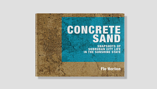
Btw. I spotted a little typo in your mock magazine. Hint: “Subruban”. You might want to fix that.
And happy birthday! 

Yay, I got one of two jobs for a birthday present yesterday, still waiting on the other. Weird, when I checked the page I don’t see the typo, Ovoao.
Why, congratulations for your new jobs (hopefully it’s a choice of either of them)!
Congratulations!! Best birthday present ever! 
Congratulations. Really pleased for you.
