An Old Lady Newbie So Needs Portfolio Feedback

Hi -

So, I received a BA (liberal arts, concentrated in film/video art) gosh, decades ago now. Due to taking care of a sick family member I had to take some time off of life; but, hey, they are better now. So, I went back to school and received an AS in graphic design in December 2020.

I feel like I need more guidance in graphic design, and have been timid to apply for jobs. Actually, I have turned a couple interviews away - total regret now and I should have tried. Nonetheless, I can’t seem to find internships or the likes, that’s really what I want, esp. paid ones. I live in the US, South Florida.

You guys give great feedback here, totally raw honesty & I love that. I know my portfolio is all school work, but I don’t have anything else to show. I won one logo contest on 99Designs, a finalist for a couple and have continued tooling around on there, but a slight disinterest has risen. Like, I just want to do more than logo design/99Designs. Totally, not dissing 99Designs, it’s cool for what it is. Anyways, very itchy to work/get out there and MAKE, while counting down the clock to turning 40 in a couple of years, lol. Of course, I would love some of that professional, raw and honest feedback on my portfolio (website). It may seem like a lot and unfocused, I just wanted to demonstrate that I can do “a little of this, a little of that”. Any words of wisdom, much appreciated and welcomed.

I don’t know how to include a link here to my portfolio , but it’s on my profile.

Thanks,
-ar


Moderator note: ashleyreese.myportfolio.com/

Old lady, yeah. I’m over two decades ahead of you. :wink:

You have some nice things going on in your portfolio. It shows considerable talent but not a lot of experience. You know about the lack of experience, but experience comes with, well, experience. If you have doubts about the talent part, don’t be too concerned about that — it’s there.

You’re at something of a disadvantage without a Bachelor’s degree, but your ability might help make up for it. You do need that experience, though, so please apply for some of those jobs you’ve been avoiding, and stay away from the crowdsourcing sites; all you’ll pick up there are bad habits.

Your portfolio of work, however, is a little uneven. There are some things I really like (see below), and some things that could use some improvement. I think you also know that too. Again, though, it’ll come with the experience you still need to get.

By the way, I added your website address to your post. New forum members can’t post links — we get lots of spammers here.

Welcome to the forums :beers:

It’s awesome that you’re following through on your passion.

As you mentioned your portofilo is pretty broad, to help me give you some feedback what would you like to do?

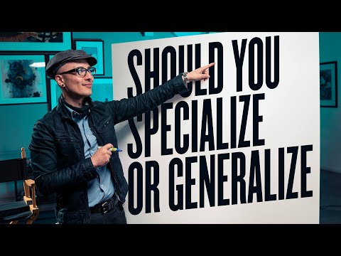
Would recomend watching this video first:

Ashley

Firstly, hi and welcome

OK, portfolio. I shall start with a couple of negatives. The first one; don’t make people click two buttons just to get to the meat of your portfolio. The first page should have a link to your work straight away.

Secondly. Your logo feels a little gimmicky and gratuitous to me, if I am being honest. Personally, I’d ditch it in favour of a simple, classy word mark – not a million miles from what you have already.

Right with those minor issues out he way; your work. Wow!

It’s not often I look at a portfolio that has been put up for review and there aren’t glaring holes all over it – usually typographic – that make me groan and roll my eyes. Although there are some niggles, these are things you’ll fix over time, in the main, you have some really nice work.

Start applying for jobs.

You already understand how to put type on a page and make white space work for you (though looking at the book, specifically, you could do with a little more around the body text). It usually takes a good few years for ‘getting type’ to ‘click’ and you are a good way there.

I really don’t want to focus on negatives, but one other thing I would say is with your portfolio categories, you seem to have three that could be combined under the one branding heading. Using the term ‘Logo design’ makes my toes curl a little. The term just smacks of the 15-year old crowd-source ‘graphic-designing-is-way-cool’, uneducated wannabe designer (which, of course, you are in a different league to). It implies a lack of understanding about what logos are and their place within a comprehensive brand identity.

The overall impression – especially given that these are college portfolio pieces and not live projects – is very, very positive indeed.

If I were hiring, you’ve already got a second interview, if not the job already.

Nice work.

1 Like

Hi @a.reese. Welcome on board! :smiley:

Looking at your site, I liked the photography and typography sections - but the branding and logo design sections had me puzzled tbh. I mean, they are well crafted, but the brand/logo concepts are real head scratchers. The cookie logo seems to be an homage to cookie-cutter design and the “Veggie Pig” branding would realistically neither appeal to vegetarians nor carnivores.

Welcome to the forum @a.reese

Wow I wish my portfolio was this good when I was starting out. You can apply for jobs with confidence in your abilities. You are willing to take criticism, which is good because there will always be people who want to tell you how they think it should be done. None of us are the finished article - it is important to never stop learning.

Good luck with the job hunt :slight_smile:

Thanks for adding the link. Yes, experience is totally what I crave; time & money is way I can’t got back for a BFA. Anyways, it just seems like the well is dry, as far as internships. When I received my BA, it seemed like the world was so open and options unlimited; and that was not just because I was some early 20’s dreamer. Now it’s like get a part-time job and intern; but that is just not working as planned. Yeah, I am totally not going to write off anymore interviews, I need to do them, even just for the experience of the interview.

Thanks soooo much everyone, I will put your comments into a nice little checklist to review. Much of my previous work experience has been in the field of admin. assistance so, I like lists and checking things off. I am sorry for not being clear with what exactly I wanted feedback on, but the given feedback has been floating around in my thoughts. I haven’t had a portfolio review before, I guess I was basing some of “Plea” on other post I’ve read.

Yeah, first on the list will be to link from the landing page directly to my work, and just keep the About part as a link in the header.

I do like my logo, it’s a reference to my curly/wavy hair so I think I’m keeping it as is; though the About statement is a little on generic/gimmicky side, will work on.

In school I really enjoyed branding/social media projects; and that’s what I would love to gain more experience in. That’s what I want the take way from my portfolio to be. So I may move up those project links to the top of the page. I could nix some of the individual pieces inside each link and make just a branding section, but that could be too much of a mixed bag. - If I’m understanding you correctly, Sprout.

Pluto, thanks for the video link, spot on for what’s in my head.

Ok, I’ve got some work to do.

-ar

Hi Ashley: First of all, welcome to the forum. It is not very often we come across a good first impression. Well done.

I am especially intrigued by how clever your personal logo is. It is clever and playful at the same time. Not a lot of “designers” can do that. Once again, good job.

You are.

Mixed bag, or an ability to handle a diverse range of clients and styles. One man’s poison… and all that. My own work ranges from branding and collateral for the automotive industry, kids’ educational books, interfaces for medical devices, cd design, beer labels, etc. I could go on. No common theme, beyond my ability to solve problems and come up with ideas. I am never too concerned by mixed bags. Shows versatility. As long as the quality of the work is consistent.

Your call, but the fact you have wavy hair is irrelevant. Are you trying to communicate your abilities as a designer, or the fact you have curly hair. It’s not about ego (I mean that in the original Freudian sense of the word, rather than the more modern, slightly insulting sense). You need to detach yourself from it, to an extent. After all, how would you feel if you found out, after the fact, that someone hired you because of your curly hair, rather than your abilities as a designer?

Of course I want to be remembered/noticed for my work, not my hair :wink: However, I feel settled on my personal logo because I feel that it represents me in various ways (i.e. a little serious, a little playful). I know that we all have had things, design wise and not, that we feel settled/complete on regardless of other’s opinions. So, that my friend, I am taking off of my list of revisions, and backing out of any further duels.

Not a dual. Just an opinion, you can take or leave. Option 2, methinks.

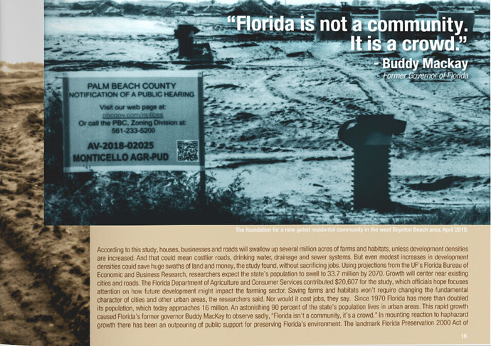
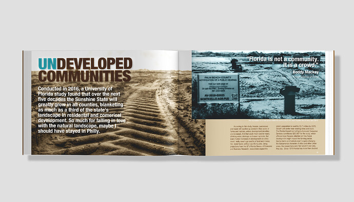
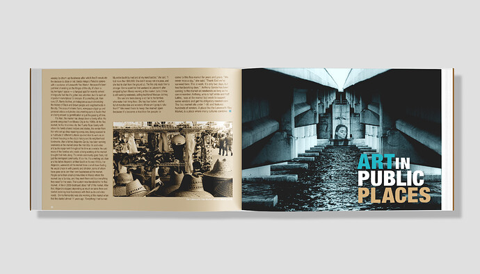
Where I’m a little tired of the “book design” project, going back to duels if anything I kept getting into a fight with the mockup when I made it last year. I really had trouble finding a good one for the dimensions I used. Would the layout of the text look better if I increased the number of columns to three, and maybe loosen things up with a left alignment rather than justified? Because the layout right now just feels heavy and rigid (which hey reflects the title, but it’s really not what I wanted). Or maybe just start all over again? I guess this is just a classic example of how if you don’t feel 100% on the inclusion of a piece in your portfolio, then don’t include it? It’s a Saturday night, some time to play with it.

Sometimes it boils down to personal opinion, but I rarely use justified columns of text. There’s some evidence that ragged right provides readers with waypoints, of sorts, in the sense of making each line visually unique, which counters the monotony of having everything perfectly aligned. This can be especially helpful in wider column widths where a large eye shift needs to repeatedly happen to return to the beginning of the next line. In narrow columns, I never use justified type since it interferes with good word spacing.

Speaking of wide column widths, I wouldn’t do the following. It’s way too wide for comfortable reading.

Another strong personal opinion (maybe a pet peeve) is extra leading between paragraphs. This was somewhat uncommon before the worldwide web. Neither HTML nor CSS has ever made it simple to make the more traditional paragraph indents, so the norm became an extra space. Somewhere along the line, this seems to have morphed into print, which to me, always looks terrible. It’s becoming more common, though. Every now and again, I’ll have a client request that I change the paragraph indents to extra leading. I’ll likely go to my grave arguing about it. On the other hand, the Worldwide Web has helped make ragged right text more acceptable, which I’m totally liking. :wink:

Definitely. For me, as Just-B said, ranged left (ragged right) is the way to go. There are very few instances where using justified improves a block of text and can often lead to ugly rivers running through it, where word spacing, forced wider by the justification, aligns badly and you get great holes in the middle of the para.

Line lengths. The optimum to aim for is somewhere between 50-70 characters per line, with an outside max of around 80-90. It is not a hard and fast rule and you will see many variations of this ‘rule’, but the average will be somewhere around this. The reason being, this allows the whole line to stay within peripheral vision so the reader can comfortably keep track of the line they are on. Any narrower and it gets uncomfortable and ugly, even more so with the justified / river scenario. Even ranged left creates ugly line endings.

Now I have to move on to something that rarely happens; I am about to disagree with B! I much prefer half line spaces between paras. For me, it gives type room to breathe. My preference pre-dates the World Wide Web too. I find indents, interrupt the vertical flow of type. That said, I am not a fan of a full line space between. That goes too far and breaks the text up into separate blocks. That said, there have been many times when I have used indents over para space. For example, when multi-column type absolutely must align at the bottom (though a lot of times you can counteract the uneven paras in columns by use of images).

Thinking about it, perhaps the preference comes down to where and how you cut your teeth. Your background, B, was in newspapers wasn’t it? My first job – and where I learned how to actually use type, beyond the theory of university – was in annual reports and corporate documents, back in a time (early 90s) when blue chip companies were throwing huge budgets into them, in giant a corporate pissing competition. It was all about prowess and market position. I was fortunate enough to work for one of the best specialist agencies in London at the time and a lot of effort went into ‘crafting’ the type. They were actually a terrible company to work for, but it was a great education, so I stuck it for five years to learn as much as I could. Anyway, I’m rambling on a side thought about how we develop our typographic aesthetic. So…

…back in the room. Like everything, indents vs para space has to come down to appropriateness for the job at hand. If I were doing a largely text only, multi-column layout, I’d never dream of half line spaces. Something more open and relaxed, I’d almost always go for them.

This leads to the next conundrum; how indented should a para indent be? For me, I don’t like them too deep, so 4mm (about 0.16”) is my usual go-to.

How do I always end up intending to write a one or two line response and end up writing a tome.

Verbal diarrhoea, perhaps?

Possibly because sharing is caringknowledge is powereducation is the premise of progress

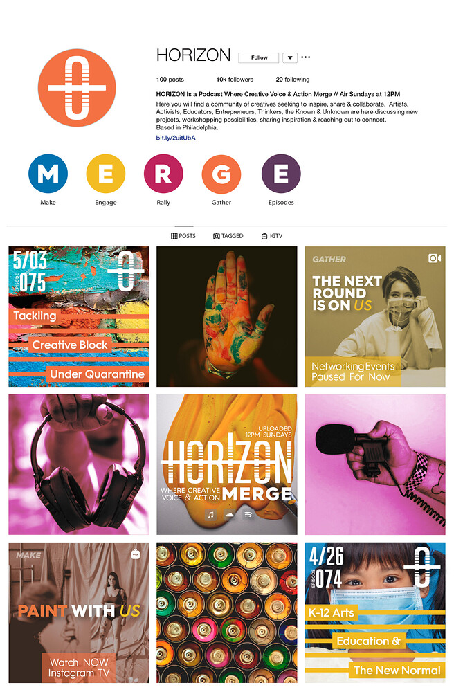
Overall, a lot of bold, interesting work. It immediately comes across as competent and professional but could be edited down a bit. In particular, the typography design/phrase visualization section doesn’t need to be there, and maybe the photo compositing as well. They’re both strong but strike me as student work without a brief behind it to give it meaning and context. You use mockups effectively to give your other designs context (the social mockups for Great American Cookies are great). I think some of the type selections could use more thought, such as the Veggie Pig logo. The fonts used seem a bit generic. Your photography is the real standout to me, especially the product/still life photography. There’s nothing that I think is weak or needs a redesign, just some things that could be removed to let your stronger work really shine.

1 Like

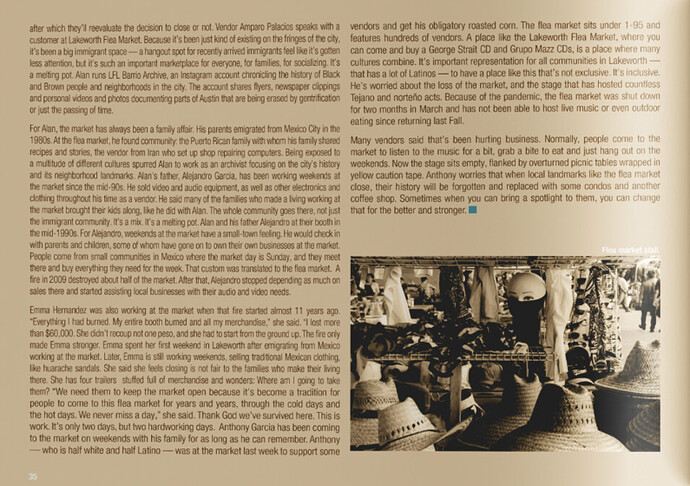
So, does this work out better? Even though I do miss the justified look and the space between paragraphs.


I prefer the para space to the indent and I am definitely not a fan of the very deep indent, but that’s my taste. Makes the text too formal and blocky, formal an traditional looking that the feel of the rest of the book. I know at least one person who may disagree with me!

Works much better ranged left though, and with a decent line length.

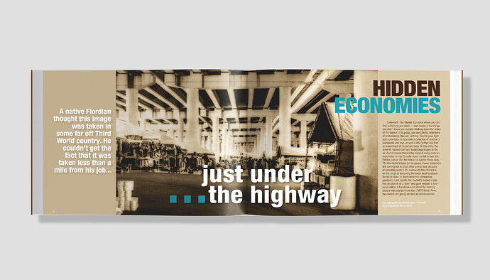
Drop cap might help. In the Hidden Economies spread, I’d refrain from white reversing the cutline as it does not show well from the light background. I’d also check spelling (“Floridian”) and punctuation (“couldn’t”).

(Mods: This post should graduate to “The Crit Pit” from “Student Forum”)

1 Like