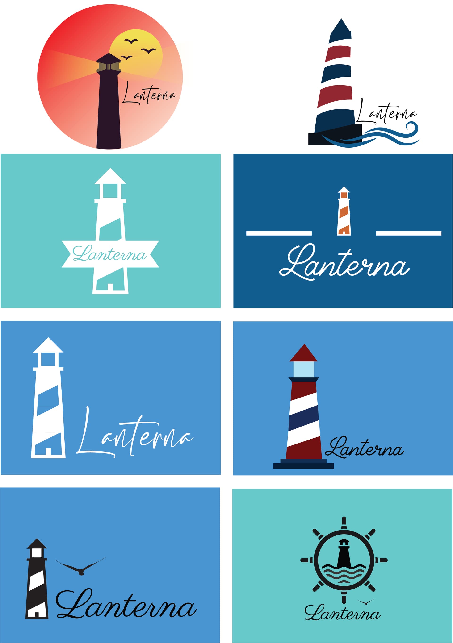
Hi everybody, I need any tips/suggestions you have about these drafts I made for a guesthouse/apartment/airbnb place. I need kind of a mediterranean look. The guesthouse is called Lanterna which means “lighthouse” in Latin, so I have to incorporate a ligthouse. I ran out of ideas and inspiration so I really need opinions on whether any of these logos is good. Hi everybody, I need any tips/suggestions you have about these drafts I made for a guesthouse/apartment/airbnb place. I need kind of a mediterranean look. The guesthouse is called Lanterna which means “lighthouse” in Latin, so I have to incorporate a ligthouse. I ran out of ideas and inspiration so I really need opinions on whether any of these logos is good. Thanks in advance!
Is the Airbnb by the sea? This really has a nautical look, which might be misleading if the place was oddly named and located ten miles away from the water.
I’m not too fond of the two on the top row. I’d avoid gradients. I’d also avoid a hard-to-decipher script typeface.
As for the ones I like best, the second one down on the left is nice, as is the bottom right one. However, the helm or wheel really pushes the nautical angle, which might be inappropriate unless this Airbnb is adjacent to a marina.
I’m only guessing, but it sounds like the reason you’re struggling to make a decision is that you don’t have clear paremeters to work to.
Some questions that might help you figure out which one is more appropriate:
Why do you think you need a logo?
What does mediterranean look like (personally, I don’t have a clue)?
Who are the guests - are they young or old, couples, families or large groups?
What are the guests looking for when they come to your AirBnb? to explore the area? for a luxury experience? a bed to crash for the night? Or to get away from the city?
Where will the logo be used? on physical signage or only online or both?
You mentioned that you’re including a graphic of a lighthouse because the place is called Lantena which is latin for Lighthouse, but you probably don’t actually need to include a picture of a lighthouse, especially if there isn’t one nearby.
Hopefully helpful.
It’s not exactly by the sea, but it’s about 500 meters away from the beach. About the typeface, I was aiming for that kind of script/handwriting font but the more I look at it I have to admit it looks kind of weird.
I’m not sure what kind of a font to use though. Serif, sans-serif? Whichever I use I don’t really feel like it’s suiting the logo, so if you have some ideas about that I’d be very thankful.
On the last one which has the wheel, it’s there kind of to achieve the vibe of the town it’s in. I know it doesn’t exactly fit in the guesthouse theme but I just wanted to find something different from all the other logos I made.
Honestly kind of yes, I’m don’t really have exact parameters to go by.
I need the logo to give the resort an identity; it’s going to be used on a website and physically it’s going to be used on things like visit cards and welcome books (a book made for guests to inform them about interesting places in the area and stuff like that).
The guests are coming to a seaside town for a relaxed vacation and it’s open to any kind of guests really, but it mostly hosts families and young people, but not large groups. The resort operates mostly in the summer, so it’s really a family holiday kind of resort.
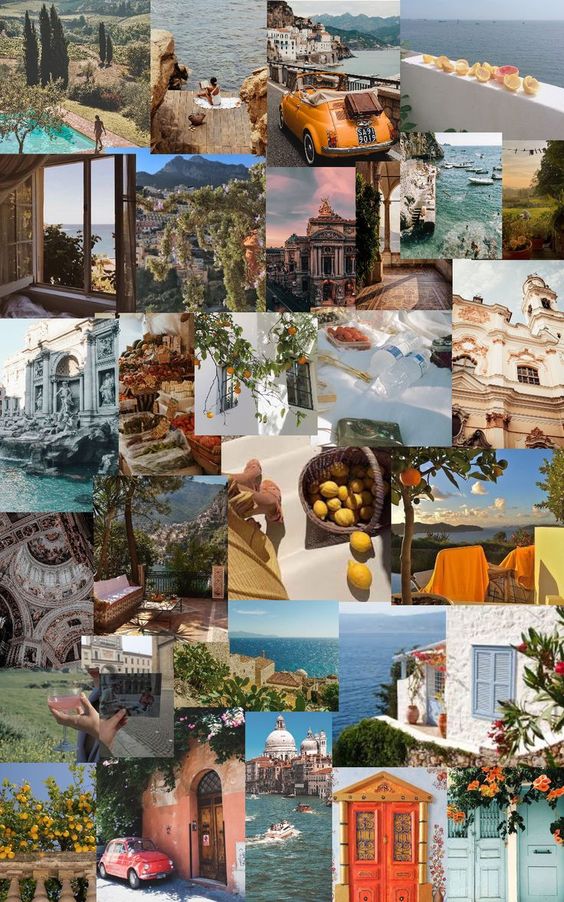
A mediterranean look is kind of a vintage Italian look. I’m going to put some pictures because it’s easiest to explain visually.
Is this a crowdsourced logo contest?
Or a student project?
Kinda sounds like the first…
Is the accomodation an actual lighthouse?
Not at all
The second one ![]()
Someone may move this to the Student Forum where you might get more appropriate answers. ![]()
2 Likes
Fair enough - this gives you a bit more to go on.
From this you can probably put together a bit of a list of what a good logo should do, the list might be something like:
- Relaxing feel
- Carefree
- Coastal
- Summer vibes
- Family friendly
If I were you, I’d do a bit of exploring for other logos that you think tick some of these boxes and try to emulate the elements of those logos that create that feeling you’re trying to achieve in your logo. A logo doesn’t have to tick all of the boxes, in reality it probably can’t without being a complete mess, just choose the one that ticks a decent percentage and the important ones and feels right to you.
For example you might find a logo that’s done in script typeface and realize that the cursive lines give it a carefree feel that might be suitable for what you’re after:
Hopefully this makes sense and helps you on your quest! Design is not art, it’s problem solving. If you don’t know the problem you’re trying to solve, you’re not going to have much chance of figuring it out. If you can describe the problem clearly, the answer will become clearer.
1 Like
Thank you so much for the tips! You were really helpful and I got some ideas now.
I’ll try to put your advice into work and I really hope to get this logo done and to actually be happy with the work I’ve done.
I know Italy well and I hate to say that I am afraid, none of those logos have an 'Italian Riviera’ feel to them.
They all feel too clipped and clinical – a bit too vector drawn. Although Italians do clipped, minimal very well, they also have a great tradition of rustic charm. Your logos fall between both. Look at the photos you posted. Do they have this feel? Think 1950s Cinquecentos, warm evenings, good wine, long lazy lunches, etc.
Research Italian vernacular lettering. Everywhere you go, there are old worn examples of painted signs on walls. Not always the highest quality, but there is definitely a common feel to them.
For what it’s worth, also Lanterna just means lantern. The Italian for lighthouse is, Faro. Also, nouns in Italian, use the article. The Lantern, The Lighthouse and, as with most European languages, unlike English, have masculine and feminine nouns. So…
La Lanterna (f)
Il Faro (m)
Hope this helps.
This topic was automatically closed 365 days after the last reply. New replies are no longer allowed.