Can someone dumb this down for me even more-- I want to make sure I’m understand it correctly.
Should/would this show issues when you use “Overprint Preview” in InDesign?
Can someone dumb this down for me even more-- I want to make sure I’m understand it correctly.
Should/would this show issues when you use “Overprint Preview” in InDesign?
Output preview is just a preview.
Output of black is only for output to rgb devices.
I will clarify…
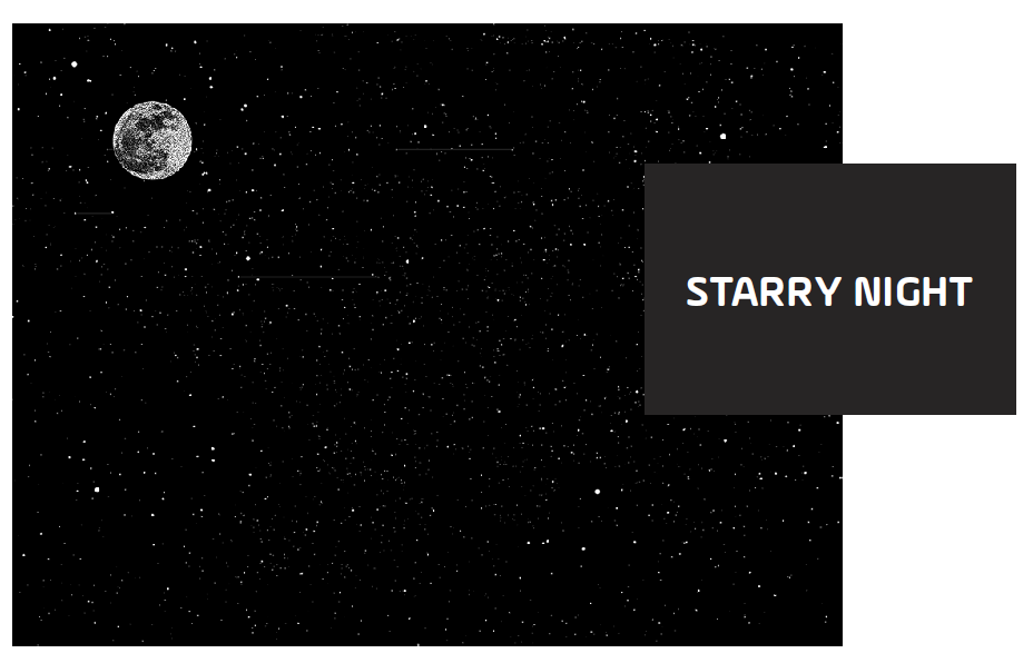
This is part of the graphic I submit
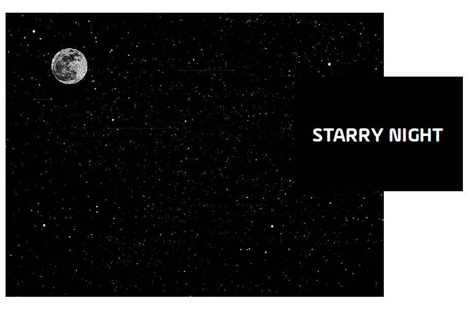
but once printed in the newspaper, the red background shows through the box like this (note: I have adjusted the opacity of the black here to show you an example of what happens- however in reality the black is still black.)
Initially I thought an overprint issue, but didn’t find anything in “Overprint Preview” in ID OR any issues in Acrobat with preflight…
So I emailed the paper and got this reply:
“Okay so the black that is used is an Nchannel black not just a regular 100%k. It is set to knockout but the RIP in Polka Dots for Vantage way may be set to change black knockouts to overprint. This can be adjusted if absolutely necessary but it would be a change to all papers that print at Vantage Way. If you could try using the 100%K instead that may make a difference without changing the RIP settings.”
I’m assuming that “Nchannel” is the basic [Black] swatch in ID so I made my own black CMYK swatch of 0/0/0/100 which in fact indicates this was an overprint issue… right..?
I guess I’m surprised that InDesign’s “Overprint Preview” wouldn’t show this. Isn’t that what it’s for? How else should I check my files to ensure this doesn’t happen?
It seems he’s just saying their RIP didn’t honor the overprint setting for the InDesign black and to just build your own black using 0c,0m,0y,100. The default black always overprints unless you turn off the settings you referred to. A custom-built swatch with only 100k doesn’t overprint by default — it knocks out just like any other color.
There’s no reason the preview would have shown the built-in black overprinting since as far as InDesign was concerned, it wouldn’t overprint because you changed the settings to knockout rather than overprint. Like the guy mentioned, it was the RIP that didn’t honor the InDesign black settings, not InDesign.
In any case, the InDesign preview wouldn’t show 100% black overprinting the red behind it because on your monitor it would be so dark you couldn’t see what was behind it. Solid colors on newsprint, unlike the solid colors on your computer display, never have a 100% density. This is because the ink soaks into the absorbent newsprint. If you were overprinting black onto red on coated stock, you might not notice the red beneath it at first glance. On newsprint, it’s glaringly obvious.
Sorry for the short reply, I was on my mobile and had a longer answer written, but shortened it down to the simplest.
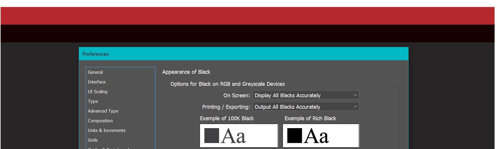
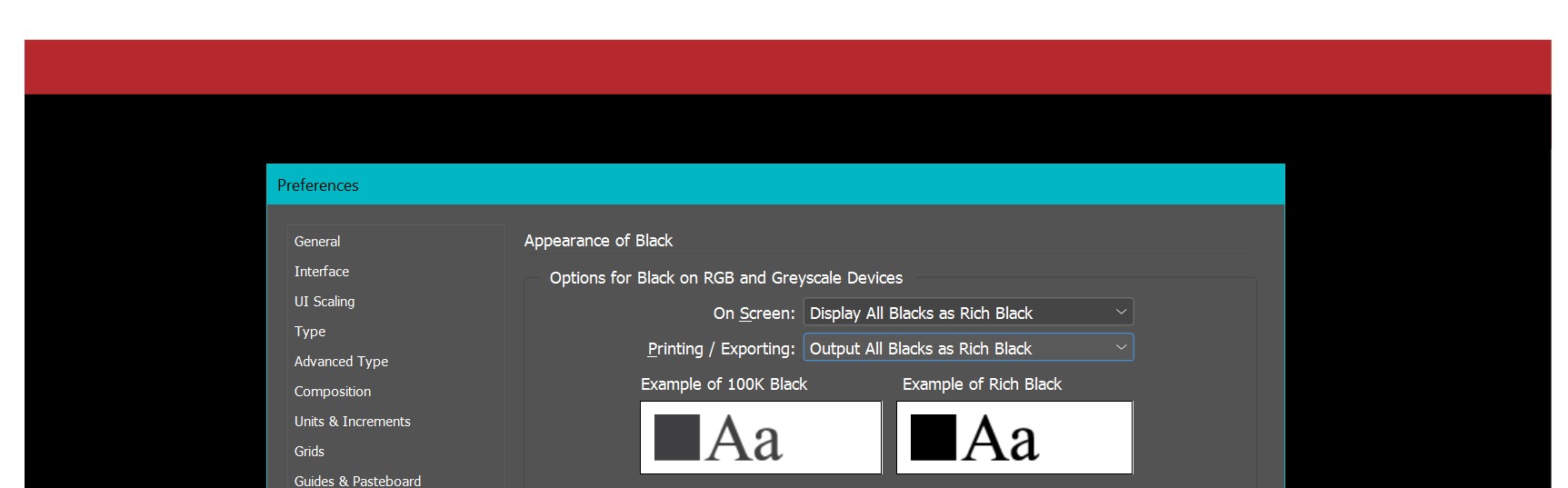
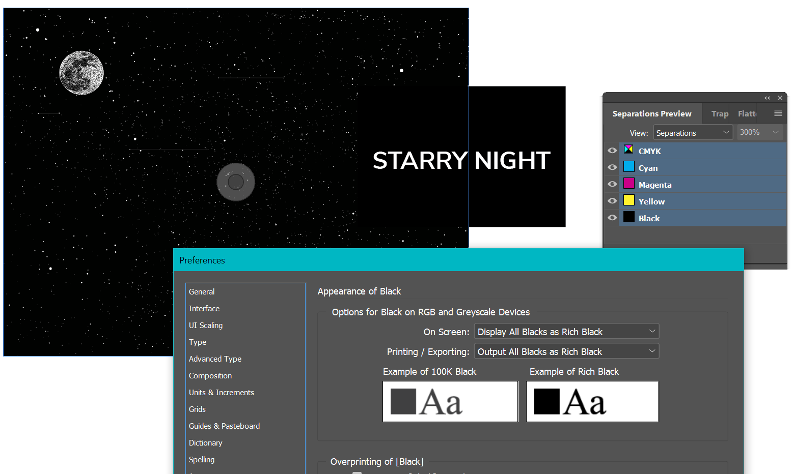
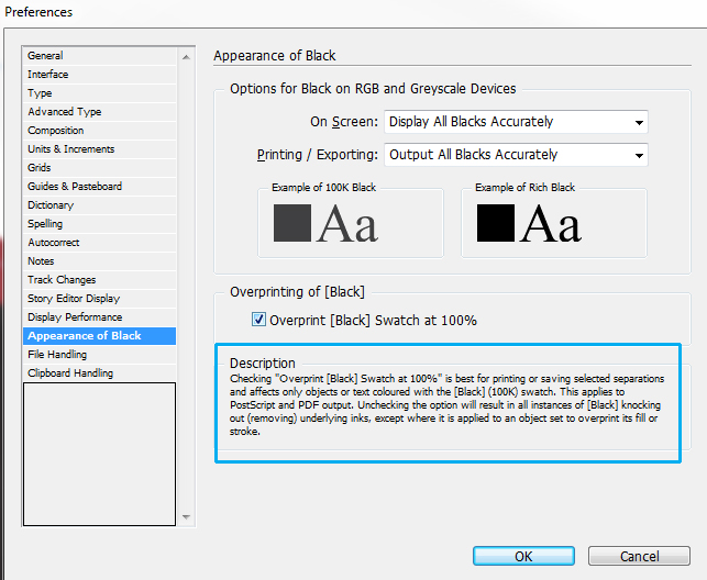
The appearance of black is only for output to RGB devices like a monitor - or an office printer with RGB profiles.
If you hover over the item in the panel it tells you this
For litho print you need to look at it with overprint preview turned on.
It’s different - I wish Adobe made this clear in the settings, I admit it’s confusing.
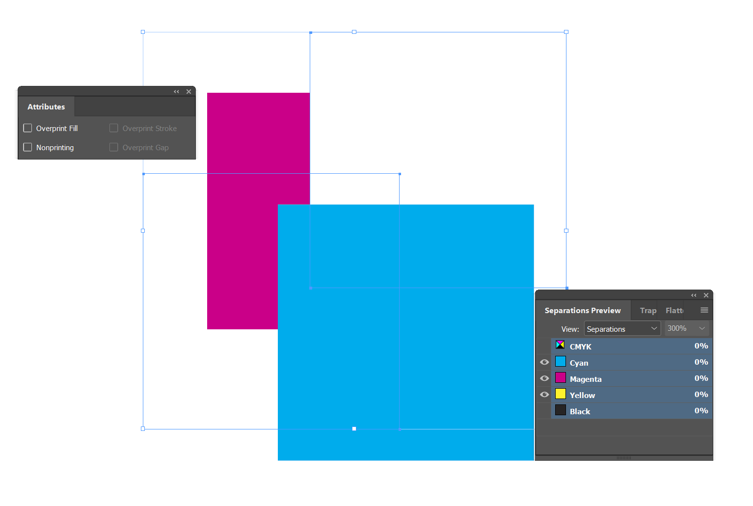
This is with Display Black Accurately
This is with Display as Rich Black
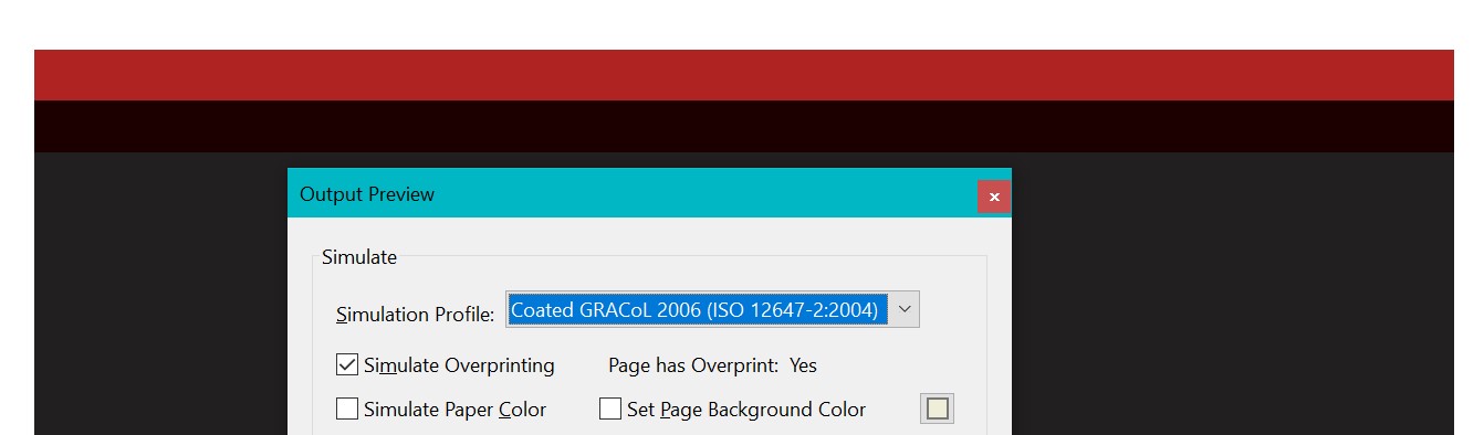
However, in the PDF for print you see it like this without the Overprint Preview it looks ok.
But with Overprint Preview on you see the issue.
The easiest solution here is to have the black underneath and the Red on top - this would have made the Red knockout the black.
Instead, black is always is set to overprint, so you have overprint your black on top of the red.
Black ink in printing is translucent, you can see through it.
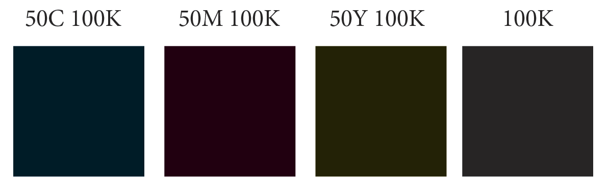
That’s why for anything that is large blocky black for printing - eg., anything over approx 48pt print (but preferably 72pt) needs to be set as a Rich Black - that is made up approx 50 CYAN and 100 BLACK.
Large blocks of black - like a shape - need to be set to rich black too. But again I’d mix only 1 other colour - some mix 3 or 4 colours, but this can lead to registration issues.
For example: Cool Black; 50 Cyan, 100 Black; Warm Black; 50 Yellow, 100 Black; Hot Black; 10050 Red, 100 Black.
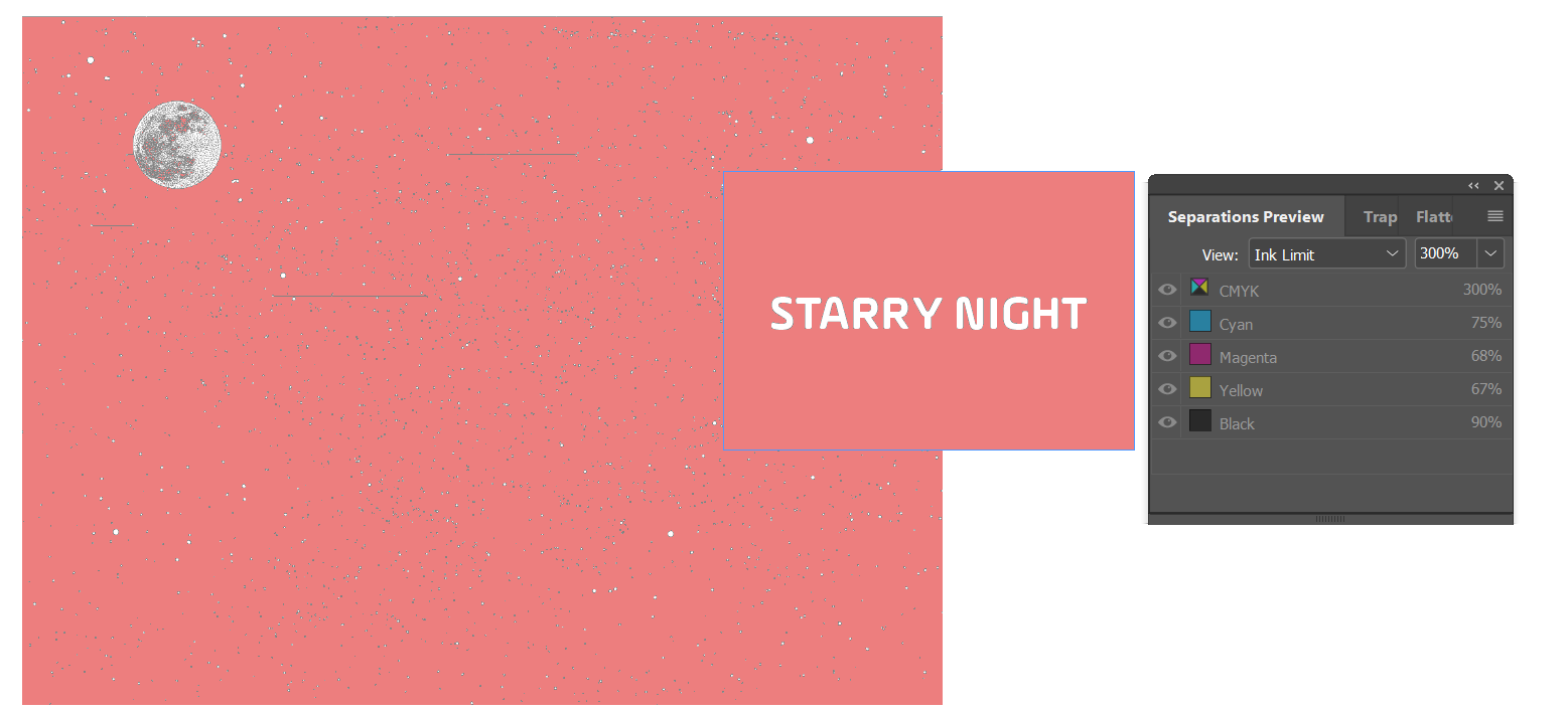
Using 50% and 100% gives an ink limit of 150%. Newspapers for example have an ink limit of 220-270%.
To expand on Just-B - whom I agree with 100%
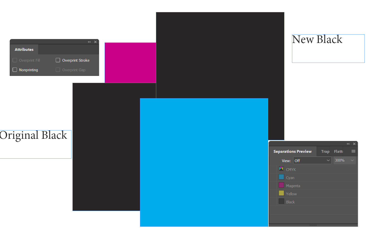
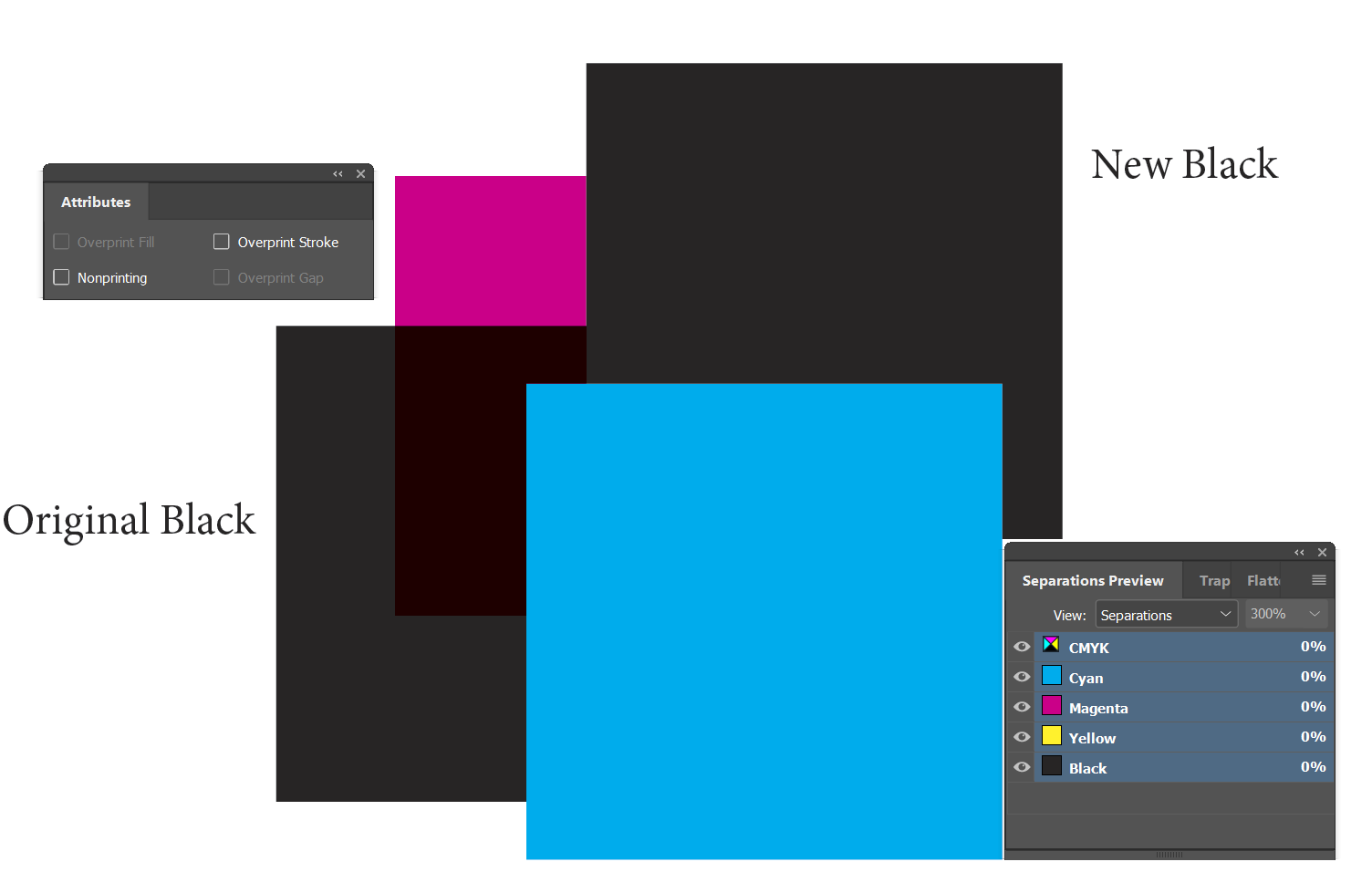
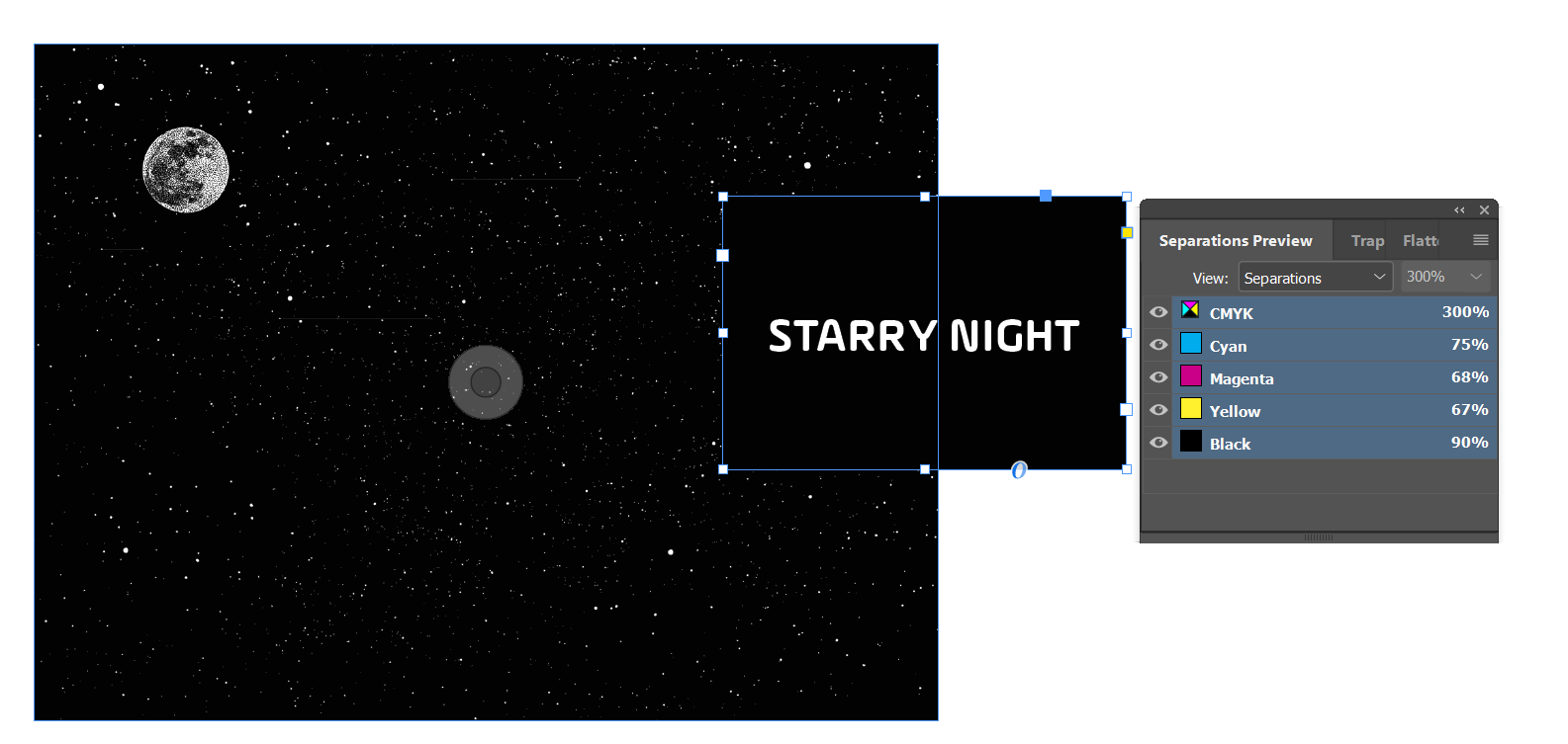
This is how it looks with overprint turned off.
With overprint preview turned on
You see some issues cropping up already.
The black on the left (original) is going to mix with the ink underneath as it’s set to overprint by default.
The one on the right is not set to do anything except be 100% black.
However, when you turn off the black plate - you can see it knocksout the right side of the Pink rectangle
The left side is in tact - as the original black is set to overprint.
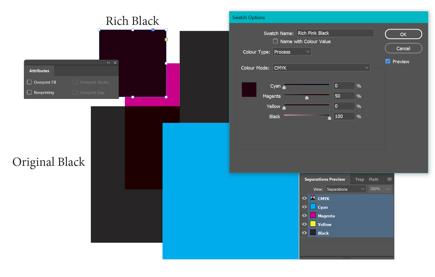
If we introduce our Rich Pink Black - using 50 M and 100 C you get a much fuller - non-dull black
In terms of your Rich Black - you are looking at 3 variants - compared to the 100% black only.
I’d be using 100% black for text, and headings - but once going over even 48pt - or any heavly block of text in black that is large type, I’d be looking at adding a bump behind it - usually 50% Cyan and 100% Black.
The worst mistakes happen when overlaying say a black box over an image for example.
When you display all blacks as rich black - what you see in InDesign is not entirely accurate for print.
This is what it looks like in the PDF
Even if you use a rich black -
You need to give your black here the same values as your image
And ensure you have not exceeded the ink limit from the printers - usually 300 is ok - but if it was a newspaper - you’d need to reduce your ink limit in the blacks in both the image and the overlayed text box in InDesign.
The RIP can do it - but you’re leaving the values up to a machine.