Hello, what do you think about my design?
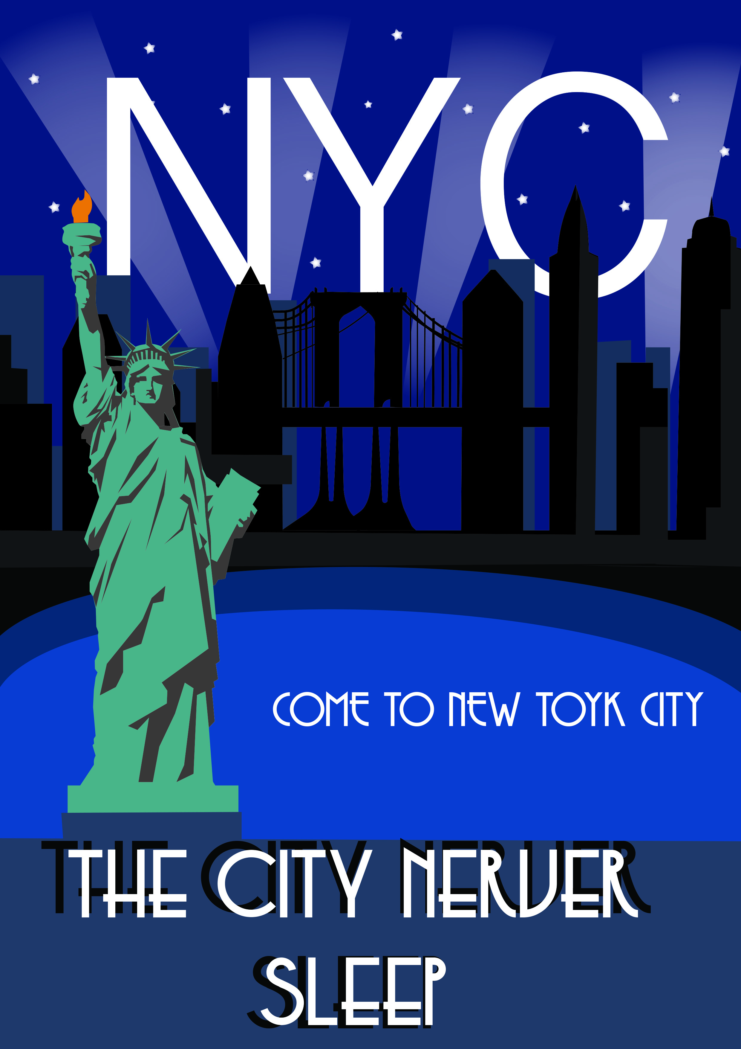
I have to say, first *York not “Toyk”, tagline “The city *that never *sleeps”, very important to proofread. Also, the placement of words are for me not ideal.
yes, i will correct it I don’t know how I missed that and thank you
Also it’s never, not nerver.
You’ve used an Art Deco typeface, which is a good start. The typeface at the top that spells out NYC does not appear to be an Art Deco typeface. The way you’ve treated the background images of New York, however is arguably done in an Art Deco style.
The Statue of Liberty itself was designed in a Neoclassical style, which might make it a little bit inappropriate to highlight on a poster designed to show off an Art Deco style. If you wanted to highlight architecture in New York City, the Chrysler Building is a wonderful example of Art Deco architecture.
Thank you
This is a nice start.
As the others have said, you need to change the font of NYC and the 2 spelling errors.
“The city never sleeps” doesn’t really work, I would change it to:
The city that
never sleeps
Art deco has a specific colour palette and also makes use of pattern. If change the colours to match Art Deco more closely and create similar pattern designs, I think this would start looking really good.
Lose the black duplicate letters. They add confusion. Or if you are going to use them, keep the offset equal on both ends and a little bit closer.