Hi Guys
check out my latest project logo redesign concept for AS MONACO
FULL PROJECT HERE :
https://www.behance.net/gallery/74004899/AS-MONACO-Concept-Logo
I hope you like it, and any critiques are very welcome ![]()
Hi Guys
check out my latest project logo redesign concept for AS MONACO
FULL PROJECT HERE :
https://www.behance.net/gallery/74004899/AS-MONACO-Concept-Logo
I hope you like it, and any critiques are very welcome ![]()
Moving to student forum.
The quality of the art is good. However, consider removing the gradient from the gold elements (perhaps even the red, despite me enjoying its visual aesthetic) - reason being, you’re taking away from what could easily a solid 2 color logo - which could be quite critical considering that golden color will print with little to no consistency digitally. Color fluctuation from one print to next, and from one machine to another, will be chaotic at best.
The logo text also may be difficult to read on smaller print pieces, like a business card.
That aside, the piece is well designed. It’s clean, simple, no trapping or tight registration issues, symmetry looks solid, typeface is well kerned and arched perfectly with the shield.
Overall decent piece.
Thank you so much for your remarques ![]()
Nike is one of the biggest Sport’s Company if not the biggest, It has Superieur machines that could do anything with high quality, so I don’t think color grading for printing is a problem tho there is a lot of other examples.
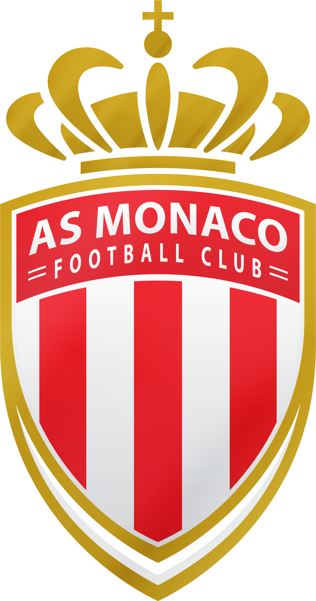
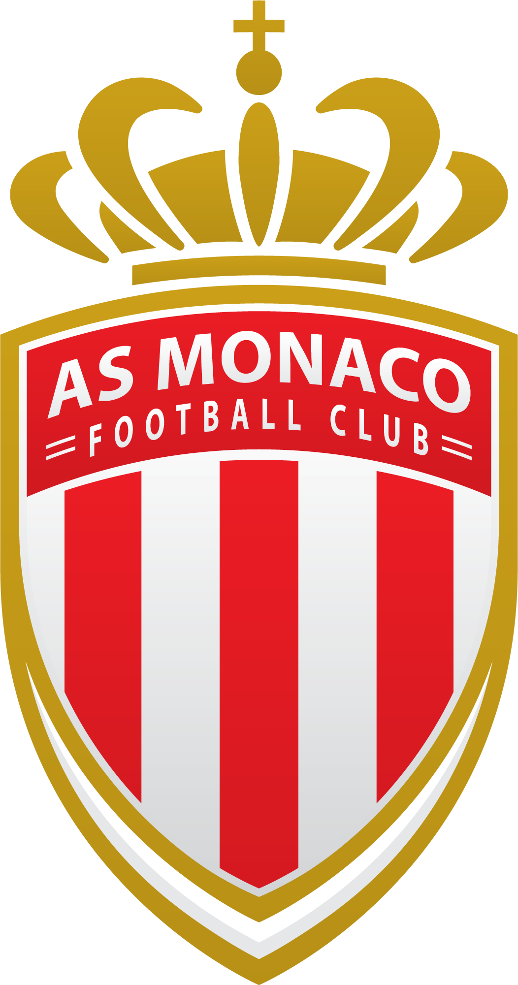
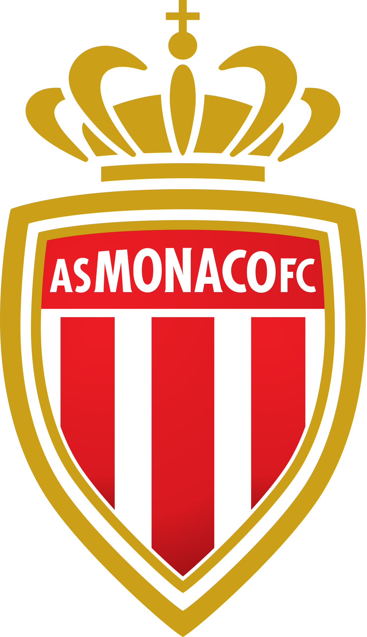
But despite that, I made 3 versions :
1/ with gradient effects :
2/ with simple colors :
3/ Vector style :
Thank you so much I appreciate your reply and review ![]()
See the original crest.
For people who are familiar with the club, the first reaction will be “What for?”.
“Redesign” perhaps is too bold a word.