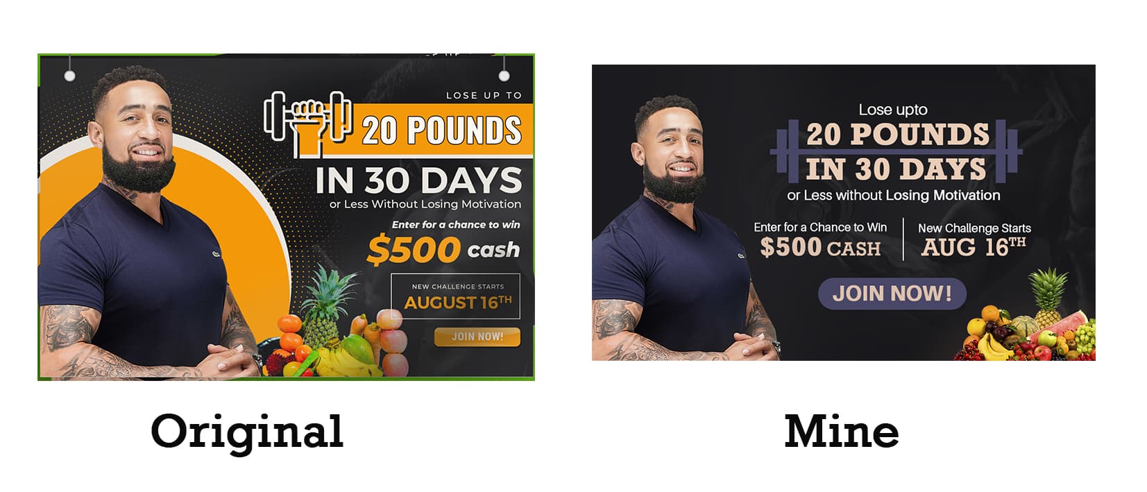
Dear freinds, I redesigned this design, need all of your comments. I feel content has scattered in right alignment in right most side of the design and it is clear and that’s why I decided to redesign this.
Looks like you changed the logo. That’s a no-go right out of the gate.
While you’ve simplified it, you have added other issues.
Putting the colorful fruit in the lower right draws attention away from everything.
There is still an unnecessary gray background element.
The word “upto” is a typo.
The orange in the original adds some energy and vibrancy that is missing from the redesign. It also helps separate the photo of the trainer from the background.
I think that orange would be a great color for that button! Look, the whole point of this is to get someone to click that button. Making it larger was a good start.
When you skim it you read 20 pounds, $500 cash and August 16. Make it: Lose 20 Pounds, Win $500 Cash, Starts August 16.
This topic was automatically closed 365 days after the last reply. New replies are no longer allowed.