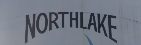
I’m pretty sure this will be an easy one for you guys, but I’m not a graphic artist and have already spent waaaay too much time on this. I am working on a 3D model for a client and they want to reuse part of their existing logo. I have no idea how they bent the text (See attached picture.) Can someone please send me in the right direction on how to do this? Thank you.
-
Use Adobe Illustrator.
-
Set type, convert to outlines.
-
Create an object that is the shape of the text (e.g. straight sides, shallow curve on top, deeper curve on bottom).
-
Make sure the shape is above the type by selecting the shape and bringing it to the front.
-
With both the shape and outlined text selected, go to: Object > Envelope Distort > Make with Top Object.
-
Bob’s your uncle.
Steve’s method will create the right shape, but the letters will be stretched and distorted to fit in ways that aren’t necessarily wanted. For example, the horizontal strokes will be stretched and made thicker or thinner in relationship to the vertical strokes. It might also tilt some of the vertical elements that should remain upright.
If it were me, I’d use that method to create the basic shapes, then I’d tweak each letter to bring all the shapes back into balance and correct for the unwanted distortions. In other words, it’s not as easy as it might first seem.

Yup, try the Arch tool.
1 Like
I’d play with the appearance palette in Illustrator and applying effects to your live text in the appearance palette. Here’s my live text with the appearance palette showing a “Warp Arc Lower” and a “Warp Arc” effect to it:
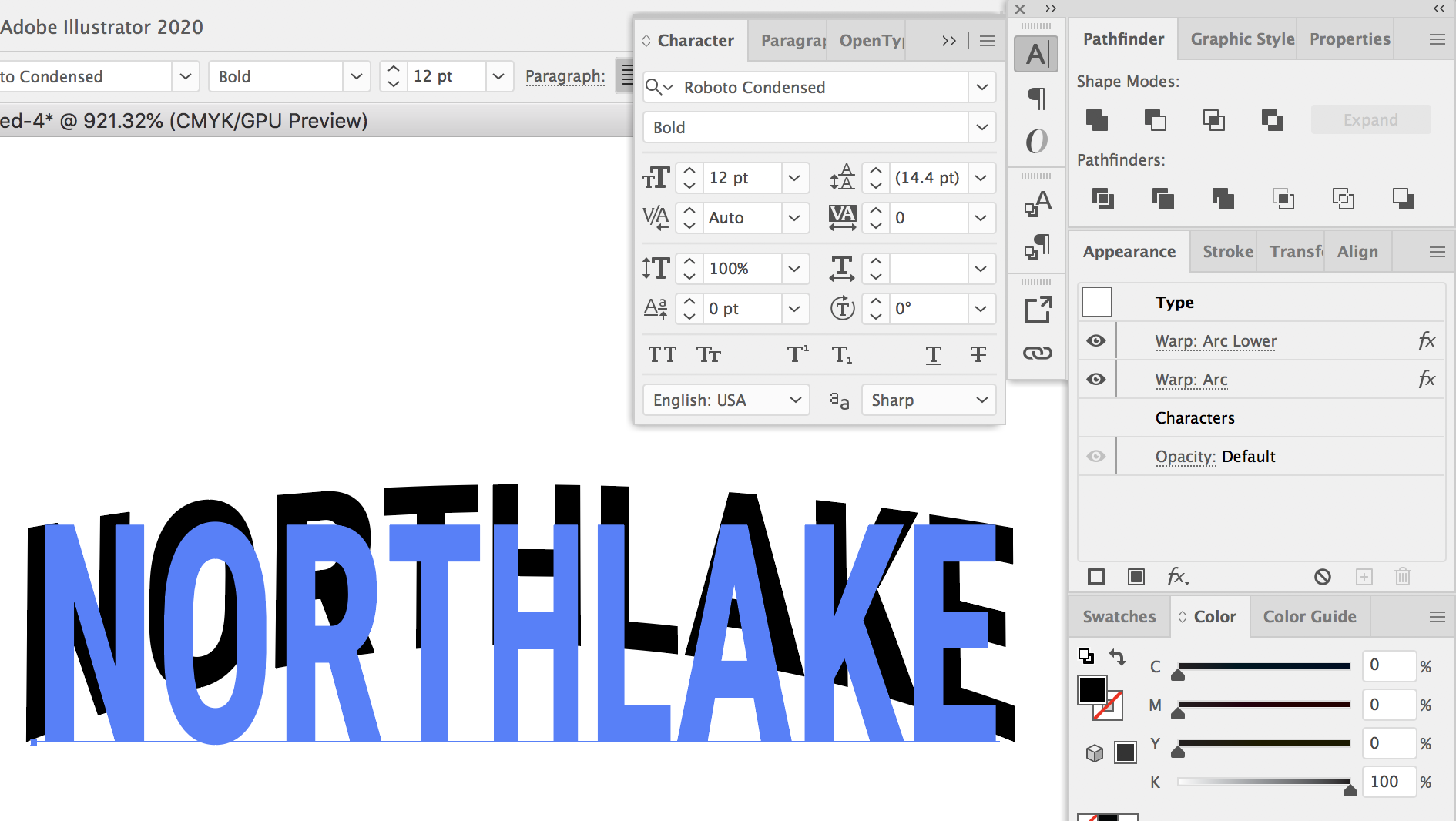
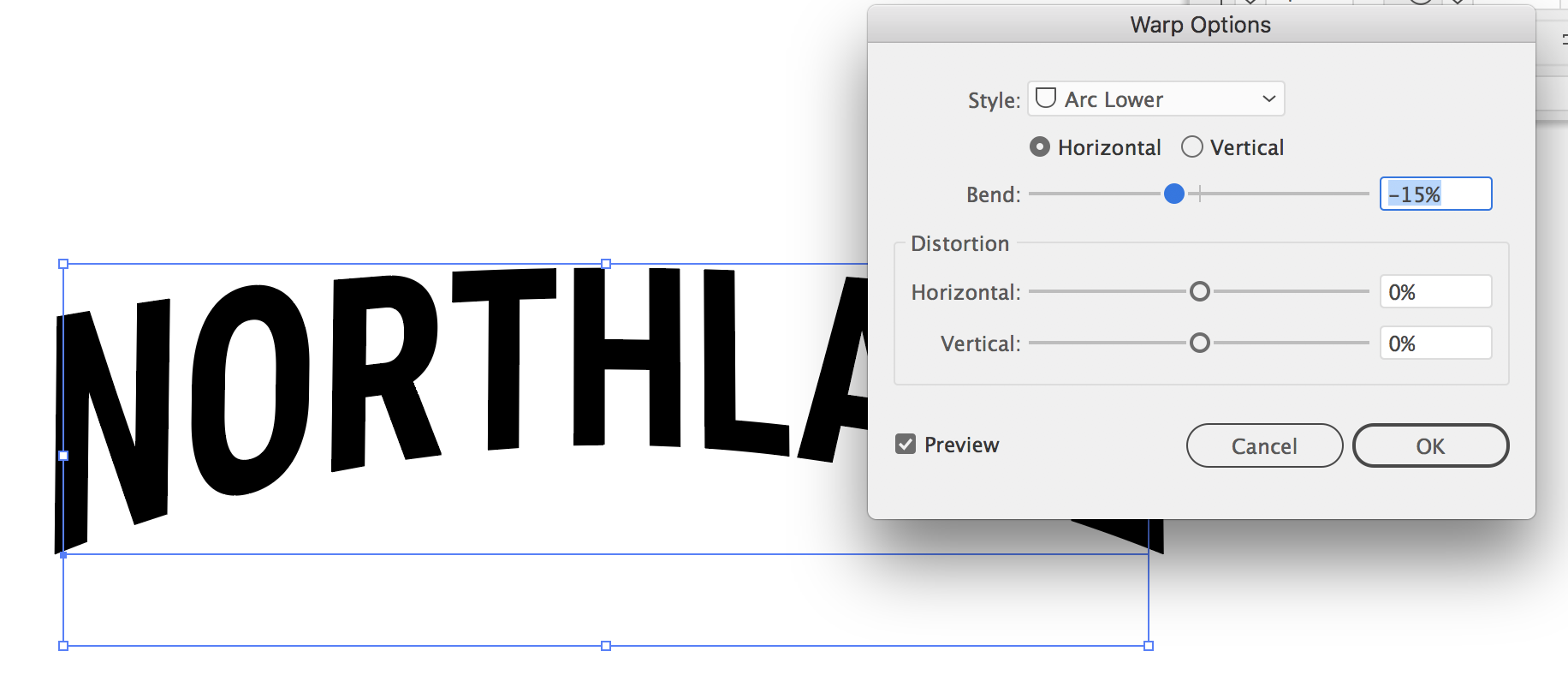
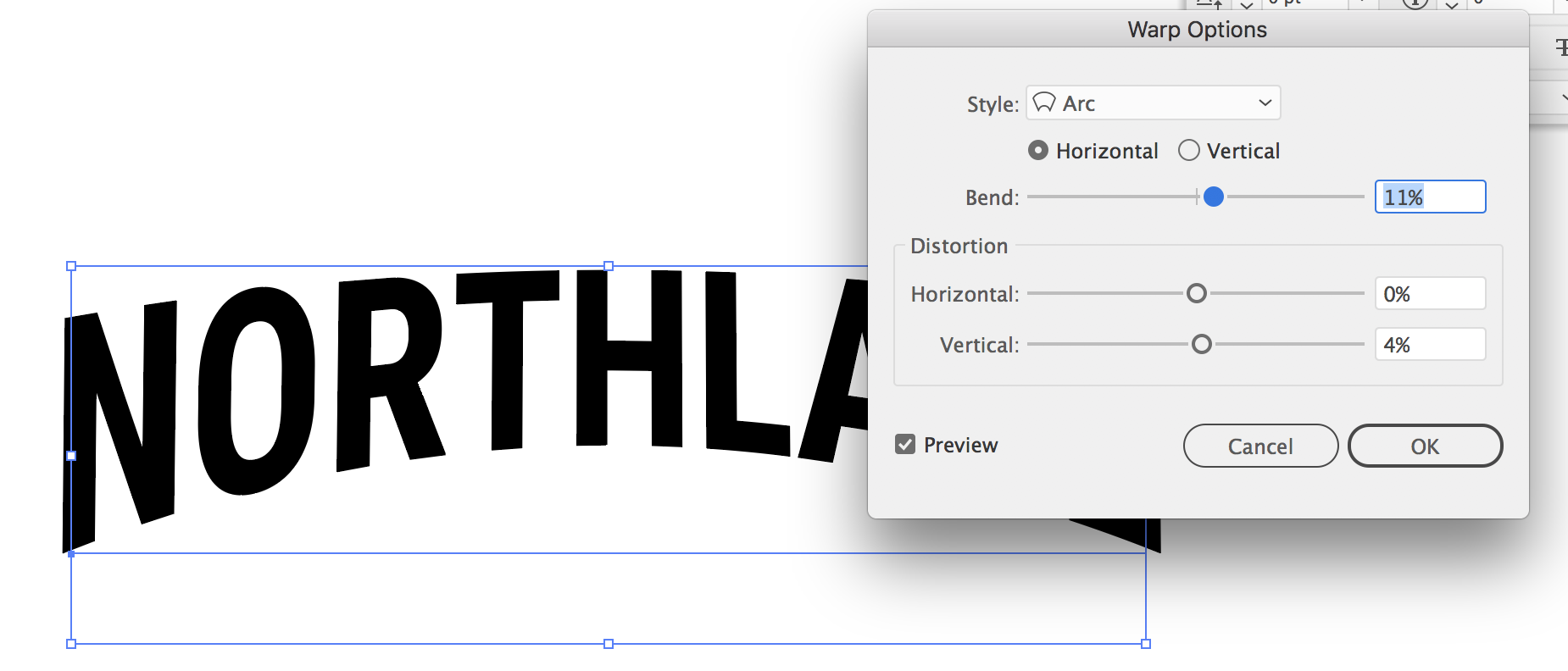
I used both because in your example the top was rounded as well. By starting with arc lower, I was able to bend the bottom, and then with the regular arc warp I was able to warp all of it. Here are the separate effect settings I used:
And this shows a comparison by the non warped font to the final version below it.
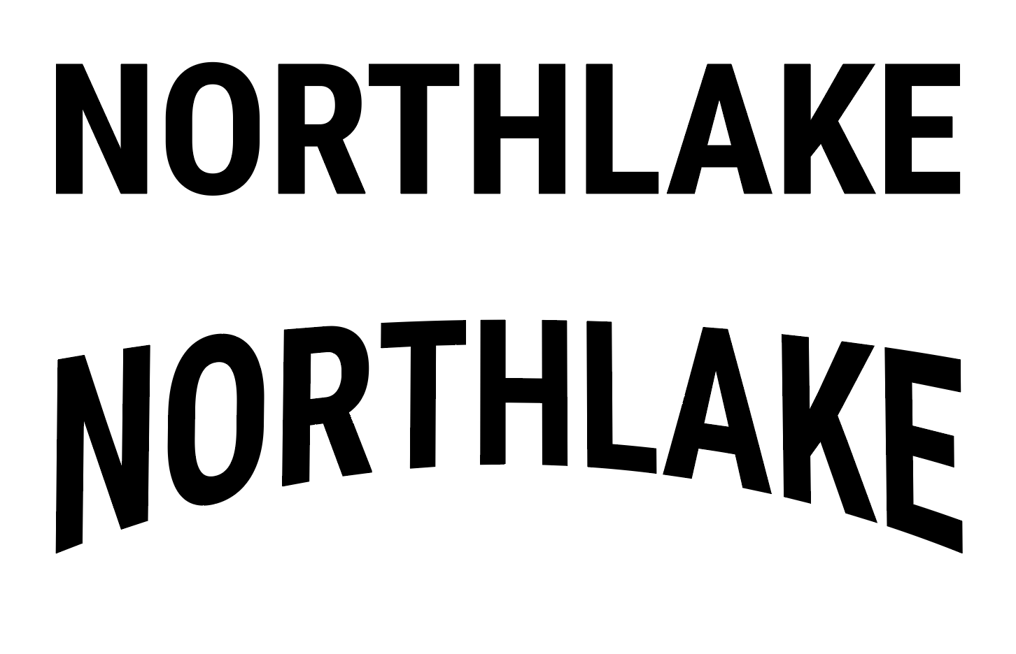
A final caveat is that using warping in illustrator on text tends to distort the font quite a bit. To “fix” the fact that it tends to stretch the font, I applied a 65% horizontal scale to the letters in the character palette. And To further “fix” the issue I applied a 60% horizontal scale to the center three letters “THL” since the center letters get more stretched than the outside.
Basically you may just have to tweak and play with it.
1 Like
And this was down and dirty. You’d probably go in and fix kerning and some other issues in the end. Once you’re happy with the end result make sure to expand the text. Especially before planning on printing or using as a “final” file.
That one worked. Thank you so much. ![]()