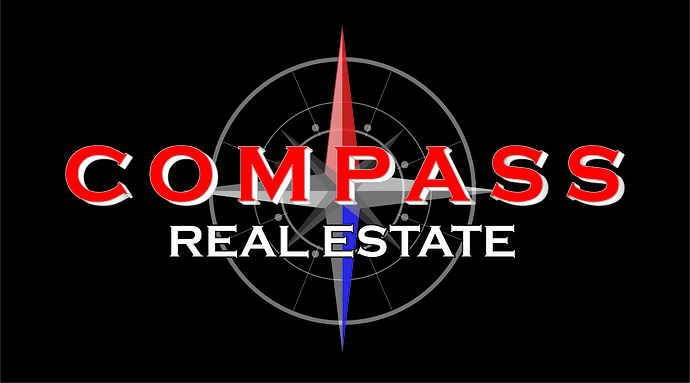
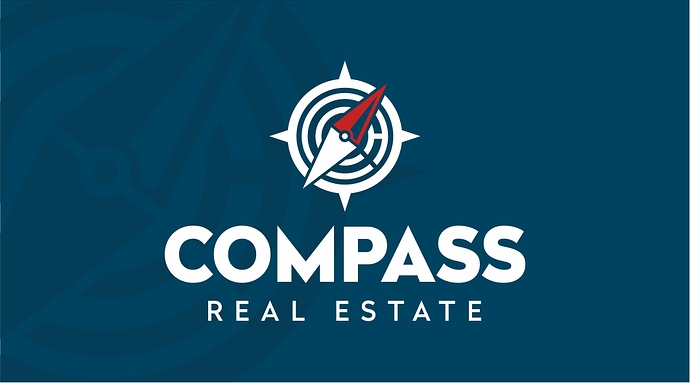
Here is the case. I friend of mine started working in a small real estate agency and showed me their website and logo. I usually don’t like doing work with friends but decided to show him how modern logos should look like using an old concept I made for another client and replacing the company name. Both companies are using a compass as a main element. Original client were in recruiting staff for ships and ended up using a lighthouse as their graphic element. It’s an old project but it looks much better than the logo the company is using. I know it kinda looks generic (also the reason it wasn’t picked by my client) but the point here is to compare both styles.
This is not an actual job and please feel free to share your opinions, critics, comments on both mine and client designs. He is pretty open minded and don’t mind this experiment.
There are certain design elements that you will run into over and over: globes, stars, compasses…
So your job is to take this stale old concept and make it “new” while still retaining the “feel” of the original. I HATE this kind of job because it means the client is thinking with his heart not head - and you are expected to give it to them. I’ll bet dollars to donuts that he/she will say at some point “I don’t know what I want, but I’ll know it when I see it.”
All that said, you made a good looking logo. So what could be turning him off? These are my best educated guesses, not critique.
- The thickness of all elements in your design makes the logo look cartoony in comparison to the original that is more exacting. Maybe make all the elements a little thinner
- The background: when presenting a logo, don’t make it dependent on the background like this. Either put the element in or leave it out. Although as a business card I like that background if you move the logo left and top and any contact info right aligned - would look fantastic.
- This original is one of the few times Copperplate actually works (classic maps). So maybe try pulling the text onto the new design and adjust the design to “feel” more like the original. Stretch those art muscles.
Good work, but the client gets what they want - even if you think it stinks.
Hey dude, thank you for your comment  As i mentioned the guy is not my client and the logo is made 2-3 years ago as a concept pack for completely different client. My point was to compare and comment the old logo as a rusty, busy, and in my honest opinion ugly logo from the early 90s. I really apretiate your comment but I am not sure you get the purpose of my post.
First of all i am not taking the original logo as a base concept at all. This is a absolute joke according to my taste. I hate absolutely everything in the logo. I used these fonts and styles when I was 12 LONG TIME AGO.
Once again, we are just comparing styles. This is not a real job for a paying client. But you are absolutely right about the part of picking it with the heart… which is a heart with pretty bad taste lol  Thank you dude.
Re this part: " 1. This original is one of the few times Copperplate actually works (classic maps). So maybe try pulling the text onto the new design and adjust the design to “feel” more like the original. Stretch those art muscles." … i consider this a joke because it sounds absolutely ridicuouls man  I still thank you for your input but… come on… are you from the guys who dance when the client is clapping? COME ON!!!
P.S. Logo is on a colour background because the original one was on black background… sent as a flat jpg. Thank you for clarifying everything lol 
1 Like
I’m a little bit lost on the point of this discussion. This isn’t your job, but rather a spec piece created for your client a long time ago?
Which one is yours? We don’t critique pieces not posted by the original designer so are you just looking for which one we like better?
Yeah, I guess I misunderstood the question. The original looks like it was made by an old metal head.


 As i mentioned the guy is not my client and the logo is made 2-3 years ago as a concept pack for completely different client. My point was to compare and comment the old logo as a rusty, busy, and in my honest opinion ugly logo from the early 90s. I really apretiate your comment but I am not sure you get the purpose of my post.
 Thank you dude.